
Trending Colors This Year are more than just shades on a palette—they set the mood, influence how we feel in our homes, and reflect our personal style. Whether you’re planning a full home makeover or just want to refresh a single room, understanding the top color trends can inspire creativity and help you make choices that feel both modern and timeless. In this guide, we’ll explore the popular paint colors, stylish color combinations, and practical tips to bring these vibrant hues into your space in a way that suits your lifestyle. Get ready to transform your home with the most exciting color trends of the year!
Why Color Trends Matter in Home Design
Choosing the right colors for your home goes beyond mere decoration; it plays a vital role in shaping the atmosphere and emotional experience within your living spaces. Trending colors this year are not just random picks—they are carefully influenced by cultural shifts, lifestyle changes, and even psychological effects. Understanding why these colors resonate at a particular time can help you create interiors that feel both fresh and meaningful. By tapping into the psychology of color and the way trends evolve, you can make smarter, more confident choices that enhance your home’s comfort and style.
The Psychology Behind Color Choices
Colors have a profound impact on human emotions and behavior. For example, soft blues and greens tend to promote calmness and relaxation, making them ideal for bedrooms or meditation spaces. On the other hand, warmer tones like reds and oranges can energize a room and stimulate conversation, which is why they often work well in social areas like living rooms or dining rooms. The right use of color psychology can also influence how spacious or cozy a room feels. By understanding these subtle effects, you can choose popular paint colors that support the mood you want to cultivate in every part of your home.
From Fashion to Interiors – How Color Trends Emerge
Color trends rarely appear out of nowhere; they are reflections of broader societal moods and cultural moments. As fashion, art, technology, and world events evolve, so do the colors that capture the public’s imagination. Designers, artists, and creatives collectively respond to these influences by incorporating certain hues into their work, which eventually trickle down into interior design. This cycle means that trending colors this year often mirror what is happening in the world around us, offering a way for homeowners to express current values and emotions through their spaces. Recognizing this connection can help you select colors that feel relevant, intentional, and inspiring.
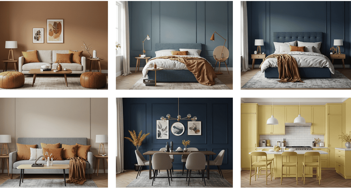
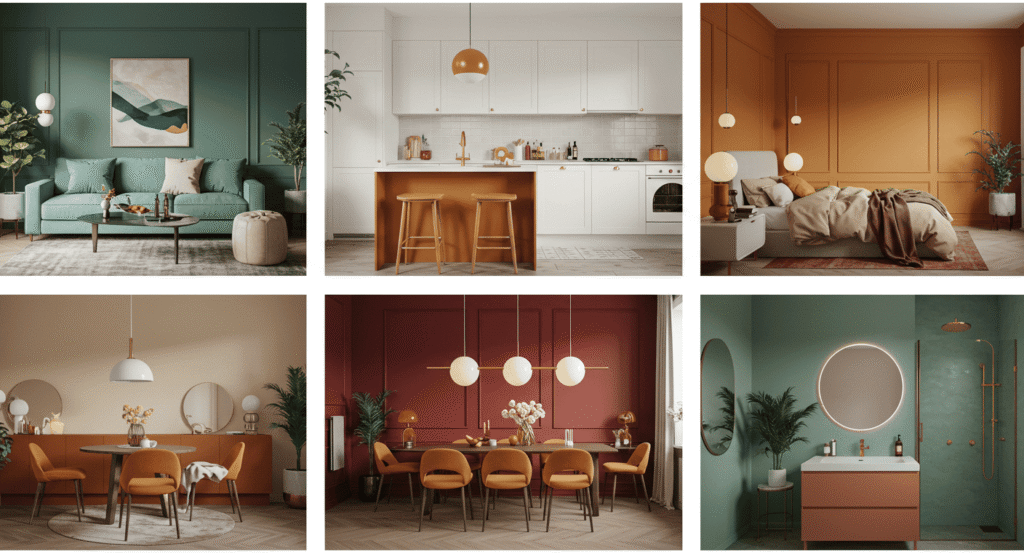
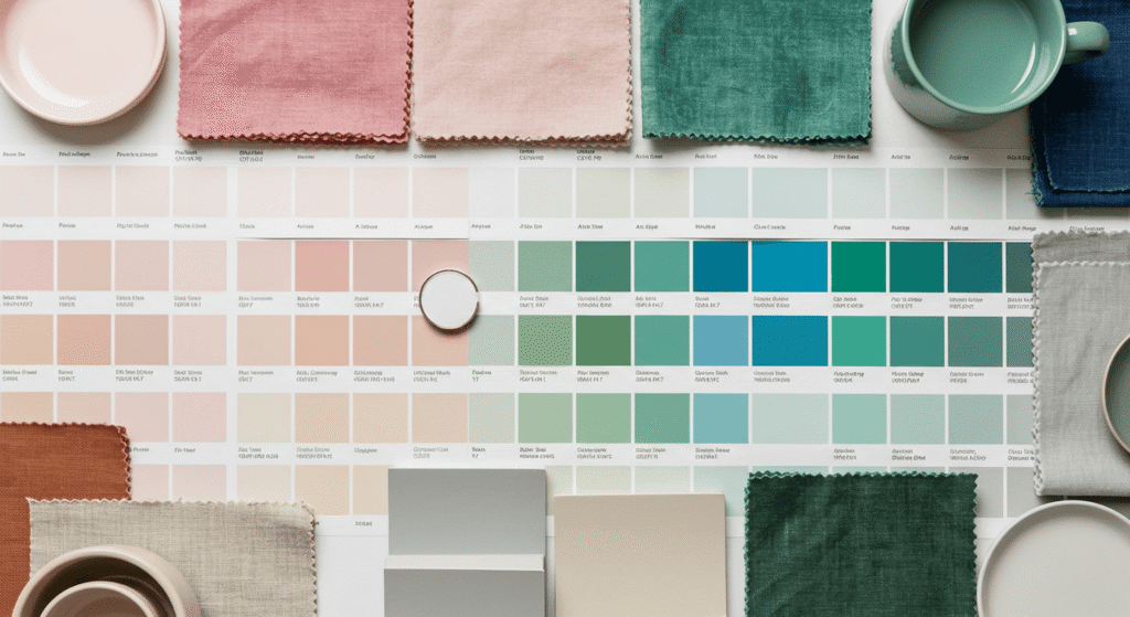
Top Trending Colors This Year (With Mood Chart)
Exploring the trending colors this year can be both inspiring and practical when you understand the mood each color brings to your home. Colors don’t just fill a room—they create feelings and atmospheres that influence your daily life. To make it easier, here’s a handy chart that pairs popular hues with the emotions they evoke and the best rooms to showcase them.
Quick Look: Trending Colors & What They Say About You
| Color | Mood/Energy | Best Rooms |
|---|---|---|
| Dusty Rose | Calm, Romantic | Bedroom, Bathroom |
| Olive Green | Natural, Grounding | Kitchen, Living Room |
| Terracotta | Warm, Earthy | Entryway, Dining Room |
| Misty Blue | Serene, Airy | Office, Bedroom |
This table helps you quickly identify colors that suit your personality and the function of each room. Whether you want to feel relaxed or energized, there’s a tone for every mood.
Soft vs. Bold: Choosing Based on Your Vibe
When deciding between soft neutrals and bold statement colors, consider your personal style and the vibe you want to create. Soft tones like dusty rose and misty blue evoke tranquility and subtle elegance, perfect for spaces where calm is key. Bold colors like terracotta and olive green make a striking impact and bring warmth or natural earthiness, ideal for areas where you want to feel grounded or lively. Mixing these thoughtfully allows you to balance personality and comfort while staying on trend.
Color Zones: What Works Best for Each Room
Each room in your home has a unique purpose, and the colors you choose should reflect that function and desired ambiance. Understanding which trending colors this year best suit different spaces can help you create a harmonious flow throughout your home while enhancing the mood in each area.
Living Room – Where Warm Meets Welcoming
The living room is a social hub, where comfort and style need to coexist. Warm tones like soft terracotta or muted olive green create an inviting atmosphere that encourages relaxation and conversation. Pair these with neutral accents to keep the space balanced and cozy without overwhelming the senses.
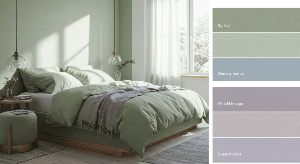
Bedroom – Calm, Cozy, or a Pop of Energy?
Bedrooms call for colors that promote rest and rejuvenation. Soft hues such as dusty rose or misty blue foster calmness and serenity, making them excellent choices for creating a peaceful retreat. If you prefer a more energizing vibe, consider adding a bold accent wall in a richer shade, but keep the overall palette soothing to ensure restful sleep.
Kitchen & Dining – Appetite Meets Aesthetics
Colors in the kitchen and dining areas do more than just look good—they can influence appetite and social energy. Warm, earthy shades encourage appetite and conviviality, while cooler tones can have the opposite effect. <details> <summary>Colors That Boost Appetite vs. Suppress It</summary>
| Colors That Boost Appetite | Colors That Suppress Appetite |
|---|---|
| Warm Reds and Oranges | Cool Blues and Greens |
| Earthy Terracotta | Pale Purples and Lavenders |
| Warm Yellows | Grays and Muted Neutrals |
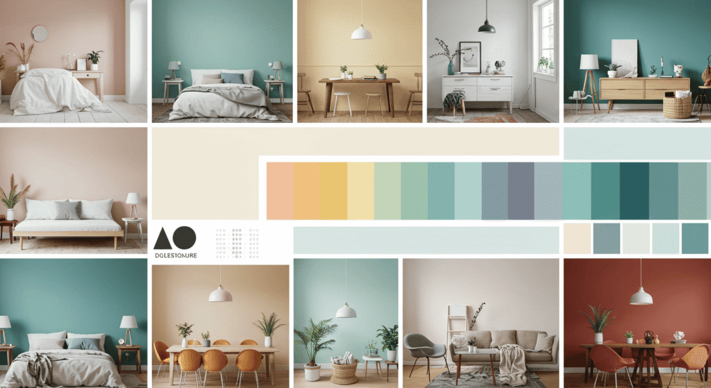
Seasonal Inspiration: Year-Round Color Rotation
Colors have the power to reflect the changing seasons, helping your home feel fresh and in tune with nature all year long. By adapting trending colors this year to the different moods of spring, summer, autumn, and winter, you can keep your space dynamic and inviting throughout every season.
Spring/Summer – Breezy, Light, and Uplifting
Spring and summer call for airy, light-filled colors that evoke freshness and energy. Soft pastels, gentle greens, and pale blues are perfect for creating spaces that feel bright and rejuvenating. Think of shades like misty blue or delicate dusty rose, which invite natural light and promote a cheerful vibe.
Suggested Spring/Summer Palette:
- Misty Blue (#B0C4DE)
- Dusty Rose (#DCAE96)
- Soft Mint (#98FF98)
- Pale Yellow (#FFFACD)
Autumn/Winter – Cozy, Moody, and Layered
As the days grow shorter and cooler, richer, warmer colors bring comfort and depth to your interiors. Earthy tones like terracotta and olive green create a cozy, grounded feeling ideal for autumn and winter. Layer these colors with warm neutrals and textures to enhance the snug atmosphere.
Suggested Autumn/Winter Palette:
- Terracotta (#E2725B)
- Olive Green (#556B2F)
- Warm Taupe (#8B7E66)
- Deep Charcoal (#36454F)
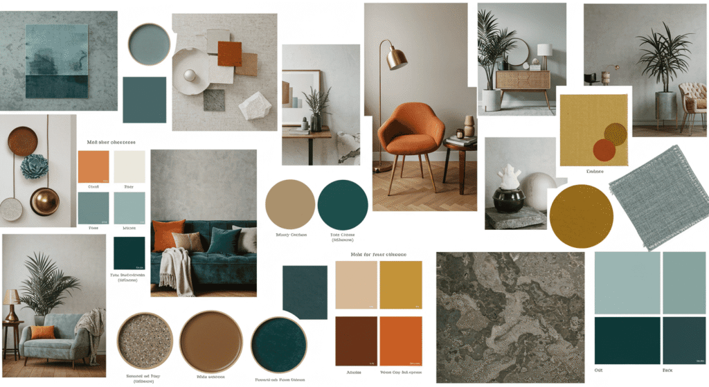
Trending Color Combinations That Actually Work
Mixing trending colors this year can be tricky if you’re worried about clashes or overwhelming a space. The key is understanding color relationships and choosing combinations that create balance and harmony. Here’s a guide to two popular approaches that help you blend colors beautifully and confidently.
Complementary Combos
Complementary colors sit opposite each other on the color wheel. When paired, they create vibrant contrasts that bring energy and visual interest to any room. Using complementary combos thoughtfully—often by balancing a bold color with a softer one—can make your décor pop without feeling chaotic.
Analogous Harmony
Analogous colors are neighbors on the color wheel and share similar undertones. This creates a soothing and cohesive palette that’s easy to live with. Using analogous colors allows for subtle variation in tones and moods, perfect for creating layers of interest while maintaining unity.
| Pair This | With That |
|---|---|
| Dusty Rose | Misty Blue |
| Olive Green | Warm Taupe |
| Terracotta | Deep Charcoal |
| Pale Yellow | Soft Mint |
This simple color-pairing matrix helps you visualize combinations that work well together, making it easier to mix and match popular paint colors in your home design.
How to Test Colors Before You Commit
Choosing the right color for your space can feel overwhelming, and committing to a shade without seeing it in action can lead to regret. To avoid costly mistakes, it’s essential to test trending colors this year in your actual home environment before making a final decision. Here are practical tips to help you confidently pick the perfect hue.
Sampling Techniques That Don’t Ruin Your Walls
Instead of painting entire walls, try small test patches using sample pots or peel-and-stick color swatches. Painting a few square feet in different spots of the room lets you observe how the color interacts with your existing furniture and lighting. Another option is to use large poster boards painted with the color, which you can move around the room to see how it looks in various areas without any damage.
Light Matters – Testing in Different Times of Day
Colors can look dramatically different depending on the natural and artificial light they receive. What appears vibrant and warm in the afternoon sun might seem dull or cool under evening lighting. Testing your color choices at different times of day ensures you won’t be surprised after painting.
| Color Sample | Morning Light | Evening Light |
|---|---|---|
| Dusty Rose | Soft, warm and inviting | Slightly muted, cozy |
| Olive Green | Fresh and vibrant | Deeper, more subdued |
| Terracotta | Warm and glowing | Rich and intense |
| Misty Blue | Bright and airy | Cooler, calming |
Use this chart as a quick guide to understand how common trending colors may shift in different lighting conditions, helping you make the best choice for your space.
Small Space, Big Impact: Using Trending Colors Wisely
When working with small apartments, studios, or quirky nooks, the right use of trending colors this year can make a dramatic difference. Thoughtful color choices can visually expand your space, add personality, and create a sense of flow without overwhelming the room. Here are some smart strategies to maximize impact without sacrificing comfort.
Tricks with Contrast, Ceilings & Trim
Using contrast strategically can define areas and add depth to small spaces. Painting ceilings in a lighter shade of a trending color can create the illusion of height, while darker trims provide crisp definition without crowding the room. Experiment with color on moldings, baseboards, or window frames to add subtle sophistication that enhances your overall design.
The Accent Wall Comeback – But Make It Trendy
Accent walls are back—but with a modern twist. Instead of bold, overpowering colors, try applying a trending tone on just one wall to create a focal point that energizes the room. This technique works well in small spaces where a full-room color might feel too intense.
Try This on Just One Wall:
- A warm Terracotta wall behind a sofa or bed adds cozy warmth without overwhelming.
- An Olive Green accent in a nook or hallway creates a natural, grounding vibe.
- A soft Misty Blue behind a workspace can boost calm and focus.
Using an accent wall in trending colors can refresh your small space with minimal effort and maximum style.
Future-Proofing Your Space with Timeless Trendy Tones
While it’s exciting to embrace trending colors this year, it’s equally important to create a home that feels stylish and relevant for years to come. Future-proofing your interiors means balancing bold, trendy hues with timeless elements that won’t feel outdated quickly. This approach helps you enjoy the best of both worlds: fresh design that lasts.
Picking One Trendy Element to Highlight
Instead of painting entire rooms in a trend-forward color, focus on highlighting one element—such as a single wall, a piece of furniture, or décor accents. This keeps your space adaptable and easy to refresh as trends evolve, without requiring a complete overhaul.
Balancing Neutrals with Statement Colors
Pairing vibrant popular paint colors with neutral tones creates a grounded, harmonious look. Neutrals act as a calming backdrop that lets statement colors shine without overwhelming your space. This balance ensures your design remains elegant and approachable over time.
How to Know If It’ll Still Look Good in 3 Years
- Does the color complement your existing furniture and style?
- Is it versatile enough to pair with other hues and textures?
- Does it feel comfortable and not just trendy?
- Can you easily update accents around it to refresh the look?
- Are you excited to live with it every day, not just for now?
Using this checklist helps you choose colors that combine trendiness with timeless appeal, making your home a joyful place for years ahead.
Embrace Trending Colors This Year to Transform Your Home
Embracing trending colors this year offers a wonderful opportunity to refresh your living spaces with style and personality. By understanding how colors influence mood, choosing thoughtful combinations, and testing shades carefully, you can create a home that feels both current and timeless. Whether you go bold with statement walls or gently layer soft tones, these color trends can inspire a space that truly reflects you. Use the tips from this guide to confidently bring the latest hues into your home and enjoy a vibrant, welcoming environment all year round.