


When you want to Style Shelves like a pro, the secret isn’t owning more decor—it’s mastering a handful of design principles and turning them into repeatable, confidence-boosting routines. This guide takes you from blank shelf to balanced showpiece with a clear plan, designer-backed composition techniques, and practical tables you can follow on the spot. You’ll learn how to choose a palette, balance scale and height, layer for depth, and curate objects with intention, all while keeping your style authentic and your shelves functional. As you move through each section, you’ll find quick-reference tables and formulas so you can act immediately instead of second-guessing. By the end, you’ll be able to Style Shelves anywhere in your home with refined ease.
If you’d like more practical room-by-room ideas that pair beautifully with your shelf vignettes, browse related guides on my site at
ameliastips.com. For lighting accuracy that makes materials look true-to-life (a key detail in shelf styling), review foundational guidance on LED lighting and color rendering from a trusted authority like the U.S. Department of Energy at
this resource.
Start With a Clear Vision (and Space Audit)
Before you place a single object, map the story your shelves will tell and the constraints you’re working within. To Style Shelves that feel cohesive and intentional, define the purpose—display, storage, or hybrid—and identify the atmosphere you’re aiming for: modern, Scandinavian, farmhouse, mid-century, or transitional. Then consider the room context and architectural features like built-ins, alcoves, niches, and floating shelves. When your vision and constraints are clear, every styling choice becomes simpler and more confident.
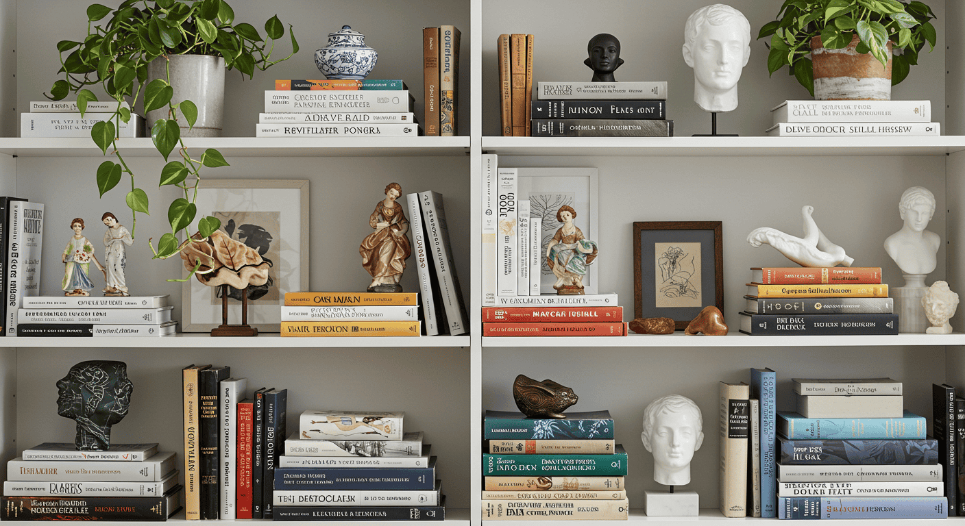
Define Your Shelf’s Story
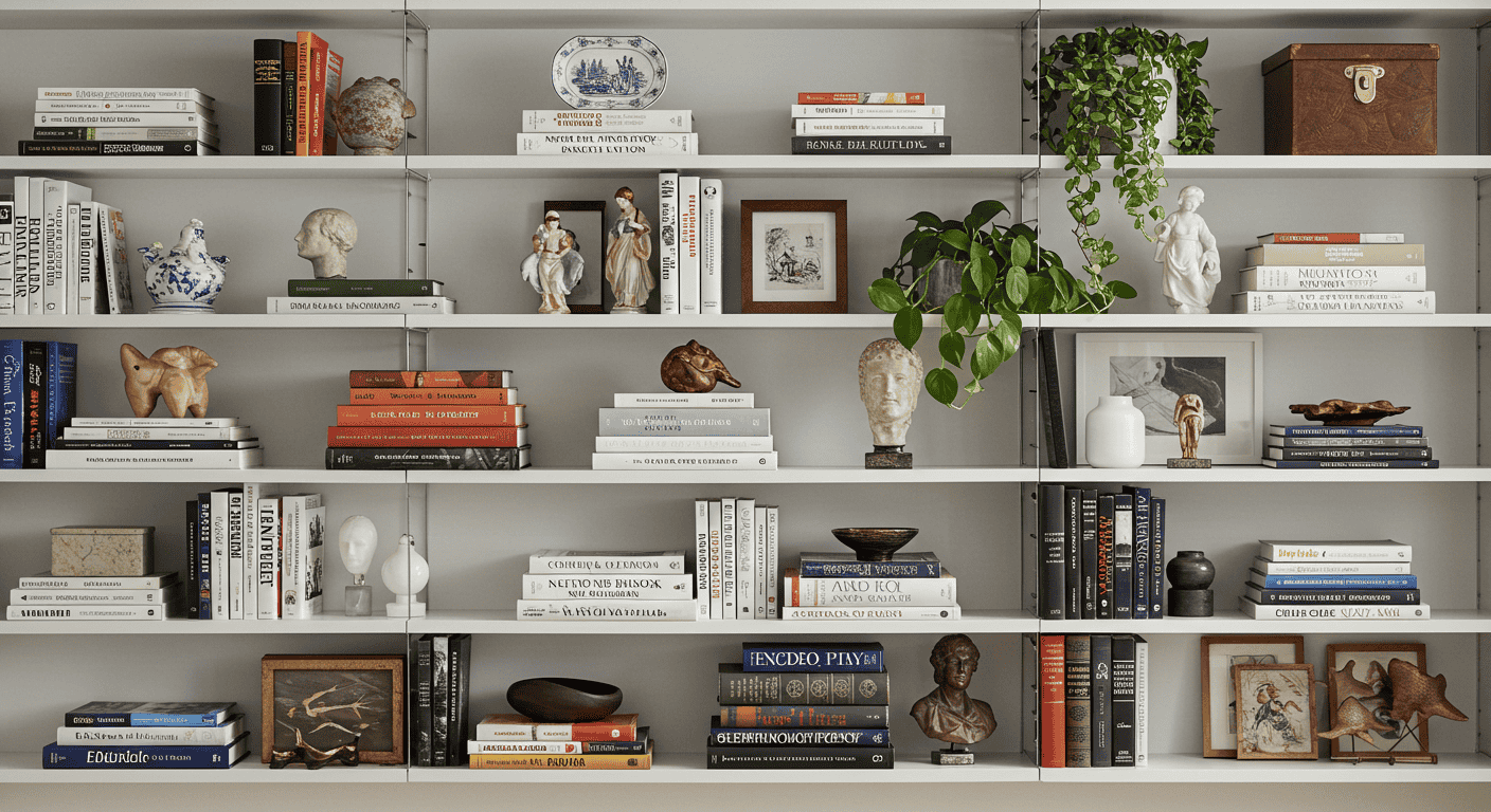
A compelling shelf vignette reads like a short story: there’s a leading character (your anchor piece), a supporting cast (medium objects), and context (books, art, plants). Decide what you want the viewer to feel—calm and minimalist, collected and scholarly, or warm and organic. When you Style Shelves with a story in mind, you’ll naturally select objects that “belong” together and cut anything that muddles the narrative.
Space and Constraints
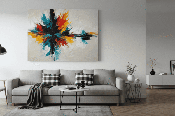
Constraints keep you honest. Weight limits, shelf depth, and sightlines influence what looks balanced in the room. In a living room, shelves might flank a focal point and need symmetrical quiet; in a home office, they might need more functional storage without visual heaviness. Use constraints as design prompts that sharpen your choices rather than limit them as you Style Shelves.
| Room | Primary Function | Mood | Dominant Materials | Color Palette | Must‑Have Objects |
|---|---|---|---|---|---|
| Living Room | Display | Calm, curated | Natural oak, ceramic, glass | Neutrals + 1 accent | Art, vases, plants, book stacks |
| Home Office | Hybrid | Structured, tidy | Walnut, linen boxes, metal | Tonal neutrals | Reference books, trays, framed photos |
| Kitchen | Functional display | Warm, useful | Wood, stone, glass | Warm neutrals | Bowls, jars, small art, greenery |
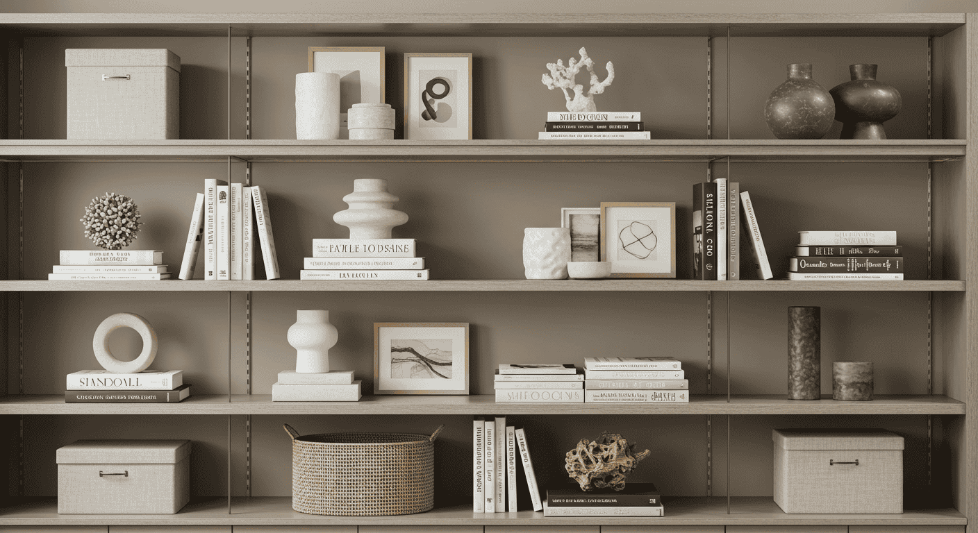
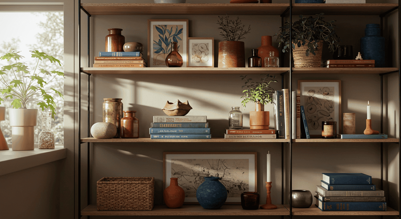
Build a Cohesive Color Palette
Color is a powerful shortcut to coherence. To Style Shelves with polish, establish a base tone, one secondary, one accent color, and a single metal finish that quietly repeats. Keep the background calm, then echo accent colors in small, strategic doses—think a ceramic vase, the spine of a coffee table book, and a small bowl. This keeps the eye moving without turning your shelves into a patchwork of competing hues.
Pick a Base, Accent, and Metallic
Choose a neutral base (white, greige, natural oak, or walnut), a harmonious secondary, and a restrained accent. Add one metal finish—matte black or brushed brass—and repeat it sparingly. When you Style Shelves with just one metal, everything reads more deliberate and elevated.
Apply Color Theory Lightly
You don’t need a color wheel to get this right. Aim for tonal harmony with subtle contrast: a gentle warm/cool interplay keeps things lively without chaos. If your walls and shelves are warm, consider a cooler green plant and a ceramic with a quiet blue-gray cast to balance the temperature as you Style Shelves.
Quick Color Rules
Use the 60/30/10 guideline to allocate base, secondary, and accent. Repeat an accent in three places across the entire shelf system; it can be faint, but its rhythm should be perceptible. This is one of the simplest ways to Style Shelves for visual unity.
| Base | Secondary | Accent | Metal | Texture Pairing | Example Objects |
|---|---|---|---|---|---|
| Natural oak | Warm white | Sage green | Matte black | Matte + woven | Planter, linen box, ceramic vase |
| Walnut | Cream | Rust | Brushed brass | Stone + glazed | Bookends, bowl, candlesticks |
| White lacquer | Gray | Navy | Polished chrome | Glass + linen | Tray, frame, clock |
Master Scale, Height, and Proportion
Shelves feel balanced when objects vary in size but relate in visual weight. The easiest way to Style Shelves without clutter is to select one anchor per shelf, support it with medium pieces, and then sprinkle small items sparingly. Use height variation to create triangle compositions that guide the eye in a comfortable rhythm.
Anchor, Medium, and Small Pieces
An anchor is the piece you notice first—a framed print, a large vase, or a sculptural object. Medium objects add interest and shape; smalls are accents, not the main act. If your shelf looks busy, you probably have too many small items. Remove a few and let the anchor breathe; this refinement is essential as you Style Shelves.
Create Triangle Compositions
Triangles are a designer’s quiet trick. Place the tallest element as one point, then step down across the shelf with medium and small heights. This creates a stable base and an elegant slope for the eye to follow. Repeat the triangle logic across shelves to Style Shelves with consistent flow.
The Rule of Odds
Odd-number groupings prevent symmetry from becoming stiff. Threes and fives look collected and intentional. If something looks forced, break the formation and rebuild the group with fresh spacing—this is how you Style Shelves that feel casually perfect rather than staged.
| Shelf Height | Anchor Height | Medium Heights | Small Fillers | Notes |
|---|---|---|---|---|
| Short | 8–10in | 5–7in | 2–4in | Favor horizontal stacks and low bowls |
| Standard | 10–14in | 6–9in | 2–5in | Create triangles with a small plant and book stack |
| Tall | 14–18in | 8–12in | 3–6in | Use art as anchor; layer a vase in front |
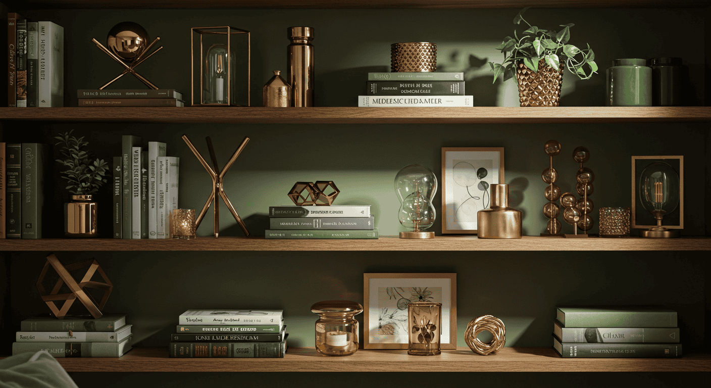
Layering and Depth (From Flat to Curated)
Flat shelves happen when everything sits on the same plane. To Style Shelves with richness, think back-to-front: anchor the back with leaning art or a tall object, add mid-depth pieces like books or a planter, then place a smaller object slightly overlapping in front. This overlap creates cohesion and depth without adding clutter.
Back-to-Front Layering
Start with a back layer that establishes height—lean a framed print or place a tall vessel. Add a mid layer of books or a medium sculpture, and finish with a small bowl or candle in the foreground. This three-step structure is one of the fastest ways to Style Shelves that look finished.
Overlap for Visual Cohesion
Overlap lightly so objects relate to one another. Avoid lining everything up like soldiers. A touch of overlap creates conversation between items and helps the vignette read as a single scene. As you Style Shelves, remember that connection beats isolation.
Negative Space
Breathing room is design oxygen. Leave some areas intentionally empty so the eye can rest and key objects can shine. If your vignette feels cramped, remove 20% and step back. To Style Shelves beautifully, embrace the power of what you don’t use.
| Back Layer | Mid Layer | Front Layer | Texture Contrast | When To Use |
|---|---|---|---|---|
| Leaning framed art | Book stack | Ceramic bowl | Matte + glazed | General living areas |
| Tall vase with branches | Small planter | Tray with trinket | Organic + polished | Entryway calm |
| Stacked frames | Clock or sculpture | Candlesticks | Metal + linen | Evening ambiance |
Books: Style, Stack, and Flow
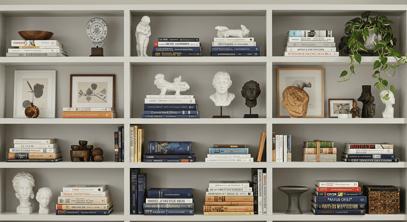
Books are the most versatile tool you have. They add color, structure, and instant personality. To Style Shelves with books, alternate vertical rows (stabilized with bookends) and horizontal stacks (which become platforms for smaller objects). Break long runs with sculptural pieces so the eye can pause and enjoy the scene.
Orientations
Vertical spines convey order; horizontal stacks soften the look and create height where you need it. Mix both to control rhythm and silhouette. When you Style Shelves, think of books as both content and architecture.
Mix With Object Breaks
Insert a vase, bowl, or small sculpture between book clusters to avoid a monotonous “library wall.” Object breaks introduce negative space and focal points, helping you Style Shelves that feel collected rather than crammed.
Book Color Strategy
Sort spines by tone and saturation rather than chasing perfect color matches. A nuanced spectrum looks more natural than a strict rainbow. If the palette gets loud, flip some books to show neutral pages. This restraint helps you Style Shelves with elegant calm.
| Pattern Name | Placement | Best For | Add‑On Object | Visual Effect |
|---|---|---|---|---|
| Pillar & Platform | Vertical row + horizontal stack | Balanced rhythm | Small vase | Height variation, soft edges |
| Anchor Break | Books flanking a sculpture | Strong focal | Sculptural form | Emphasis at center |
| Tonal Wave | Light to dark gradient | Color control | Neutral tray | Subtle movement |
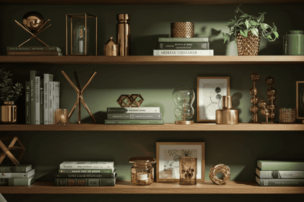
Curate Objects With Purpose
Curating is the difference between clutter and collection. Choose objects for their form, texture, and emotional resonance. To Style Shelves with personality, lean on a core capsule: ceramic vases, bowls, trays, candlesticks, picture frames, small sculptures, clocks, diffusers, and natural elements like plants or branches. A thoughtful mix creates contrast and interest without noise.
Core Categories
Build around a few reliable categories that you rotate seasonally. Ceramics add calm mass, glass brings lightness, wood warms things up, and stone grounds the composition. With a compact capsule, you can Style Shelves quickly and with less decision fatigue.
Natural Elements
Greenery is a cheat code for freshness. Pothos, snake plants, and succulents thrive on shelves and add organic lines that counter rigid edges. Dried branches or eucalyptus introduce movement and a sculptural silhouette, helping you Style Shelves that feel alive.
Materials Mix
Combine matte with gloss, smooth with woven, and warm wood with cool stone. This contrast keeps the eye engaged. If your composition feels flat, change a finish—swap a matte vase for glazed, or a linen box for a rattan basket—to instantly Style Shelves with richer tactility.
| Category | Size Range | Typical Material | Visual Weight | Where It Shines | Pairing Tip |
|---|---|---|---|---|---|
| Ceramic vases | Small–large | Matte/glazed ceramic | Medium | Anchors and overlaps | Pair with books for height |
| Bowls & trays | Small–medium | Stone, wood | Light–medium | Front layer | Catchalls for small items |
| Picture frames | Small–medium | Wood, metal | Light | Leaning back layer | Layer slightly behind a vase |
| Planters | Small–medium | Terracotta, ceramic | Medium | Texture and life | Contrast foliage with backdrop |
Light It Like a Designer
Lighting adds clarity and mood—both essential when you Style Shelves. Use subtle illumination to highlight anchors, reveal textures, and protect sightlines. Even a small amount of well-placed light raises the perceived quality of your display and helps colors and materials read true to life.
Choose the Right Approach
Picture lights and sconces create gentle, directional emphasis; LED strip lights and pucks add an even wash or discrete highlights. Choose the method that suits your shelf type and the vibe you want: dramatic accent or soft ambiance. With the right choice, you’ll Style Shelves that look elegant at any hour.
Temperature and CRI Basics
Aim for a comfortable warmth that complements wood and natural materials, and a high color rendering index so finishes appear accurate. Good color accuracy prevents your carefully chosen palette from looking dull or off. These small technical choices make a big difference every time you Style Shelves.
Placement Tips
Hide light sources to avoid glare, angle fixtures to graze textures, and spotlight anchors instead of flooding everything equally. Let some areas fall into softer shadow so the composition has shape. This is how you Style Shelves with dimension instead of flattening them with uniform light.
| Shelf Type | Lighting Type | Placement | Desired Effect | Notes |
|---|---|---|---|---|
| Built-in | Picture light | Top front edge | Focal highlight | Great for art anchors |
| Open floating | LED strip | Underside/back edge | Soft wash | Hide the diode line |
| Deep shelves | Puck lights | Ceiling of niche | Spot accents | Space evenly, avoid glare |
Style Systems: Repeatable Formulas You Can Reuse
Systems are your shortcut to consistency. When you Style Shelves, use formulas that remove guesswork while leaving space for personality. These frameworks scale from a single niche to a full wall of built-ins, and they’re flexible enough to adapt for seasonality or small spaces.
The 5‑Item Vignette
Start with an anchor, add a book stack, introduce an organic element, layer a sculptural form, and respect negative space. Five elements are enough to feel complete without crowding. This formula helps you Style Shelves swiftly and confidently.
Symmetry vs. Asymmetry
Symmetry is calming and formal; asymmetry is dynamic and modern. Alternate them across shelves for a pleasing cadence. Use symmetry to frame a focal point and asymmetry to energize a corner. Balancing both is a nuanced way to Style Shelves with sophistication.
Seasonal and Small Space Tweaks
Rotate accent colors, swap botanicals, and edit object counts for tighter spaces. Small rooms benefit from fewer items with stronger silhouettes. Seasonal adjustments ensure you Style Shelves that feel fresh without buying endlessly.
Troubleshooting Checklist
If a vignette looks flat, add height or a back layer. If it feels busy, remove 20% and add negative space. When colors fight, reduce accents to two and repeat each three times. This checklist is your on-call designer when you Style Shelves and something just feels off.
<tr>ProblemLikely CauseFast FixUpgrade Option
| Looks flat | No back layer | Add leaning art | Introduce height with branches |
| Too busy | Too many smalls | Remove 20% | Swap to one stronger anchor |
| Color clash | Too many accents | Limit to two | Repeat each accent three times |
| No focal point | Equal visual weight | Choose an anchor | Light the anchor subtly |
Conclusion: Turn Theory Into Habit
The difference between a shelf that looks “fine” and one that feels designer-level is consistency. Pick a color palette, honor scale and proportion, layer for depth, curate intentionally, and light with care. Then practice the same systems in different rooms until they become second nature. Whether it’s a living room built-in or a tiny entry niche, you can confidently Style Shelves by repeating the formulas in this guide—swapping only the colors, textures, and objects to suit the mood you want at the moment.