


Paint colors for small rooms can completely transform how your space feels — making cramped corners appear open and inviting instead of tight and cluttered. Choosing the right hues isn’t just about picking your favorite shade; it’s a smart blend of color psychology, lighting, and room layout that can visually expand your space and uplift your mood. In this ultimate guide, you’ll discover expert tips on selecting paint colors for small rooms that brighten, enlarge, and add personality to even the coziest nooks — all while avoiding common mistakes that can shrink your space. Ready to make your small rooms feel bigger and more beautiful? Let’s dive in!
Why Paint Matters More in Small Spaces Than You Think

Choosing the right paint colors for small rooms is not just about aesthetics—it can dramatically change how a space feels and functions. In smaller rooms, color plays a bigger role because the walls and surfaces take up more of your field of vision. The right color can create an illusion of spaciousness, improve natural and artificial light distribution, and even influence the overall mood. Understanding how colors work in confined spaces helps you make smarter choices that enhance comfort and style.
The Visual Psychology of Color in Tight Quarters
When dealing with small rooms, the choice between light and dark colors is critical. Light colors reflect more light, making walls seem to recede and the room feel larger and airier. Shades like pale blues, soft grays, and whites are excellent for visually expanding a room. Conversely, dark colors absorb light and can make walls feel closer, shrinking the perceived size if overused.
Color temperature also affects mood and perception. Warm tones such as soft yellows and beige create a cozy, inviting atmosphere without overwhelming the space, especially when paired with good lighting. Cool tones like blues and greens evoke calm and freshness but can feel cold if not balanced well. Achieving the right balance between warm and cool tones enhances both space and mood.
Small Room, Big Impact: Common Paint Mistakes to Avoid
It’s easy to unintentionally make a small room feel more cramped by choosing the wrong colors or combinations. One frequent mistake is using dark colors on all walls, which can make the room feel heavy and smaller than it is. Dark shades are better used strategically, such as on an accent wall.
Another common error is mixing undertones that don’t complement each other, such as pairing warm wall colors with cool trim. This mismatch creates visual tension and can make a room feel chaotic rather than harmonious.
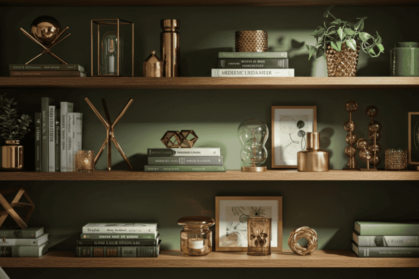
Also, many overlook ceilings and trim, but these areas influence spatial perception significantly. A dark ceiling or one painted in the same color as the walls can reduce the feeling of height, while neglecting trim makes the space appear unfinished. Using subtle contrasts and finishes here can add dimension and polish.
| Color Type | Effect in Small Rooms | Mood Evoked |
|---|---|---|
| Light Cool | Expands space visually | Calm, fresh |
| Warm Neutrals | Cozy but open | Inviting, soft |
| Dark Accent | Adds depth when used strategically | Bold, grounded |
How Natural and Artificial Light Influence Paint Color Choices
Lighting plays a crucial role when selecting paint colors for small rooms because it directly affects how colors appear and influence the atmosphere. Both natural and artificial light interact with paint in different ways, altering the way hues are perceived throughout the day and under various lighting conditions. Understanding these effects ensures you pick colors that work harmoniously with your room’s lighting setup, making the space feel comfortable and visually balanced.
North vs South-Facing Rooms
The direction your room faces impacts the quality and intensity of natural light it receives, which in turn affects how paint colors look. North-facing rooms typically get cooler, indirect light throughout the day, which can make colors appear bluer or grayer than they are. For this reason, warm tones or colors with a slight yellow or red undertone often work better to counteract the coolness.
South-facing rooms, on the other hand, receive abundant, warm sunlight that can enhance colors, making them seem brighter and sometimes more intense. However, in very bright south-facing spaces, some lighter colors might appear washed out, so slightly richer tones can provide better balance.
In dim or poorly lit spaces, avoid colors that absorb light, such as deep or muted shades, as they can make the room feel smaller and gloomier. Instead, opt for lighter, reflective colors that amplify the available light and open up the space.
Choosing Paint Based on Room Function and Lighting
Different rooms have different lighting needs based on their function, which should influence your choice of paint colors for small rooms. Bedrooms, for example, benefit from calming, softer colors that promote restfulness, often enhanced by warm artificial lighting in the evenings.
Kitchens typically require brighter, more energetic colors that work well with both natural daylight and cool-toned artificial lights to create a fresh, clean environment. Bathrooms, which often have limited natural light, do well with light, moisture-resistant paint colors that keep the space feeling fresh and hygienic.
Artificial lighting placement also changes how colors appear. Overhead lighting can cast shadows or highlight textures differently compared to side lighting, which provides softer illumination and can warm up cooler paint tones. Considering the type and position of lighting in your room helps in selecting a paint color that consistently looks good throughout the day and night.
The 3 Color Strategies That Work Wonders in Small Rooms

When it comes to choosing paint colors for small rooms, using the right color strategy can dramatically change the way your space feels. Rather than randomly selecting colors, employing thoughtful approaches helps visually expand your room, add personality, and maintain harmony. Here are three effective strategies to consider.
Monochromatic Magic
One of the simplest yet most powerful techniques is to stick to a single color family. Using varying shades, tints, and tones of the same color throughout the room creates a seamless flow that visually expands the space. Because there are no harsh breaks or conflicting colors, your eyes move smoothly across surfaces, making the room feel larger and more cohesive. This approach also offers flexibility to play with textures and finishes within the same color palette, adding depth without clutter.
Contrast with Intention
Introducing contrast can add energy and dimension to a small room—but it needs to be done thoughtfully. A well-placed pop of contrasting color, such as a darker accent wall or bold trim, can define space and create focal points without overwhelming the room. The key is to balance contrast so it doesn’t fragment the space or make walls feel closer. Using contrast in moderation helps maintain openness while injecting personality.
Gradient and Ombre Walls
Vertical gradients or ombre effects, where colors gradually shift from light to dark or vice versa, can create an optical illusion that adds height or width to a room. For example, a gradient that transitions from a deep shade at the floor to a lighter one near the ceiling can make the ceiling feel higher. Alternatively, a horizontal gradient can visually widen narrow spaces. This creative technique adds artistic flair and spatial enhancement simultaneously.
🟨 Side-by-side layout diagram idea:
| Strategy | Visual Effect | When to Use |
|---|---|---|
| Monochromatic Magic | Seamless flow, room feels larger | Small rooms needing calm, unified look |
| Contrast with Intention | Adds depth and focal interest | Rooms needing energy without crowding |
| Gradient and Ombre Walls | Creates height or width illusion | Spaces with low ceilings or narrow layouts |
Best Paint Colors for Different Types of Small Rooms

Choosing the right paint colors for small rooms depends greatly on the room’s purpose and how you want it to feel. Different spaces benefit from specific moods and color palettes that enhance both function and comfort. Here’s a breakdown of ideal color choices tailored to various small room types.
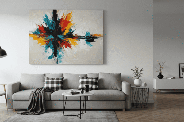
Small Living Rooms
Living rooms are often the heart of a home, even when space is limited. For small living rooms, colors that feel calm and airy work best. Soft grays and muted taupes provide a neutral backdrop that opens the space without overwhelming it. Adding subtle hints of sky blue can introduce a refreshing touch that keeps the room feeling light and inviting. These tones help balance warmth and openness, making small living areas perfect for relaxation and socializing.
Tiny Bedrooms
Bedrooms should be cozy sanctuaries, and in small bedrooms, soothing, restful colors create the right atmosphere. Pale sage brings a gentle natural calm, while dusty rose adds a soft, comforting warmth. Ivory tones serve as a perfect neutral base that reflects light and keeps the space feeling peaceful. These colors promote relaxation, helping to turn even the tiniest bedroom into a restful retreat.
Narrow Hallways and Entryways
Hallways and entryways are often overlooked but are crucial for setting the tone of a home. In narrow or small corridors, bright and welcoming colors are essential to avoid a cramped or gloomy feel. Cream shades soften the space, buttery yellow adds warmth and optimism, and pearl white maximizes light reflection. These colors can make even the narrowest passageways feel more open and inviting.
🟦 Color Palette Cheat Sheet
| Room Type | Ideal Color Mood | Sample Palette |
|---|---|---|
| Living Room | Calm, airy | Soft gray, muted taupe, sky blue |
| Bedroom | Cozy, restful | Pale sage, dusty rose, ivory |
| Hallway/Entryway | Bright, welcoming | Cream, buttery yellow, pearl white |
Using Accents and Trim to Elevate Small Spaces
When working with paint colors for small rooms, focusing solely on the walls is only part of the picture. Accents and trim play a powerful role in shaping the perception of space and adding sophistication. Thoughtfully treating ceilings and trim can transform a small room from feeling flat and confined into one with depth and character.
Don’t Ignore the Fifth Wall (Ceiling Tips)
The ceiling—often called the “fifth wall”—is frequently overlooked but can greatly influence how spacious a room feels. Painting the ceiling a light color, typically a shade lighter than the walls, helps to visually raise the height of the room, making it feel more open and airy. Whites, pale creams, or soft pastels work well for this purpose.
Experimenting with finishes on the ceiling can also add subtle effects. A glossy finish reflects light, which can brighten the room and add a sense of height, while a matte finish creates a soft, even surface that absorbs light for a cozy feel. Choosing between matte and glossy finishes depends on the mood you want to create and how much light the room receives.
Trim Tricks That Add Dimension
Trim provides a natural frame for walls and can either blend seamlessly or stand out to create visual interest. Using the same color for trim as the walls offers a smooth, continuous look that avoids breaking up the space—perfect for very small rooms where simplicity helps maintain openness.
Alternatively, contrasting the trim with a lighter or darker color can define architectural details and add depth. When doing so, it’s important to choose finishes carefully. Satin finishes on trim catch light softly and are easy to clean, making them a popular choice. Matte finishes offer a more understated effect but can help trim blend subtly without drawing too much attention.
By balancing color and finish choices for ceilings and trim, you can add layers of dimension that enhance the perception of space in small rooms without overwhelming them.
When to Break the Rules: Going Bold in Small Rooms
While classic guidelines for paint colors for small rooms often lean toward light and neutral tones, there are times when breaking the rules with bold colors can create striking and surprisingly spacious effects. When done thoughtfully, bold choices can add personality, depth, and sophistication without making the room feel cramped.
Accent Walls Done Right
An accent wall is a perfect way to introduce bold color into a small room without overwhelming it. By limiting the intense hue to just one wall, you create a focal point that adds visual interest and depth. This technique works especially well when paired with lighter, neutral walls and can highlight architectural features or artwork. The key is choosing a wall that naturally draws attention, such as the one behind a bed or sofa.
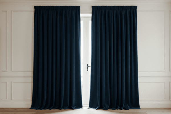
Dark Colors That Actually Make Rooms Feel Bigger
Contrary to popular belief, dark colors don’t always shrink small rooms. When used strategically, they can add dimension and make spaces feel cozier yet more expansive. Dark tones like deep navy or charcoal gray can create a sense of depth when applied to walls with high ceilings or rooms that receive ample natural light. The trick is balancing these rich hues with lighter accents—like white trim or soft furnishings—that reflect light and prevent the space from feeling closed in.
🟥 Do It Bold, Do It Smart comparison chart:
| Bold Color Choice | When It Works | What to Pair With |
|---|---|---|
| Deep Navy | High ceilings, lots of light | White trim, light flooring |
| Charcoal Gray | One-wall statement | Soft neutral furnishings |
Paint Finishes and Their Hidden Role in Small Rooms
When selecting paint colors for small rooms, it’s easy to focus solely on the hue and overlook the impact of paint finishes. However, the finish you choose plays a subtle but powerful role in how the room feels, especially in tight spaces. Finishes affect how light interacts with surfaces, influencing everything from mood to perceived size.
Choosing the Right Finish for Each Room
Matte finishes absorb light and reduce glare, creating a soft, cozy atmosphere that’s perfect for bedrooms or living spaces where comfort is key. Satin finishes offer a balanced sheen that reflects some light, making them ideal for high-traffic areas like kitchens and hallways because they are easier to clean without being overly shiny.
Glossy finishes, which have the highest reflectivity, work best when used sparingly—such as on trim, doors, or accent features. They add a polished, crisp detail that can make architectural elements pop without overwhelming the room.
Playing with Light Reflection
Using finishes strategically can enhance the way light bounces around a small room. Low-sheen (matte or eggshell) surfaces create a calm, muted environment by softening reflections, which can make spaces feel intimate and warm. High-sheen finishes (satin to gloss) reflect more light and visually “lift” surfaces, adding brightness and sometimes a subtle sense of spaciousness.
By mixing finishes thoughtfully, you can manipulate light to your advantage—highlighting certain areas, minimizing imperfections, and enhancing the overall depth of the room without cluttering the visual field. This nuanced approach helps small rooms feel well-balanced and inviting.
Final Tips, FAQs, and Visual Tools to Help You Decide
Bringing together everything you’ve learned about paint colors for small rooms, this final section offers quick actionable advice and answers common questions to help you confidently choose the perfect color scheme. Plus, we provide handy visual tools to make your decision easier and more fun.
Quickfire Tips Recap
- Do choose light or medium tones to visually expand the space.
- Don’t overuse dark colors on all walls; save them for accents.
- Do consider natural and artificial lighting when selecting colors.
- Don’t ignore ceilings and trim—these “fifth walls” add depth.
- Do experiment with finishes to control light reflection and mood.
- Don’t mix undertones that clash; keep warm and cool tones consistent.
- Do use monochromatic or gradient strategies to create flow.
- Don’t forget to test paint samples on your walls before committing.
- Do leverage accent walls strategically to add interest without shrinking space.
- Don’t overlook room function when choosing your color palette.
Small Room Paint Color FAQ
What’s the safest color to choose?
Soft neutrals like pale gray, warm beige, or creamy whites are versatile and reliable, complementing most lighting conditions and décor styles.
Can I paint a small room dark?
Yes, if done thoughtfully! Use dark colors on one accent wall or in rooms with high ceilings and plenty of light to add depth without making the room feel cramped.
How do I test colors without painting the wall?
Try painting large sample boards or poster boards and place them in different areas of your room at various times of day to see how lighting affects the color.
Mastering Paint Colors for Small Rooms to Transform Your Space
Choosing the right paint colors for small rooms is both an art and a science—one that can dramatically change how your space feels and functions. By understanding the impact of color, light, finishes, and strategic accents, you can create a room that feels larger, brighter, and more inviting. Remember, it’s not just about picking pretty shades; it’s about making thoughtful choices that work with your room’s unique features. With these insights, you’re now equipped to confidently transform even the smallest spaces into beautiful, comfortable havens.