


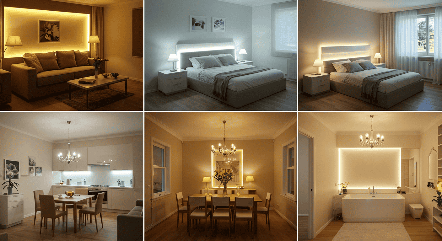
Home feels different when light is intentional, layered, and responsive to real life. Instead of blasting a single overhead source, Mood Lighting sculpts the atmosphere room by room, switching from focus to downtime without changing the furniture. This guide delivers practical, renter-friendly ways to soften glare, reduce eye strain, and make spaces welcoming, with tables that remove guesswork and scene recipes that are fun to use daily. To keep things truly helpful, each section builds from essentials to execution, so the payoff is immediate and the results are unmistakable. For more home guides, visit Amelia’s Tips, and for a dependable reference on color temperature and lighting basics, see Energy Saver (U.S. Department of Energy).
The Lighting Basics That Change Everything (Quick Primer)
Without a foundation, it is easy to buy bulbs that feel wrong or place lights that create headaches rather than comfort. In practical terms, Mood Lighting starts with three layers—ambient, task, accent—plus control over brightness and color temperature. Think of ambient as the general glow, task as the purposeful beam, and accent as the personality that makes a room feel curated rather than flat. When these layers are distinct yet coordinated, spaces naturally become calmer, easier to use, and infinitely more adaptable to the day’s rhythms.
Ambient, Task, Accent—What Each Does
Ambient lighting sets the baseline, preventing dark voids and harsh contrast. Task lighting adds precision where activities happen—prep, reading, detail work—so eyes do less straining. Accent lighting brings depth and focus, drawing attention to textures, corners, or architectural lines that otherwise disappear in uniform brightness. Together, these layers allow Mood Lighting to shift from energized to serene without rearranging a room; simply adjust levels and the entire atmosphere responds.
Ambient = overall glow; Task = do‑things light; Accent = visual interest
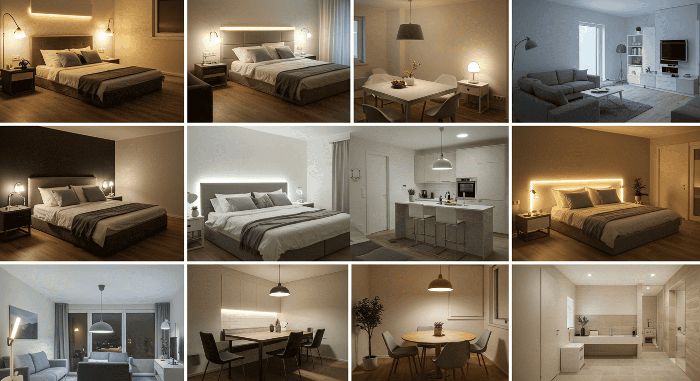
The fastest way to apply this triangle is to decide the primary layer in each zone, then add only what improves comfort. For a living room, an ambient fill with two soft corners prevents shadows, while an adjustable reading beam near seating covers tasks. Accent may become a warm wash along a wall or a subtle backlight behind furniture to calm hotspots. Keep it simple: pick one focal point to highlight, a practical task area to support, and an even, dimmable base to unify the entire scene—classic Mood Lighting done right.
Kelvin, Lumens, CRI—Choosing Bulbs That Look Right
Color temperature (Kelvin) changes how rooms feel: warmer (around 2700K–3000K) makes evenings comforting, neutral (3000K–3500K) balances kitchen and dining, and cooler neutral (around 4000K) supports alertness in offices without becoming clinical. Lumens indicate brightness; choose ranges suited to room size and activity so Mood Lighting can dim down without leaving the space too dark. CRI (Color Rendering Index) helps colors look accurate; higher CRI makes materials and finishes appear true, which is noticeable in mirrors, artwork, and natural materials.
Dimmers, Layers, and Scenes—Control the Vibe
Dimming is the throttle that makes the same room perform double duty. Lowering brightness in the evening reduces visual noise, while presets keep routines easy: a dinner scene, a reading scene, a wind‑down scene. Place controls where the hand naturally goes and consider time‑based routines so Mood Lighting flows with the day. This is how a home becomes responsive rather than static—small adjustments that feel luxurious because they work every single time.
| Room | Suggested Kelvin | Why It Works | Notes |
|---|---|---|---|
| Living Room | 2700K–3000K | Relaxed, flattering evening glow | Dim lower for movies and conversation |
| Bedroom | 2700K | Warmth supports pre‑sleep routines | Keep task reading neutral but dimmable |
| Kitchen | 3000K–3500K | Neutral clarity for prep | Shift warmer for meals and guests |
| Bathroom | 3000K–3500K | Balanced for mirrors | Diffuse to avoid harsh shadows |
| Home Office | 3500K–4000K | Alertness and focus | Add ambient fill to prevent contrast fatigue |
Living Room: From Daylight Tasks to Nighttime Cozy
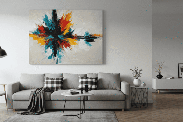
A living room wears many hats: social hub, reading nook, quiet cinema, and cozy cocoon after long days. The trick is to keep options ready without clutter. Use Mood Lighting to soften corners, pull attention to textures, and create transitions that feel intentional rather than abrupt. A balanced plan leaves no harsh hotspots or dead zones, just gradients that flatter people and spaces alike.
Corner Lamps + Backlighting for Soft Ambient
Corners are the secret to smooth ambient light because they bounce glow back into the room. Add a subtle backlight behind a console or sofa to avoid the floating island look that happens when the center is bright but edges are dark. With Mood Lighting, the goal is a gentle envelope of light that supports conversation without glare, answers a book’s small text, and dims elegantly when screens turn on.
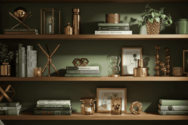
Accent Focus: Artwork, Plants, and Textures
Directing a soft wash across a textured wall or spotlighting a leafy plant adds visual rhythm without raising overall brightness. One focal point is usually enough; more can feel busy. This is where Mood Lighting adds character—light becomes part of the décor, revealing materials, shadows, and silhouettes that a flat ceiling source overlooks entirely.
Movie‑Night Scene: Lower Lumens, Warmer Kelvin
A comfortable viewing scene reduces eye fatigue by lowering ambient brightness and nudging warmth slightly deeper. Avoid a glowing beacon behind the screen; instead, keep a low backlight or two distant, dim sources to balance contrast. This is Mood Lighting that respects both immersion and eye comfort, letting the screen pop without plunging the room into total darkness.
| Activity | Brightness Range | Kelvin Range | Placement Tip |
|---|---|---|---|
| Conversation | 30%–50% | 2700K–3000K | Warm corners and gentle wall wash |
| Reading | 50%–70% | 3000K | Adjustable beam near seating |
| Movie Night | 10%–25% | 2700K | Backlight furniture, not the screen |
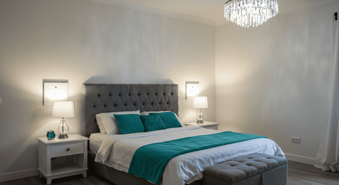
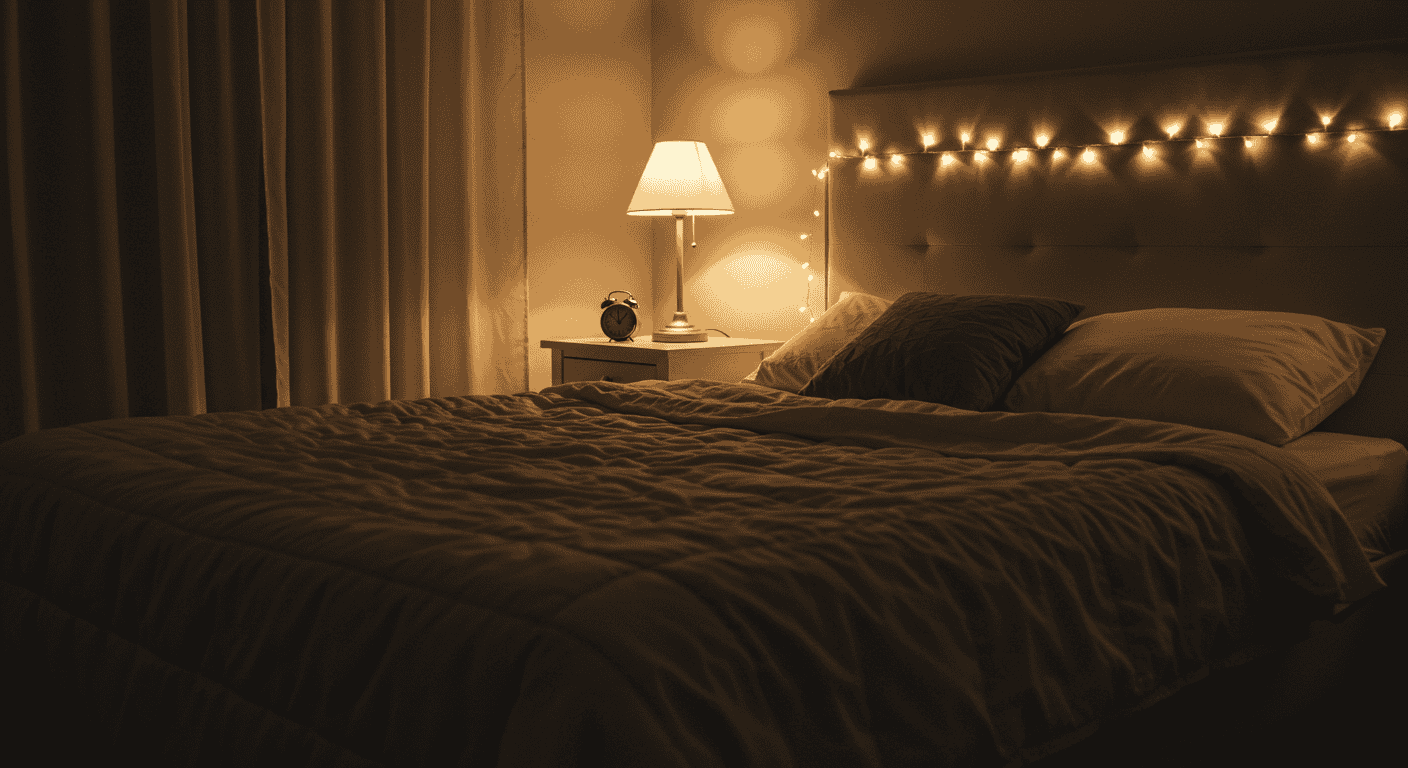
Bedroom: Sleep‑Forward, Clutter‑Free Glow
Bedrooms thrive on softness and routine. Every light should have a clear job: a calm base that feels like a hug, a focused beam for reading that doesn’t blitz a partner, and low‑level guides that keep navigation effortless at 2 a.m. When Mood Lighting supports circadian cues—warmer, dimmer light as night approaches—sleep comes easier and mornings feel kinder.
Bedside Layers: Reading vs. Wind‑Down
Separate reading from winding down. Reading prefers a directed, adjustable source that avoids glare across glossy pages; wind‑down benefits from a diffused shade that relaxes the eyes. With Mood Lighting, this pairing lets one person tuck in while the other finishes a chapter, and both wake up without harsh afterimages from bright fixtures.
Shade materials and beam spread for glare control
Fabric shades and diffusers keep brightness from jabbing at the eyes, especially in smaller rooms. Angling the beam away from pillows and toward pages prevents splash on walls that can wake light sleepers. Subtle details like shade opacity and distance are the fine‑tuning stages where Mood Lighting turns clinical light into a cocoon.
Under‑Bed/Toe‑Kick Strips for Night Walks
Low‑level strips cast a quiet pathway that spares the retinas from a shock. This is practical and charming: soft glows near the floor make the room feel curated. In Mood Lighting terms, these are micro‑layers—small effects with oversized comfort, especially for night routines or checking on children without flooding the space.
Color Temperature for Better Sleep
Favor warmer tones before sleep to cue the body for rest. Cooler shades are best kept for morning dressing if needed, and even then, keep brightness moderate. The body recognizes these signals; Mood Lighting just translates them into an easy routine that becomes second nature.
| Time | Brightness | Kelvin | Automation Trigger |
|---|---|---|---|
| Evening Wind‑Down | 20%–35% | 2700K | 1 hour before bedtime |
| Reading Session | 50%–65% | 3000K | Manual toggle at bedside |
| Night Walk | 5%–10% | 2700K | Motion or timed low‑level |
| Morning Wake | 40%–60% | 3000K–3500K | Alarm‑linked ramp up |
Kitchen: Task‑to‑Dinner Transitions That Actually Work

Kitchens are the test of any lighting plan because they demand clarity during prep and warmth at mealtime. Get the tasks right—shadow‑free counters, balanced island light—and transitions become smooth with a dim. The magic of Mood Lighting is feeling like the space can host brunch, homework, and late‑night tea without swapping a single fixture.
Under‑Cabinet Lines for Prep Precision
Lighting from the front edge of the cabinet minimizes shadows on the cutting surface and brightens the backsplash for a clean, crisp line. With Mood Lighting, this precision layer is what keeps knives, recipes, and textures readable; dim it post‑prep and let ambient sources take over for dining.
Island/Dining Dim‑Down for Meals
Meals deserve intimacy without darkness. Slightly warmer and softer light makes faces look relaxed and food look inviting. In Mood Lighting, the dining scene is the reward for getting tasks right: a gentle shift that turns utility into hospitality.
Color‑Zone Strategy: Neutral for Tasks, Warm for Eating
Think of the kitchen in zones. Prep zones stay neutral and bright while seating zones shift warmer. With Mood Lighting, the zones blend seamlessly; no area feels stranded, and family or guests instinctively know where to gather.
| Zone | Primary Use | Brightness | Kelvin | Fixture Type |
|---|---|---|---|---|
| Countertop | Chopping/Prep | 70%–85% | 3000K–3500K | Under‑cabinet linear |
| Island | Prep/Serve/Eat | 50%–75% | 3000K–3500K | Overhead with dim |
| Dining | Meals/Conversation | 25%–45% | 2700K–3000K | Centered warm pendant |
Bathroom: Spa Calm with Safety in Mind
Bathrooms challenge comfort because shine and shadow collide at mirrors and glossy tile. The fix is a combination of diffuse ambient light and face‑friendly fill from the sides rather than a single top‑down blast. A good Mood Lighting plan here is about flattering realism—true skin tones without glare, clear visibility without a surgical vibe.
Vanity Without Shadows (Front‑Fill vs. Overhead)
Lighting from either side of the mirror softens shadows under eyes and chin, while a modest top fill prevents dullness. Avoid single bright overheads that carve harsh angles across the face; Mood Lighting at the vanity should flatter and reveal, not exaggerate.
Shower Glow: Diffused, Not Dazzling
Even a small diffused source outside or above the shower area can make the space feel larger and calmer. Diffusion is the operative word: it avoids pin‑point glare on wet tile. In Mood Lighting, the shower becomes a retreat—steam, warmth, and a gentle glow that invites deep breathing.
Warm Soak Scene vs. Morning Wake‑Up Scene
The same room can feel like two different worlds. An evening soak scene leans warm and low; a brisk morning scene raises both brightness and neutrality for grooming. By assigning a personality to each scene, Mood Lighting turns routine into ritual.
| Area | Purpose | Brightness | Kelvin | Diffusion Tip |
|---|---|---|---|---|
| Vanity | Grooming | 60%–80% | 3000K–3500K | Side fill + modest overhead |
| Shower | Relaxation | 30%–50% | 3000K | Frosted lens or indirect |
| Tub | Soak | 15%–35% | 2700K–3000K | Out of direct sightline |
Home Office: Focus by Day, Unwind by Night
Work zones fail when contrast is too high and the desk is the only bright island in a dim room. Instead, balance a neutral task beam at the work surface with a gentle ambient fill that reduces edge glare on screens. With this balanced Mood Lighting, the mind stays alert without strain, and the shift to evening decompression becomes a welcome cue rather than an abrupt stop.
Desk Task Light to Reduce Eye Strain
Task light belongs near the non‑dominant hand to reduce shadows and should angle away from glossy displays. A mid‑neutral color temperature supports sustained attention. The principle in Mood Lighting is less about maximum brightness and more about clean, even coverage that keeps the shoulders and eyes from tensing.
Angle, distance, and surface reflectance
Set the beam to skim across the work surface, not ricochet into the eyes. Matte desk pads and non‑glossy finishes help. Subtle control like this is where Mood Lighting directly affects productivity—less squinting, more flow.
Ambient Fill to Avoid Contrast Fatigue
A soft, background glow reduces the stark border between screen and room, making long sessions easier. When the ambient is dimmable, the whole office becomes adaptable, and Mood Lighting helps the brain understand work mode vs. wrap‑up mode at a glance.
Scene Switch: Cool‑Neutral for Work, Warm for Shut‑Down
Two presets cover most days: a crisp, neutral scene for tasks and a warm, low scene that signals the end of work. This is Mood Lighting as time management—gentle guardrails that make transitions easier and evenings more restorative.
| Issue | Symptom | Fix | Placement Tweak |
|---|---|---|---|
| Screen Glare | Reflections on display | Adjust angle, dim ambient | Light source offset from screen plane |
| Eye Fatigue | Dry, sore eyes | Neutral task light | Beam aimed across, not into eyes |
| Shadowing | Hand blocking light | Move task to off‑hand side | Raise height; narrow beam |
Hallways, Entry, and Stairs: Safe, Welcoming, Guided
Transitional spaces are memory makers. They either welcome or jar, soothe or confuse. Layered Mood Lighting turns these pass‑throughs into extensions of the home’s personality—gentle guidance at night, warm hospitality at the threshold, and quiet confidence on the stairs.
Low‑Level Night Guides (Toe‑Kick, Stair Risers)
Low lights at ankles do the heavy lifting after dark. They calm steps without waking the house or blinding sleepy eyes. This is Mood Lighting that says this way without a word, shaping safe movement that feels effortlessly premium.
Entry Warmth That Sets the Tone
First impressions count. A balanced entry avoids stark overheads and instead pairs a soft ambient wash with a single accent focus—perhaps a textured wall or console vignette. The Mood Lighting message is clear: come in, breathe out, feel at home.
Motion‑Triggered Convenience
Motion in hallways and stairs removes fumbling and makes safety automatic. Brightness can remain low but sufficient, and timers prevent lights from staying on forever. Integrating this layer into the home’s Mood Lighting system preserves atmosphere while supporting daily life.
| Location | Height | Spacing | Brightness | Color Temp |
|---|---|---|---|---|
| Hallway | 6–12 in from floor | Every 6–8 ft | 15%–30% | 2700K–3000K |
| Entry | Eye‑level accent + ambient | One focal area | 30%–50% | 2700K–3000K |
| Stairs | Riser or wall low | Each second step | 20%–40% | 2700K–3000K |
Outdoors: Evenings on Balconies, Patios, and Paths
Outdoor comfort is largely about restraint. The night sky is part of the décor, and glare can ruin the mood. Treat outside spaces with the same Mood Lighting discipline: a soft overhead for general tasks, a low layer for edges and steps, and a warm accent for the gathering spot. Faces should be visible and relaxed, not washed out.
Layering: Overhead, String, and Low‑Level Glow
A single bright fixture can feel interrogational outside. Instead, compose layers that nest together: one general source, one social focus, and perimeter guide lights. This approach keeps the atmosphere cozy and the neighbors happy—Mood Lighting that respects both privacy and ambiance.
Zones for Dining vs. Lounging
Eating and lounging have different needs. Dining wants a slightly higher, more neutral brightness so food looks great, while lounging prefers a lower, warmer blend. Split the plan into two scenes so Mood Lighting transitions feel effortless when the evening evolves.
Neighbor‑Friendly Warmth (No Glare)
Shielded sources and downward output prevent spillover. This keeps sightlines comfortable and protects dark‑sky views. A thoughtful Mood Lighting plan outside means everyone enjoys the evening without squinting.
| Activity | Area | Brightness | Kelvin | Shielding Tip |
|---|---|---|---|---|
| Dining | Table zone | 40%–60% | 3000K–3500K | Downlight; avoid eye line |
| Lounge | Seating cluster | 20%–35% | 2700K–3000K | Diffuse; indirect edges |
| Path | Perimeter/steps | 15%–25% | 2700K–3000K | Low mount; cut glare |
21 Easy Ideas: The Quick‑Pick List
Here is the grab‑and‑go section: practical, renter‑friendly, and time‑sensitive upgrades that show immediate results. Blend two or three to get a full transformation, or work through the list over weekends. The key to Mood Lighting is momentum—small wins that add up fast.
Instant Upgrades (Under 15 Minutes)
Start where friction is lowest. Swap a too‑cool bulb for a warmer one in living areas, set a gentle evening dim on the main gathering space, and add a discreet backlight behind a prominent piece of furniture. These quick changes recalibrate the eye and reveal how Mood Lighting can change mood without changing décor.
Examples: swap warmer bulbs, add a dimmer, backlight furniture
Try one corner lamp on a lower level and one ambient source at mid‑level, then evaluate the space at night. Add a low‑level guide near the path to the kitchen or bathroom. These small tweaks create a template for the next steps and build trust in Mood Lighting as a daily comfort practice.
Rental‑Friendly Moves (No Drilling)
Plug‑in fixtures, adhesive strips, and clamp‑on options make customization easy without altering walls. Focus on areas where cables can be disguised and corners that crave softness. The renter’s version of Mood Lighting is agile, reversible, and stylish.
Scene‑Based Recipes (Movie, Read, Dine, Wind‑Down)
Name the scenes and save the settings. A reading scene might be 60% brightness at neutral; a dining scene might be 35% at warm; a wind‑down scene might be 20% with accent on and task off. The ritual is the feature: Mood Lighting remembered at one tap, night after night.
| Idea | Room | Time Needed | Difficulty | Cost Tier |
|---|---|---|---|---|
| Warm bulb swap in living area | Living Room | 5 min | Easy | Low |
| Add dimmer to main zone | Living/Kitchen | 10–20 min | Easy | Low |
| Backlight behind sofa/console | Living Room | 10 min | Easy | Low |
| Under‑cabinet task line | Kitchen | 20–30 min | Moderate | Medium |
| Toe‑kick pathway for night | Bedroom/Hall | 15–25 min | Easy | Low |
| Reading beam by chair | Living/Bedroom | 10 min | Easy | Low |
| Mirror side fill | Bathroom | 20–30 min | Moderate | Medium |
| Entry focal accent | Entry | 10–15 min | Easy | Low |
| Outdoor lounge low layer | Patio/Balcony | 15–30 min | Easy | Low |
| Hallway motion night guide | Hall/Stairs | 15–25 min | Easy | Low |
| Office ambient fill | Home Office | 10–15 min | Easy | Low |
| Dining scene preset | Kitchen/Dining | 5–10 min | Easy | Low |
| Movie scene preset | Living Room | 5–10 min | Easy | Low |
| Wind‑down bedtime preset | Bedroom | 5–10 min | Easy | Low |
| Accent wash on texture | Living/Entry | 10–20 min | Easy | Low |
| Neutral beam for desk | Home Office | 10 min | Easy | Low |
| Backlit mirror (diffused) | Bathroom | 20–30 min | Moderate | Medium |
| Bedside pair: read + relax | Bedroom | 15–25 min | Easy | Low |
| Stair riser guide | Stairs | 20–30 min | Moderate | Medium |
| Kitchen zone split (prep/dine) | Kitchen | 20–30 min | Moderate | Medium |
| Plant or art focal accent | Living/Dining | 10–15 min | Easy | Low |
FAQs: Fast Answers That Save Time
These straight‑to‑the‑point responses remove common friction and help apply Mood Lighting confidently in any space. Use them as checkpoints when planning each room and setting up scenes.
What Kelvin is cozy?
Warmth lands around 2700K for living rooms and bedrooms. This range flatters skin tones and textures and helps the nervous system release into rest. For Mood Lighting, this is the go‑to evening baseline nearly everywhere.
How many lumens per room?
There is no single perfect number because size and finishes matter, but guidelines help. Living areas benefit from a dimmable range that can scale up for reading and down for movies; bathrooms and kitchens want higher clarity during tasks. With Mood Lighting, ensure the brightest layer can comfortably drop to a calm evening level without leaving the space feeling empty.
Do dimmers actually save energy?
Yes, lowering brightness reduces consumption and extends bulb life. More importantly, dimmers align the room with the moment, so lights are used thoughtfully rather than all‑or‑nothing. This makes Mood Lighting both comfortable and efficient.
| Room | Lumens Range | Kelvin Range | Notes |
|---|---|---|---|
| Living Room | 1500–3000 total (layered) | 2700K–3000K | Dim down for screens; add reading beam |
| Bedroom | 1000–2000 total (layered) | 2700K | Low‑level guides help at night |
| Kitchen | 4000–8000 total (zone‑based) | 3000K–3500K | Under‑cabinet line bright; dining warmer |
| Bathroom | 2000–4000 total | 3000K–3500K | Side fill at mirror; diffuse shower |
| Home Office | 2000–4000 total | 3500K–4000K | Ambient fill prevents contrast fatigue |
Conclusion: Build a Home That Responds with Light
The difference between a space that drains and a space that restores is often measured in the nuances of light. By blending ambient, task, and accent layers; choosing Kelvin and lumens that match intent; and saving simple scenes for everyday moments, Mood Lighting turns rooms into experiences that flex from morning to midnight. Start with one corner and one routine—dine, read, unwind—and let the comfort compound. When every area has its story told in light, home becomes the softest place to land.
For more practical, room‑specific guidance and checklists, explore related articles at ameliastips.com, and keep a reliable reference on lighting choices at Energy Saver to align design with efficiency and longevity. With mindful Mood Lighting, everyday life feels calmer, clearer, and more deeply human.