


Common decorating mistakes to avoid can sneak into even the most carefully planned home designs, leaving your space feeling cluttered, chaotic, and far from the peaceful haven you want. Many homeowners unknowingly make simple errors—like overcrowding rooms, mismatching colors, or poor furniture placement—that make their homes look messy instead of stylish. In this post, you’ll discover how to spot these pitfalls and learn practical tips to create a clean, balanced, and inviting home that truly reflects your style without the stress. Get ready to transform your space by avoiding these common decorating mistakes!
Clutter Over Style — Why Less Is Often More
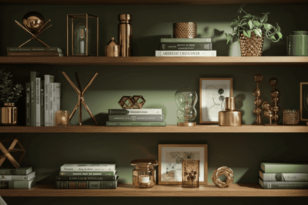
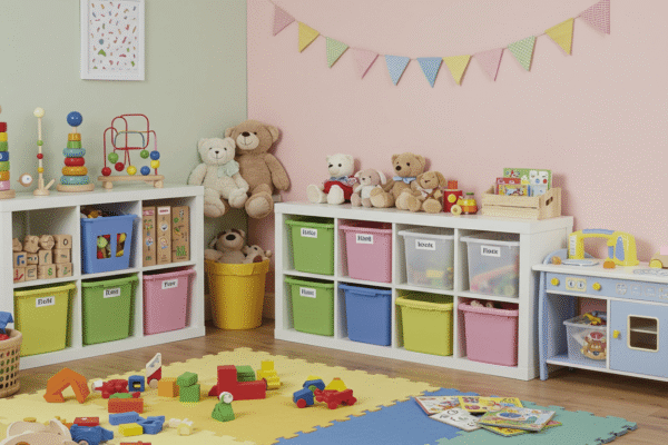
One of the most common decorating mistakes to avoid is allowing clutter to take over your living spaces. While it might be tempting to fill every surface and corner with decorative items, over-accessorizing can quickly make a room feel overwhelming and chaotic rather than cozy and inviting. A cluttered environment distracts from the beauty of your home’s features and can create a stressful atmosphere.
By embracing the principle that less is often more, you can create spaces that feel open, balanced, and thoughtfully curated. This section explores why clutter diminishes style and offers actionable strategies to maintain a clean, stylish home.
The Over-Decorating Trap
When you add too many accessories, pillows, artworks, or knickknacks, each item competes for attention. This visual overload makes it difficult for the eye to rest, resulting in a busy, cluttered look that undermines the overall design. Instead of enhancing your space, excess decor can obscure it.
To avoid this trap, focus on choosing a clear focal point in each room—a piece of furniture, a statement artwork, or a textured rug—that anchors the space. Once you have your focal point, select a few complementary accessories that support it rather than compete with it. This intentional restraint creates harmony and allows your decor to shine.
Messy Surfaces, Messy Vibe
Surfaces like coffee tables, nightstands, and countertops are prime spots where clutter tends to accumulate unnoticed. Piles of mail, random gadgets, decorative items without purpose, and everyday essentials can quickly build up, giving the impression of disorganization.
A simple way to tackle this is to regularly clear these surfaces and keep only a few meaningful or functional items on display. To help visualize the difference, you can create a checklist comparing a styled surface versus a cluttered one. For example:
| Styled Surface | Cluttered Surface |
|---|---|
| One decorative tray or bowl | Multiple scattered items |
| A small stack of books or magazines | Random piles of paper and gadgets |
| A single plant or candle | Excessive decorative objects |
By using this checklist, you can train yourself to maintain tidy surfaces that add to the room’s style rather than detract from it.
Hidden Clutter Offenders
Clutter is not always about physical items lying around. Sometimes, the combination of too many patterns, mismatched colors, or conflicting decor themes can create visual clutter that makes a space feel unsettled.
To quickly audit your space for these hidden offenders, spend five minutes stepping back and scanning each room. Ask yourself if the colors feel cohesive, if the patterns harmonize, and whether the overall style feels unified or disjointed. This quick review helps you identify areas that need editing, whether by removing or replacing items that disrupt the flow.
Color Chaos — Mistakes That Make Rooms Feel Disjointed
Color plays a powerful role in shaping the mood and flow of your home. However, one of the common decorating mistakes to avoid is creating a space with too many competing colors, which can disrupt harmony and make rooms feel disconnected. When colors clash or aren’t thoughtfully balanced, the result is often visual chaos that overwhelms rather than invites.
Understanding how to work with color effectively is key to creating a cohesive and inviting environment. This section breaks down common pitfalls and provides practical solutions to help you master your color choices.
Using Too Many Competing Colors
A room filled with a jumble of bright, contrasting colors can easily create what designers call the “rainbow room” effect. While a colorful space can be lively and fun, too many bold hues competing for attention cause visual confusion and fatigue. This can make even a well-designed room feel cluttered and disjointed.
To avoid this, limit your palette to a few main colors that complement each other. Choose one or two accent colors to add interest without overwhelming the senses. This restraint allows your color scheme to support the room’s purpose and style rather than detract from it.
Ignoring Undertones and Natural Light
Another frequent mistake is selecting paint colors or decor items without considering undertones and the natural light available in the room. For example, a wall color with cool undertones might look fresh in a north-facing room but cold in a south-facing space flooded with warm sunlight.
Similarly, dark colors can make a small or poorly lit room feel cramped, while overly bright shades may cause glare and discomfort.
Quick Fix: Use swatches and lighting tests
Before committing to a color, test paint swatches on different walls at various times of day. Observe how the color changes in natural and artificial light to ensure it creates the desired effect. This simple step helps avoid costly mistakes and disappointing results.
The Power of a Cohesive Palette
Building a cohesive color palette is a foundational decorating principle that brings harmony to your space. A well-planned palette balances colors so they work together smoothly, enhancing the overall atmosphere.
Here’s a basic guide to understanding key elements of color harmony:
| Palette Element | Description | Example |
|---|---|---|
| Complementary Colors | Colors opposite each other on the wheel, creating vibrant contrast | Blue and orange |
| Neutral Pairings | Shades like beige, gray, and white that balance and ground brighter colors | Beige sofa with navy cushions |
| 60-30-10 Rule | A guideline for color distribution: 60% dominant color, 30% secondary color, 10% accent color | Walls 60%, furniture 30%, accessories 10% |
Applying the 60-30-10 rule visually helps maintain balance by ensuring no one color overwhelms the room. This formula guides you in layering colors effectively to create spaces that feel intentional and pleasing.
Poor Furniture Placement Is Cramping Your Style
How you arrange your furniture has a huge impact on how your home feels and functions. One of the common decorating mistakes to avoid is poor furniture placement that either makes a room feel cramped or oddly empty. When furniture isn’t thoughtfully positioned, it can disrupt flow, waste space, and create an uninviting atmosphere.
This section dives into the biggest layout errors homeowners make and offers practical tips to help you arrange furniture in a way that enhances both style and comfort.
The “Wall Hugger” Mistake
A classic mistake is pushing all your furniture against the walls in an attempt to open up floor space. While it might seem logical, this approach often makes a room feel cold and disconnected. Furniture placed only along the perimeter can create large, empty central areas that lack coziness and prevent natural conversation zones.
Instead, try pulling pieces slightly away from the walls to create more intimate seating arrangements. This helps anchor the space and encourages a natural flow between furniture and traffic paths.
Ignoring Flow and Function
Poor layouts frequently block natural movement through a room, making everyday living frustrating. For example, a sofa blocking a doorway or a coffee table placed too close to seating can make a space feel cramped and uncomfortable.
To visualize this, here’s a simple floor plan comparison:
| Good Flow | Bad Flow |
|---|---|
| Clear pathways around furniture | Furniture blocking walkways |
| Seating arranged for conversation | Isolated seating with no flow |
| Open space balanced with furniture | Cluttered, overcrowded space |
Clear traffic paths and purposeful furniture groupings create a welcoming environment that works for daily life.
Not Considering Scale
Furniture that is either too large or too small for the room can throw off a room’s balance and feel awkward. Oversized pieces overwhelm smaller spaces, making them feel cramped and claustrophobic. Conversely, undersized furniture can make a room feel empty and lacking warmth.
Here’s a simple proportion guide to keep your furniture choices balanced:
| Furniture Pairing | Ideal Ratio or Size Relationship |
|---|---|
| Coffee table to sofa | Coffee table should be roughly two-thirds the length of the sofa |
| Rug to room size | Rug should cover at least 60–80% of the seating area floor space |
| Armchair to sofa | Armchair height should be similar or complementary to sofa height |
Using these guidelines ensures your furniture feels cohesive and the space feels comfortable.
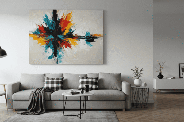
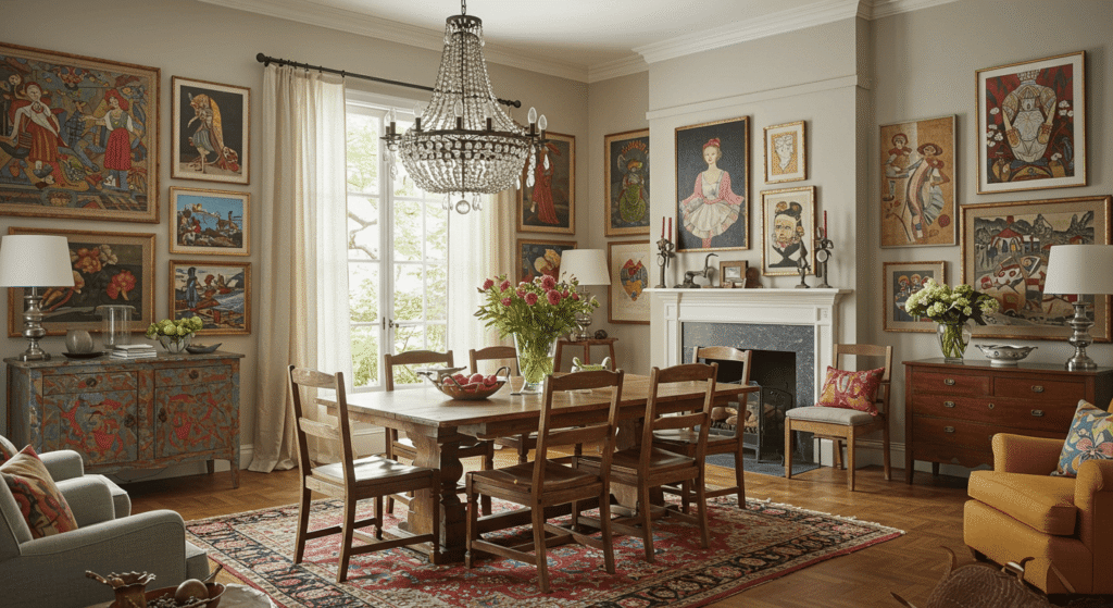
Art That’s Either Too High, Too Low, or Just Too Much
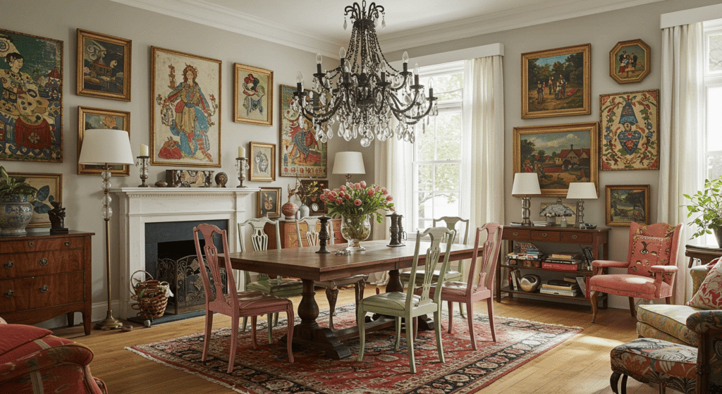
Art can dramatically enhance your home’s style, but common decorating mistakes to avoid include hanging pieces at incorrect heights or creating overwhelming gallery walls. When art is positioned poorly, it disrupts the visual balance of a room and can leave your carefully decorated space feeling off.
This section will help you master the art of hanging art—literally—so your walls become a harmonious part of your decor.
Hanging Art at the Wrong Height
The golden rule for hanging artwork is to place the center of the piece at eye level, typically around 57 to 60 inches from the floor. This height aligns with natural sightlines and makes the art feel connected to the room and its occupants. When art is hung too high above furniture or too low on the wall, it creates awkward empty spaces and a disjointed look. For example, a large painting floating far above a sofa loses impact and disrupts the room’s flow.
Gallery Walls Gone Wild
Gallery walls offer a great way to showcase multiple pieces of art or photos, but they can easily turn into visual noise if not thoughtfully arranged. Too many frames, inconsistent spacing, or a mishmash of styles can overwhelm the eye and make the wall feel chaotic instead of curated.
Fix This: Use consistent spacing, frames, and themes
To tame a gallery wall, maintain uniform spacing between frames—generally 2 to 3 inches—and stick to a cohesive frame style or color palette. Group artworks around a central theme or color story to create unity. By applying these simple yet effective rules, your gallery wall can become a stunning focal point rather than a distracting clutter.
Lighting Letdowns That Flatten the Mood
Proper lighting is essential to creating a warm, inviting atmosphere, yet one of the common decorating mistakes to avoid is relying too heavily on a single source of light. Poor lighting choices can make even the most beautiful rooms feel flat, cold, or overwhelming. Understanding how to layer light effectively is key to elevating your home’s ambiance.
Relying Only on Ceiling Lights
Many homes depend solely on ceiling fixtures for illumination, but this often results in harsh, uniform light that lacks dimension. Good lighting design combines three layers: ambient (general lighting), task (focused lighting for activities), and accent (highlighting features or decor).
Ambient light sets the overall mood, task lighting helps with specific functions like reading or cooking, and accent lighting adds depth by drawing attention to architectural details or artwork. Balancing these layers creates a dynamic, comfortable space.
Forgetting Dimmer Options
Harsh, unfiltered light can create visual tension and make a room feel sterile. Installing dimmers allows you to adjust light intensity according to time of day, mood, or activity, instantly transforming the atmosphere.
A simple way to plan your lighting is with a “Lighting Layer Cheat Sheet” that lists which fixtures serve each purpose:
| Lighting Layer | Purpose | Examples |
|---|---|---|
| Ambient | General illumination | Ceiling fixtures, recessed lights |
| Task | Focused, functional lighting | Desk lamps, under-cabinet lights |
| Accent | Highlighting and decoration | Spotlights, wall sconces |
This table can help readers design a lighting plan that feels balanced and adaptable.
Too Many Fixtures, Not Enough Warmth
Over-lighting a room with multiple bright sources can lead to overstimulation and a lack of coziness. Instead of layering warmth, too many fixtures competing for attention create a cluttered, cold effect.
Aim for a combination of soft, warm bulbs and well-placed fixtures to produce inviting pools of light. Remember, lighting isn’t just about visibility—it’s about setting a mood that makes your home feel lived-in and welcoming.
Ignoring the Power of Vertical Space
Maximizing vertical space is often overlooked, yet it’s a simple way to add both style and function to your home. One of the common decorating mistakes to avoid is leaving walls bare or using vertical elements improperly, which can make rooms feel unfinished or cramped. This section explores how to unlock the potential of your walls and windows to enhance your space without cluttering it.
Bare Walls = Missed Opportunity
Bare walls are often seen as a blank canvas, but when left empty, they can make a room feel cold and incomplete. Instead of filling every inch with decor, focus on functional vertical storage solutions that keep the space open and organized.
Think floating shelves, narrow wall-mounted cabinets, or vertical bookcases that draw the eye upward and free up floor space. Combining aesthetics with practicality ensures your walls contribute to the room’s style while solving storage challenges.
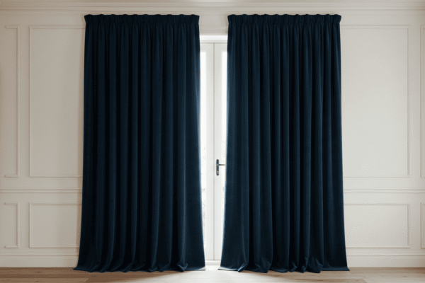
Hanging Curtains Too Low
The way you hang curtains dramatically influences how tall and spacious a room feels. One of the biggest mistakes is positioning curtain rods too close to the window frame or just above it. This visually cuts off the wall and makes ceilings appear lower than they are.
By installing curtain rods several inches above the window frame—closer to the ceiling—you create the illusion of greater height and openness. Curtains that extend all the way to the floor also add to this effect, enhancing the room’s elegance and airiness.
A visual diagram contrasting low vs. high curtain rod placement can clearly demonstrate this simple yet powerful trick for readers.
Styling Without Function — Pretty But Impractical
Creating a beautiful home is rewarding, but one of the common decorating mistakes to avoid is prioritizing style over everyday function. When decor choices don’t align with your lifestyle, they can quickly turn your space from inviting to inconvenient, leading to frustration and clutter.
This section helps you strike the perfect balance between aesthetics and usability so your home looks great—and works for you.
Style That Doesn’t Fit Your Life
It’s easy to fall for stunning furniture and decor pieces that don’t suit your daily needs. For example, choosing delicate surfaces or impractical storage can lead to constant upkeep or discomfort. When selecting storage solutions, seating, or surfaces, consider your household’s routines and habits first.
Opt for durable materials and versatile pieces that support how you live, whether that means extra storage for kids’ toys or stain-resistant fabrics for pets. Form should always complement function.
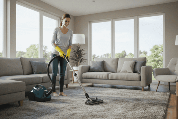
Open Shelving Overload
Open shelving has a trendy, airy look but can quickly become a magnet for dust and clutter. Without thoughtful styling and regular maintenance, open shelves become catch-alls for miscellaneous items, creating visual chaos rather than organized charm.
Before committing to open shelving, evaluate whether you have the time and discipline to keep it tidy. Closed storage might be a better fit if you prefer a low-maintenance, clutter-free environment.
When Decor Becomes a Daily Hassle
Some decor choices look fantastic but can be impractical in real life. For example, glass coffee tables may seem sleek and modern but can become a hazard or constant cleaning challenge, especially in homes with toddlers or pets.
Practical or Painful? Decision-Making Table
| Situation | Practical Choice | Painful Choice |
|---|---|---|
| Family with young children | Durable, rounded-edge tables | Glass or sharp-cornered furniture |
| Need for storage | Closed cabinets or drawers | Open shelving with many items |
| Frequent entertaining | Easy-to-clean surfaces | Delicate fabrics and materials |
Using this table helps you evaluate decor options through the lens of your lifestyle, ensuring your home is both beautiful and functional.
Following Trends Blindly
One of the common decorating mistakes to avoid is chasing every new trend without considering how it fits your personal style or your home’s unique character. Trends can be inspiring, but blindly copying them often leads to a space that feels dated quickly or disconnected from your lifestyle.
This section explores why trend obsession can backfire and how to embrace trends thoughtfully for a timeless, personalized home.
Trends That Date Fast
Some popular decorating styles shine briefly but soon feel outdated. Examples include overly themed rooms, extreme color palettes, or specific materials that fall out of favor quickly. Jumping on every trend can leave your space looking like a time capsule rather than a cozy home.
By recognizing which trends have staying power and which fade fast, you can avoid costly redecorating cycles and keep your home fresh longer.
Copying Pinterest Without Context
Pinterest is a fantastic source of inspiration, but many decorating mistakes come from trying to replicate photos without adapting them to your space. What works beautifully in a professional photo shoot might not fit your room’s size, lighting, or lifestyle needs.
Instead of copying designs exactly, use Pinterest ideas as a starting point. Consider how you can modify colors, furniture scale, or layout to suit your unique home.
How to Make Trends Your Own
The key to successful decorating is blending trends with your personal aesthetic. Incorporate trendy elements in small doses—like accent pillows, artwork, or lighting—rather than overhauling your entire space. This approach keeps your home feeling current without losing individuality.
Focus on timeless foundations—neutral walls, classic furniture shapes—and layer in trendy details that reflect your personality. This balance ensures your home feels inviting and authentic, not like a showroom or magazine set.
Avoid These Common Decorating Mistakes to Transform Your Home
Avoiding common decorating mistakes to avoid is the key to creating a space that feels both stylish and comfortable. By paying attention to clutter, color choices, furniture placement, lighting, and personalizing trends, you can transform your home into a welcoming sanctuary. Remember, thoughtful decorating isn’t about perfection—it’s about making your space work beautifully for your lifestyle. With these insights, you’re well on your way to designing a home that looks great and truly feels like yours.