


Colour combination in your home decor is more than just a matter of style—it’s the secret to creating a space that feels balanced, inviting, and uniquely yours. The right colour palette can make a small room feel spacious, turn a plain corner into a focal point, and even influence your mood. By understanding how colour harmony, accent colours, and interior colour schemes work together, you can transform any room into a reflection of your personality while maintaining a cohesive design flow throughout your home.
1. Why Colour Combination Matters in Home Decor
Understanding the importance of colour combination in your home decor is essential to creating spaces that feel both comfortable and visually appealing. The right mix of colours influences not only how your home looks but also how it makes you feel. When chosen thoughtfully, a well-planned colour palette can bring harmony, energy, and personality to any room. Let’s explore why colour matters so much and how it affects your space and mood.
The Psychology Behind Colours and Mood
Colours have a powerful psychological impact that can shape your emotions and behavior. For instance, cool tones like blues and greens tend to evoke calmness and relaxation, making them ideal for bedrooms and bathrooms. On the other hand, warm colours such as yellows and oranges can stimulate energy and creativity, which is why they often work well in kitchens or living areas. Understanding this colour psychology allows you to choose combinations that create the desired atmosphere in each room, helping you design a home that supports your lifestyle and wellbeing.
How Colour Affects Perception of Space and Light
The way colours interact with light and space plays a crucial role in how a room feels. Light colours like whites and pastels can make a small room appear larger and more open, while darker shades can add depth and coziness to a large space. Additionally, the amount and type of natural or artificial light will influence how a colour appears on walls, furniture, and décor. By mastering these nuances of interior colour schemes, you can enhance the size and mood of any room through thoughtful colour combination.
The Role of Harmony and Contrast in Design
Achieving the right balance between harmony and contrast is key to a successful colour scheme. Harmony involves using colours that complement each other smoothly, creating a cohesive and peaceful environment. Contrast, meanwhile, adds interest and drama by combining colours with striking differences, such as pairing dark and light tones or complementary colours. Using both harmony and contrast in your home decor colour ideas ensures your space feels dynamic yet balanced, avoiding monotony or overwhelming chaos.
| Colour Mood | Feeling It Evokes | Best Rooms to Use It |
|---|---|---|
| Blue | Calm and Serene | Bedroom, Bathroom |
| Yellow | Energetic and Cheerful | Kitchen, Living Room |
| Grey | Neutral and Balanced | Office, Living Room |
2. Understanding the Colour Wheel: Your Secret Tool
The colour wheel is one of the most powerful tools when it comes to mastering colour combination in your home decor. By understanding the relationships between colours, you can confidently create harmonious palettes that enhance your space. The wheel breaks down colours into categories and schemes that simplify the sometimes overwhelming task of choosing the right combinations.
Primary, Secondary, and Tertiary Colours Explained
The colour wheel consists of three main groups of colours: primary, secondary, and tertiary. Primary colours — red, blue, and yellow — are the building blocks and cannot be created by mixing other colours. Secondary colours are made by mixing two primary colours, resulting in green, orange, and purple. Tertiary colours are created by combining a primary with a neighbouring secondary colour, giving you hues like yellow-green or red-violet. Knowing these groups helps you understand the foundation of any colour palette and guides your choices when decorating.
Complementary, Analogous, and Triadic Colour Schemes
Using the colour wheel, you can identify different colour schemes that work well in home decor:
- Complementary colours are opposite each other on the wheel and create bold, high-contrast looks that add energy and vibrancy.
- Analogous colours sit next to each other, offering a harmonious and soothing palette ideal for cohesive, relaxed spaces.
- Triadic colour schemes involve three colours evenly spaced around the wheel, resulting in balanced yet colorful combinations perfect for dynamic and lively rooms.
These schemes give you a framework to mix and match colours effectively without guesswork.
How to Use the Colour Wheel to Pick Perfect Combinations
To use the colour wheel for your home, start by choosing a base colour from one section of the wheel. Then, depending on the mood and style you want, select complementary, analogous, or triadic colours to build your palette. For instance, if you want a calm and cohesive look, analogous colours work best. If you want a vibrant and energetic space, complementary colours are your go-to. Experimenting with these schemes ensures that your interior colour schemes are both beautiful and balanced.
| Colour Scheme Type | Description | Example Combination |
|---|---|---|
| Complementary | Opposite colours on the wheel | Blue & Orange |
| Analogous | Neighbouring colours | Green, Yellow-Green, Yellow |
| Triadic | Three colours evenly spaced | Red, Yellow, Blue |
3. Choosing Your Base Colour: The Foundation of Your Palette
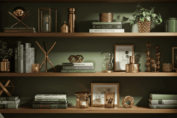
Selecting a strong base colour is a crucial step in creating an effective colour combination in your home decor. This foundation sets the tone for the entire space and influences how all other colours interact. Whether you prefer subtle neutrals or daring bolds, the base colour anchors your design and guides your choices for accents and textures.
Neutral Colours as a Versatile Base
Neutral colours like beige, grey, taupe, and soft whites provide a flexible and timeless base. These shades create a calming backdrop that allows accent colours to shine without overwhelming the space. Neutrals work well in almost any room and can easily adapt as your tastes evolve. Using a neutral base also helps balance bolder elements and creates a harmonious flow between rooms in an open-plan layout.
When to Pick Bold or Pastel Bases
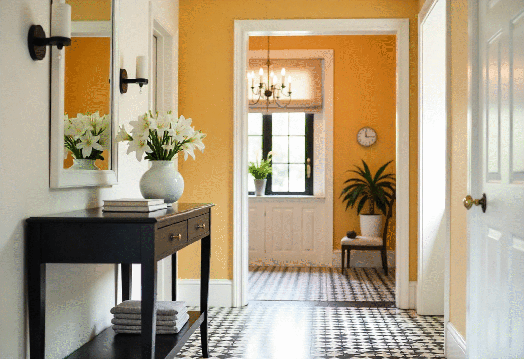
Bold base colours such as deep blues, rich greens, or warm terracotta make a strong statement and add personality to your space. These choices work well in rooms where you want to create drama or highlight architectural features. On the other hand, pastel bases — soft pinks, light blues, mint greens — bring a gentle, airy feel perfect for bedrooms or cozy living areas. Choosing between bold or pastel bases depends on your style, the room’s function, and the mood you want to create.
Using Textiles and Furniture to Reinforce Base Colours
Your colour palette for home decor isn’t limited to wall paint. Incorporating your base colour through textiles like curtains, rugs, and cushions or through furniture pieces can strengthen the overall design. For example, a soft grey wall complemented by a charcoal sofa and matching throw pillows creates depth and unity. This layered approach helps tie different elements together, making your colour scheme feel intentional and polished.
4. Accent Colours: How to Add Personality Without Overwhelming
Adding accent colours is a powerful way to inject personality and vibrancy into your home without overpowering the entire space. When done right, accents bring energy and focus to your colour combination in your home decor, making rooms feel lively and well-curated. The key is knowing how to select and balance these accent tones effectively.
Picking Accent Colours That Pop
Accent colours should contrast or complement your base colour to create visual interest. Choosing bold or unexpected hues as accents can elevate a neutral palette, while softer accents can warm up a bold base. It’s important to select colours that resonate with your style but also harmonize with your existing interior colour schemes to avoid clashing or a disjointed look.
Using Accessories to Test Accent Colours
Accessories are an easy and low-risk way to experiment with accent colours before committing to larger design changes. Items like cushions, lamps, rugs, and artwork allow you to try different shades and observe how they interact with your base colours throughout the day and under various lighting conditions. This approach helps you fine-tune your colour palette for home decor without permanent changes.
How Much Accent Colour Is Just Right?
Balance is key when adding accent colours. A good rule of thumb is the 60-30-10 rule: 60% base colour, 30% secondary colour, and 10% accent colour. This ratio ensures your accents provide enough contrast and flair without overwhelming the room. Distributing accent colours thoughtfully across textiles, decor pieces, and small furniture creates a cohesive, dynamic space.
| Accent Colour | Pairing Base Colours | Recommended Usage |
|---|---|---|
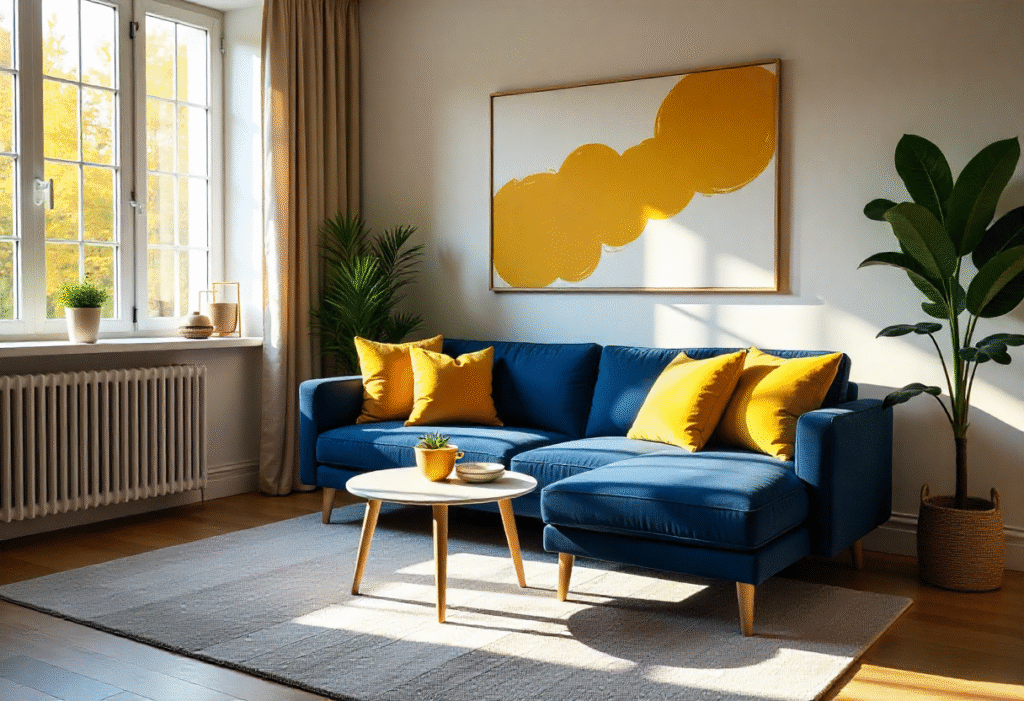
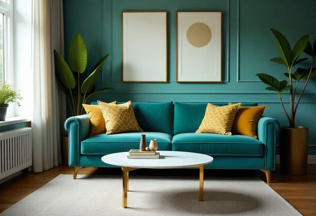
| Mustard Yellow | Grey, Navy Blue | Cushions, Lamps |
| Teal | Beige, Cream | Rugs, Throws |
| Coral | White, Light Grey | Artwork, Vases |
5. Warm vs Cool Colour Schemes: Which One Suits Your Space?
Choosing between warm and cool colour schemes is a fundamental decision when planning your colour combination in your home decor. Each type creates a distinct atmosphere and affects how a space feels. Understanding these differences will help you select the best scheme to match your room’s function, lighting, and your personal style.
Defining Warm and Cool Colours
Warm colours include shades like reds, oranges, yellows, and warm browns. These colours are often associated with energy, coziness, and vibrancy. They tend to advance visually, making spaces feel more intimate. In contrast, cool colours such as blues, greens, purples, and cool greys evoke calmness, serenity, and spaciousness. Cool colours tend to recede, which can make rooms appear larger and airier.
Effects of Warm Colours on Room Atmosphere
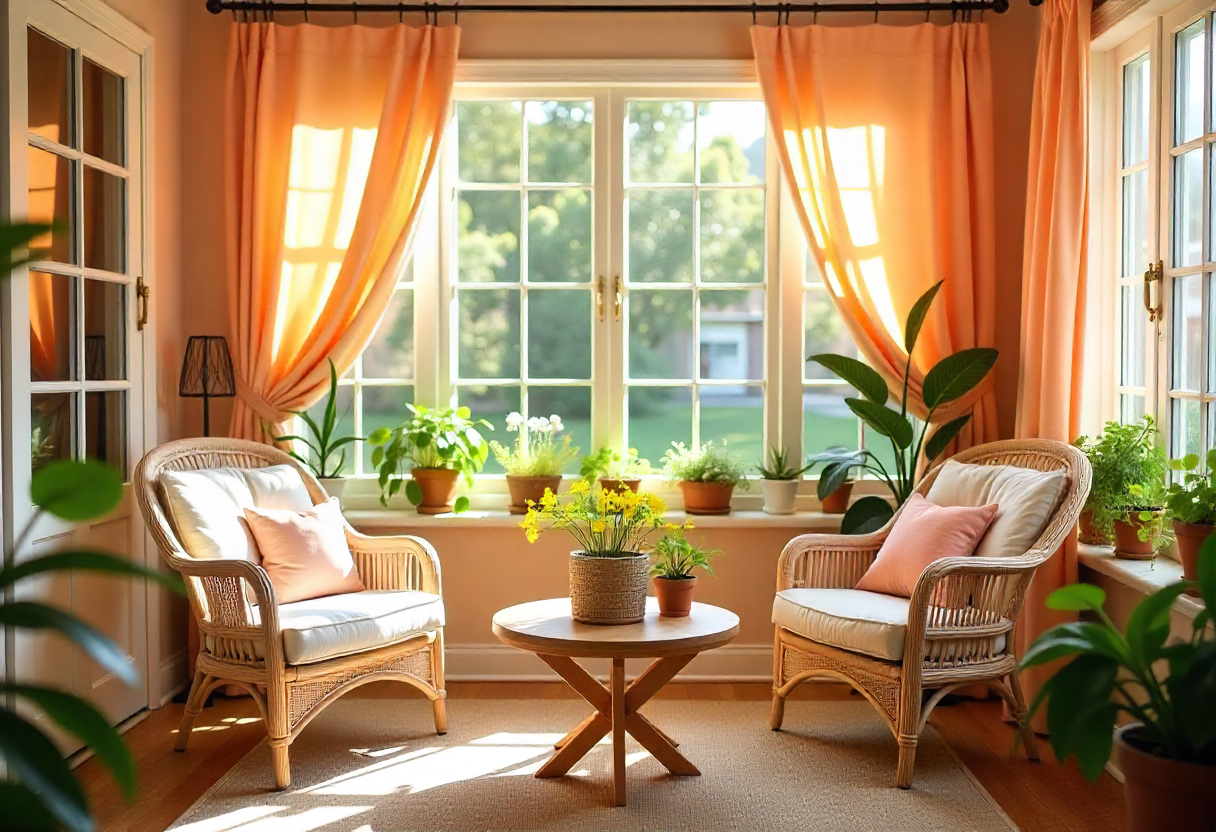
Using warm colours in your home decor colour ideas can create inviting, comfortable spaces that encourage socializing and activity. They are perfect for living rooms, dining areas, or kitchens where warmth and energy are welcome. Warm tones also work well to balance rooms with little natural light, helping to create a cheerful ambiance even on gloomy days.
When to Use Cool Colours for Calm and Space
Cool colours are ideal when your goal is to design a relaxing, tranquil environment. Bedrooms, bathrooms, and home offices benefit from these calming hues that reduce stress and promote focus. Because cool colours visually expand a room, they are also a great choice for small or cramped spaces where creating an illusion of openness is important. Using colour harmony by pairing cool tones with neutral bases can further enhance the peaceful vibe.
6. Colour Combination for Different Rooms: Practical Tips
Each room in your home has a unique purpose, and your colour combination in your home decor should reflect that. Choosing the right colours can enhance the functionality and mood of each space, making your home not only beautiful but also comfortable and practical.
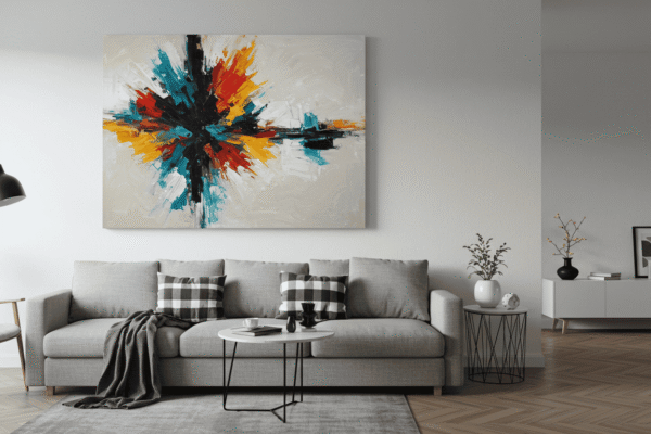
Living Room Colour Ideas to Encourage Relaxation & Socializing
The living room is often the heart of the home, where family and friends gather. Using warm neutrals as your base colour creates a cozy and inviting atmosphere. Adding deep blues or burnt orange as accent colours can stimulate conversation and create focal points without overwhelming the senses. Matte finishes on walls help create a soft, welcoming feel, while glossy accents add just the right amount of contrast and interest.
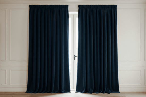
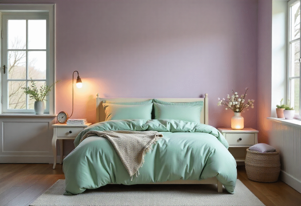
Bedroom Palettes That Promote Restful Sleep
For bedrooms, calming colours are key to promoting relaxation and restful sleep. Soft blues and lavender tones work beautifully as base colours, providing a peaceful backdrop. Accents in blush pink or soft grey add gentle warmth and sophistication without disrupting the tranquil vibe. Matte finishes are ideal here because they reduce light reflection, contributing to a cozy and soothing environment.
Kitchen and Dining Room Colour Combos That Stimulate Appetite and Energy
Kitchens and dining rooms benefit from bright, energetic colour combinations. Clean whites or light greys as base colours provide a fresh and open feel. Bold accent colours like red, yellow, or teal can stimulate appetite and add cheerfulness. Since these rooms are high-traffic and require frequent cleaning, semi-gloss or glossy finishes are practical choices for walls and cabinetry, making maintenance easier while enhancing colour vibrancy.
| Room | Ideal Base Colour | Suggested Accent Colours | Best Finish (Matte, Glossy, etc.) |
|---|---|---|---|
| Living Room | Warm neutrals | Deep blues, burnt orange | Matte for walls, Glossy for accents |
| Bedroom | Soft blues, lavender | Blush pink, soft grey | Matte for walls |
| Kitchen | White or light grey | Red, yellow, teal | Semi-gloss or Glossy for easy cleaning |
7. Common Mistakes to Avoid When Combining Colours
Creating the perfect colour combination in your home decor requires attention to detail and careful planning. Many homeowners unknowingly make mistakes that can disrupt the harmony of a room or cause frustration. Avoiding these common pitfalls will help you design a space that feels balanced, inviting, and visually appealing.
Overusing Bold Colours Without Balance
One of the most frequent errors is overloading a room with bold colours without balancing them with neutrals or softer tones. While bold colours can add personality and excitement, using too much of them can overwhelm the space and create visual chaos. Following the 60-30-10 rule—where bold or accent colours make up only 10% of the overall palette—helps maintain balance and ensures your home decor colour ideas feel intentional and pleasing to the eye.
Ignoring Lighting’s Impact on Colour Perception
Lighting dramatically affects how colours appear in your home. A shade that looks perfect under natural daylight may seem dull or harsh under artificial lighting. Many make the mistake of choosing colours without testing them at different times of day or with different light sources. Always observe your chosen colours in the actual room lighting before finalizing your palette. This will ensure your interior colour schemes look their best throughout the day and night.
Forgetting About Texture and Materials
Colour alone doesn’t define a room’s atmosphere. Texture and materials play a significant role in how colours are perceived and experienced. Glossy surfaces reflect light differently than matte finishes, and fabrics like velvet or linen can deepen or soften a colour’s appearance. Overlooking these elements can result in a mismatch that diminishes the overall effect of your colour palette for home decor. Consider how textures interact with your chosen colours for a richer, more layered design.
8. How to Experiment and Refresh Your Colour Combination Over Time
Keeping your colour combination in your home decor fresh and exciting doesn’t mean a complete overhaul every few years. With thoughtful experimentation and simple updates, you can continuously evolve your space to reflect changing seasons, moods, and trends.
Using Small Accessories to Test New Colours
Small accessories are a fantastic way to introduce new colours without commitment. Items like cushions, vases, lampshades, or artwork allow you to test how a new accent colour interacts with your existing colour palette for home decor. This method offers flexibility to change up your style frequently and helps you avoid costly mistakes before making bigger design choices.
Seasonal Colour Changes Without Major Renovation
One of the easiest ways to keep your home feeling current is to adjust your colour accents seasonally. Swapping out soft pastels and light greens in spring for bright yellows and blues in summer can revitalize your living space. In autumn, warm oranges and reds bring cozy vibes, while winter calls for deeper blues and greys paired with metallic accents. These changes require minimal effort but make a significant visual impact.
Tracking Your Favourite Combinations with a Colour Palette Table
Keeping track of your favourite interior colour schemes and combinations can simplify future decorating projects. Creating a personal colour palette table helps you remember which colours work well together and how they affect your space. This record becomes a valuable reference when refreshing your decor or selecting new accessories.
| Season | Colour Focus | Easy Refresh Ideas |
|---|---|---|
| Spring | Pastels, light greens | Swap cushion covers, add flowers |
| Summer | Bright yellows, blues | Add rugs, repaint small accents |
| Autumn | Warm oranges, reds | Use throws, candles |
| Winter | Deep blues, greys | Change curtains, add metallic accents |
Mastering Colour Combination in Your Home Decor for Lasting Style
Mastering colour combination in your home decor is key to creating spaces that feel both beautiful and personal. By understanding how colours influence mood, space, and harmony, and by experimenting thoughtfully with bases, accents, and seasonal updates, you can design a home that evolves with you. Remember, the perfect colour palette for home decor balances creativity with balance, making your home a true reflection of your style and comfort.