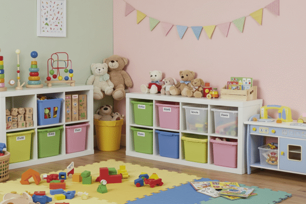
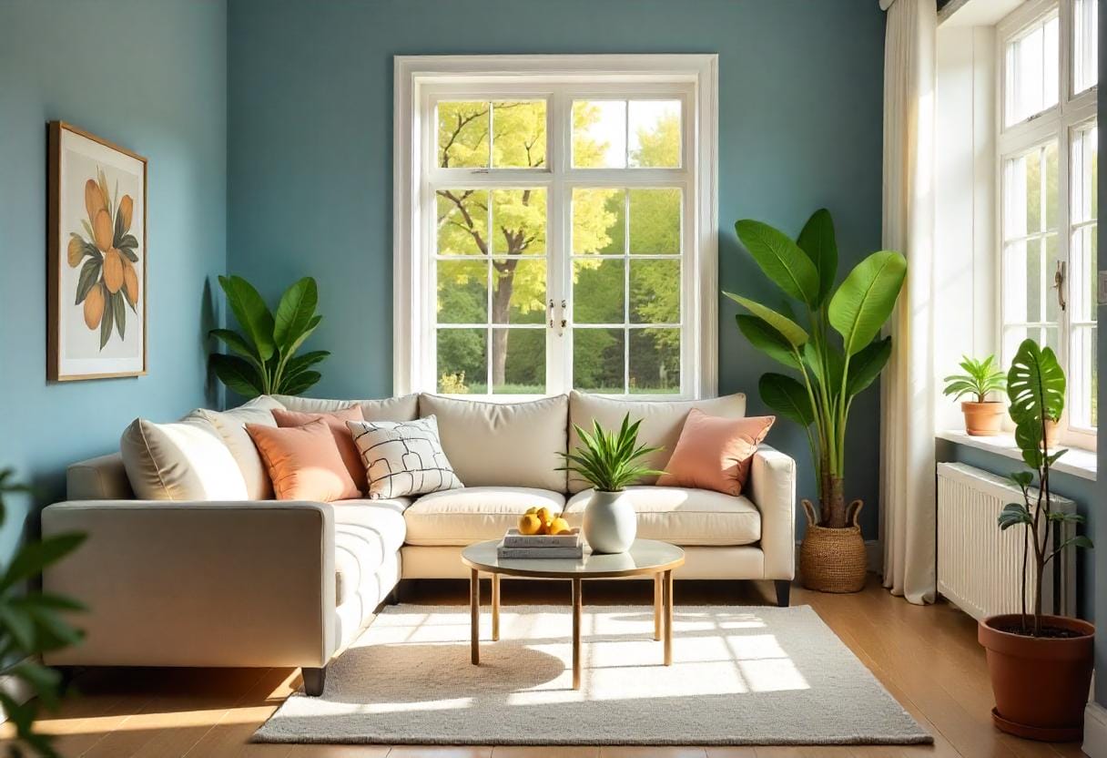
Color psychology chart plays a powerful role in shaping the atmosphere of your home. Understanding how different colors influence mood and energy can help you create spaces that feel welcoming, calming, or energizing—whatever vibe you want. By combining the science of color psychology in interior design with your personal style, you can transform ordinary rooms into areas that truly support your lifestyle. In this post, we’ll explore how to use a color psychology chart effectively to make every corner of your home reflect the mood you desire.
Why Color Psychology Matters in Home Design
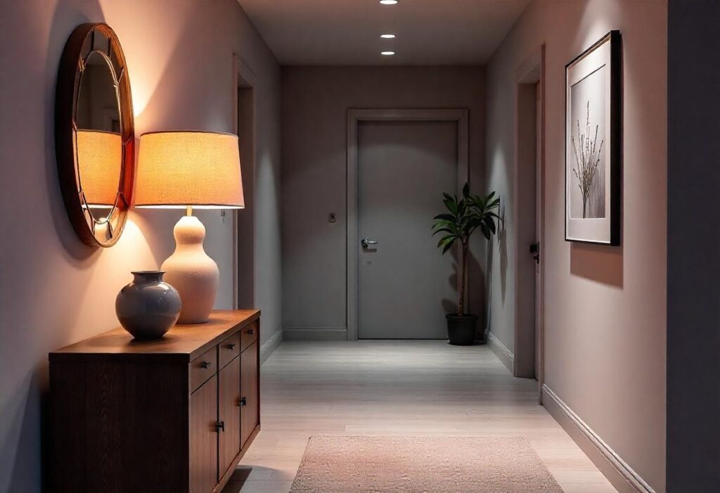
Choosing the right colors for your home goes far beyond aesthetics. A well-understood color psychology chart can significantly influence the way you and your family feel in different spaces. Colors have the unique ability to affect our emotions, energy levels, and even productivity. When you intentionally select colors based on their psychological impact, you’re not just decorating—you’re creating an environment that supports your well-being and daily activities. This is why integrating color psychology in interior design is essential for designing homes that feel balanced and harmonious.
How Color Influences Our Mood and Energy
Colors can evoke a wide range of emotional responses. For example, warm tones like reds and oranges tend to increase energy and stimulate conversation, making them ideal for social spaces like living rooms or kitchens. On the other hand, cool colors such as blues and greens promote calmness and relaxation, which is why they are often chosen for bedrooms and bathrooms. Understanding how different colors impact mood allows you to tailor each room’s atmosphere to its purpose. A color psychology chart provides a practical guide to help you harness these effects effectively, ensuring your color choices support your desired energy levels throughout the day.
The Science Meets Style Connection
While color choices are often driven by personal taste or trends, the science behind color psychology adds a deeper layer of intention to home design. Research in psychology and neuroscience shows that colors can influence hormone levels, heart rate, and even mental clarity. By blending this scientific understanding with your unique style preferences, you create spaces that are not only visually appealing but also emotionally supportive. Using a color psychology chart bridges the gap between style and science, giving you a toolkit to design a home that feels just right for you.
Understanding the Color Psychology Chart
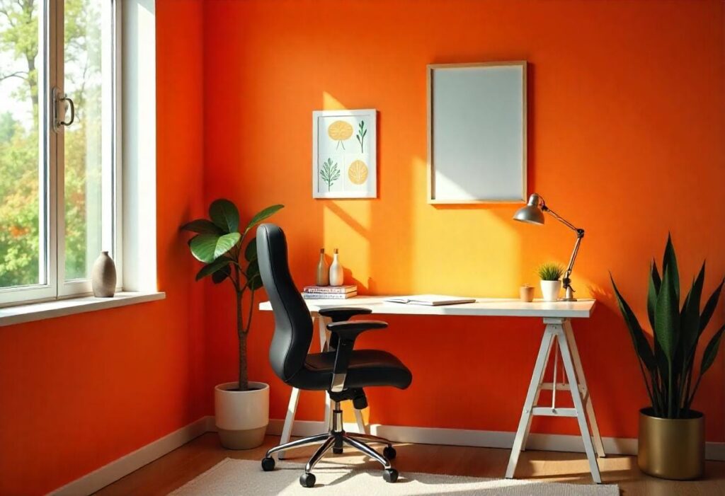
A color psychology chart is a visual tool that helps you understand how different colors influence emotions and behaviors. It serves as a guide for selecting colors in your home based on the moods you want to evoke. Rather than choosing colors at random or purely based on trends, this chart provides insights into the emotional impact each color carries, allowing you to design spaces that align with your desired atmosphere and lifestyle.
What Is a Color Psychology Chart?
At its core, a color psychology chart categorizes colors according to the feelings and psychological responses they typically provoke. It combines elements of color theory with psychological research to explain why certain hues make us feel calm, energized, cozy, or focused. This chart can be a valuable reference when planning your home decor, helping you create rooms that not only look beautiful but also support your emotional well-being.
The Basic Emotions Associated with Colors
Colors can be grouped into broad categories based on the common emotions they inspire. Understanding these groupings makes it easier to apply the chart in practical ways.
Warm Colors (Red, Orange, Yellow)
Warm colors tend to stimulate and energize. They are often associated with feelings of warmth, excitement, and passion. These colors work well in social areas where activity and interaction are encouraged, such as kitchens and living rooms.
Cool Colors (Blue, Green, Purple)
Cool colors have a calming effect, promoting relaxation and tranquility. They are ideal for spaces meant for rest or focus, like bedrooms and home offices.
Neutrals (White, Grey, Brown, Black)
Neutral colors offer balance and sophistication. They serve as excellent backgrounds or accents that can either soften or intensify other colors in a room, depending on how they are used.
📊 Here is a simple table summarizing these associations:
| Color | Emotion | Best Used In |
|---|---|---|
| Blue | Calm, Peaceful | Bedroom, Study |
| Yellow | Cheerful, Energetic | Kitchen, Dining Room |
| Gray | Neutral, Modern | Living Room, Office |
This table can help you quickly identify which colors to consider when designing different areas of your home based on the mood you want to create.
How to Choose the Right Colors for Each Room
Selecting the perfect colors for your home involves more than just personal preference—it requires matching the mood you want to create with the room’s primary function. Using a color psychology chart as a guide ensures that each space supports the activities and feelings you want to encourage, from relaxation to socializing or productivity.
Matching Mood to Functionality
Each room in your home serves a unique purpose, and the colors you choose should enhance that function. For example, a bedroom should promote rest and calm, while a kitchen benefits from colors that energize and stimulate appetite. By aligning your color choices with the intended use of the space, you create a harmonious environment that feels natural and comfortable.
Practical Room-by-Room Breakdown
Bedroom – Calm and Cozy
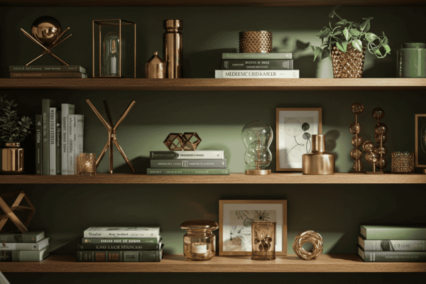
The bedroom is your sanctuary for rest and rejuvenation. Cool colors like soft blues, muted greens, and gentle neutrals help lower stress and create a peaceful atmosphere that supports restful sleep.
Living Room – Warm and Welcoming
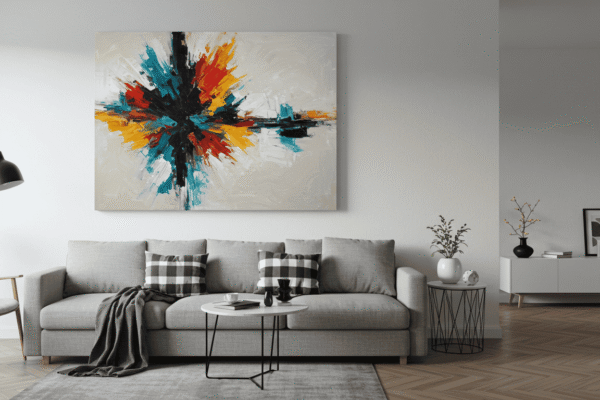
As a social hub, the living room benefits from warm tones like warm beige, soft oranges, or gentle reds that encourage conversation and a cozy ambiance, making guests and family members feel at home.
Kitchen – Bright and Stimulating
Kitchens thrive with vibrant, energizing colors such as sunny yellows or crisp whites. These shades can boost appetite and create a lively atmosphere, perfect for cooking and gathering.
Bathroom – Clean and Refreshing
For bathrooms, light and cool colors like whites, pale blues, and soft grays evoke cleanliness and tranquility, helping to create a spa-like, refreshing space.
🎨 Tip: Use soft blues or muted greens in the bedroom for a restful sleep environment.
This thoughtful approach ensures each room’s color palette enhances its function while contributing to the overall mood and flow of your home.
Warm vs Cool vs Neutral: Which Palette Should You Choose?
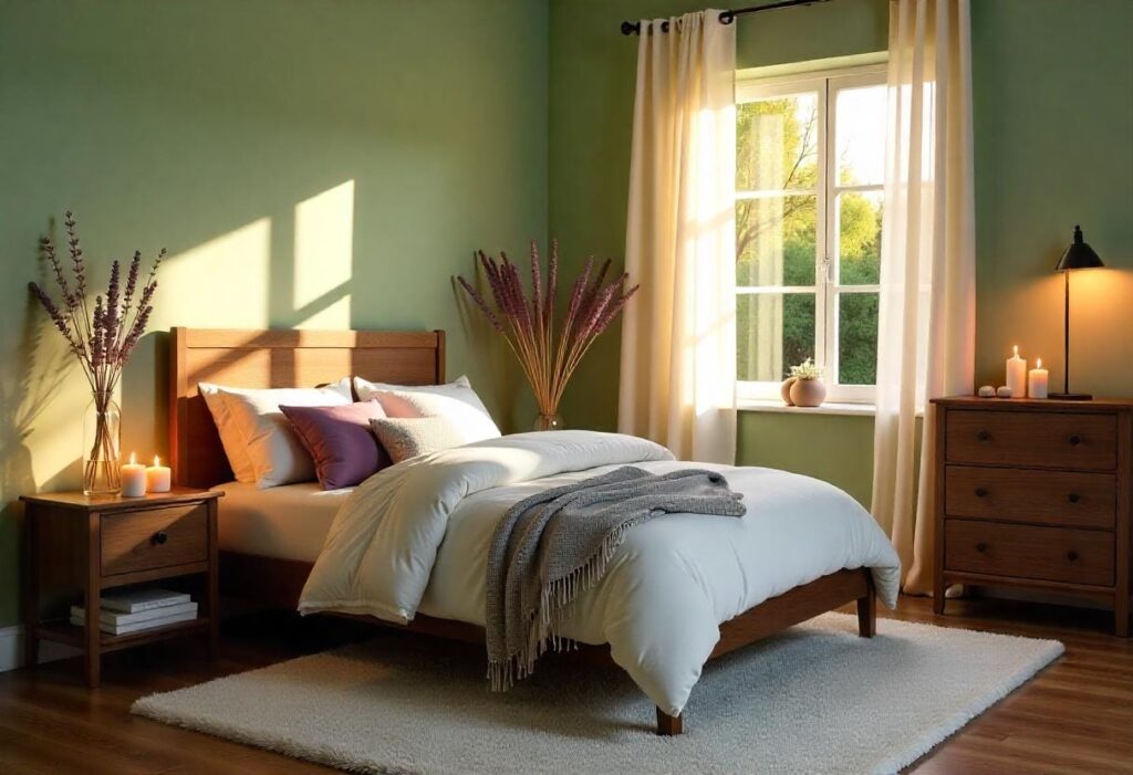
Choosing between warm, cool, or neutral color palettes is an important step in designing a home that feels cohesive and emotionally balanced. Each palette carries distinct emotional qualities that influence how a space feels and functions. Understanding these differences helps you create interiors that align with your mood goals and lifestyle.
The Emotional Spectrum of Color Palettes
Warm palettes—featuring reds, oranges, and yellows—are associated with energy, comfort, and warmth. They’re perfect for spaces meant to feel lively and inviting. Cool palettes, including blues, greens, and purples, evoke calmness, relaxation, and focus, making them ideal for bedrooms or workspaces. Neutral palettes, composed of whites, grays, browns, and blacks, offer stability and sophistication. Neutrals serve as the perfect backdrop or complement, allowing warm and cool colors to shine or providing a subtle, serene environment on their own.
Combining Tones for Balance
The most successful home color schemes often blend warm, cool, and neutral tones to create visual interest and emotional harmony. For example, pairing a warm accent wall with cool furniture and neutral flooring can balance energy and calmness in a living space. Similarly, using neutrals as a base allows you to switch out warm or cool accents seasonally or as your mood evolves without a full redesign.
Creating a Mood Board Using Color Psychology
A mood board is a powerful tool that helps you visualize and organize your color choices before committing to a full room design. By incorporating insights from a color psychology chart, you can ensure your palette not only looks good but also supports the mood and energy you want in each space.
What to Include in Your Mood Board
Your mood board should feature key elements such as color swatches inspired by your color psychology chart, textures, fabrics, and images of furniture or decor items that complement your chosen palette. Including notes about the emotions or functions associated with each color can help you stay focused on your design goals. Don’t forget to consider lighting—natural and artificial—as it dramatically affects how colors appear in a room.
Step-by-Step Mini Exercise for Readers
Start by selecting 3 to 5 colors from the color psychology chart that align with the mood you want to create. Next, gather samples of these colors using paint chips, fabric swatches, or digital palettes on your phone or computer. Arrange these samples together and experiment by adding neutral tones or contrasting accents to find a balance that feels right. Finally, add photos or sketches of furniture and decor that fit your vision, and note how each element contributes to the overall atmosphere.
📌 Interactive Tip: Grab a piece of paper or open a design app to start building your own color palette based on what you’ve learned. This hands-on approach helps solidify your choices and makes the design process more enjoyable and personalized.
Common Mistakes to Avoid When Applying Color Psychology
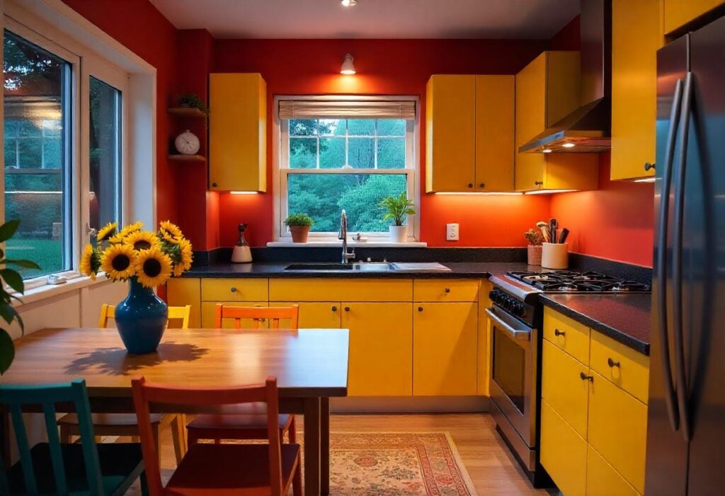
Applying color psychology effectively requires balance and awareness. While color can transform a space, certain common mistakes can undermine your efforts and leave rooms feeling off or uncomfortable. Knowing what to avoid helps you create a home that truly reflects the mood you want.
Overloading One Mood or Tone
Using too much of a single color or mood can overwhelm a room. For example, an entire room painted bright red may feel aggressive rather than energizing. Balance is key to maintaining comfort and interest.
Ignoring Lighting and Room Size
Colors look different depending on natural light, artificial lighting, and the size of the space. A dark color in a small room can make it feel cramped, while the same shade might add coziness in a larger room. Always test colors in the actual space before finalizing.
Following Trends Blindly Instead of Personal Vibe
Trendy colors may be popular, but if they don’t resonate with your personal style or the room’s purpose, the result can feel forced or temporary. Prioritize what makes you feel good over fleeting fashions.
🚫 Caution Checklist: Don’t Do This
| Mistake | Why to Avoid | What to Do Instead |
|---|---|---|
| Overload one color/mood | Creates imbalance and discomfort | Use complementary colors for balance |
| Ignore lighting and room size | Colors may appear dull or overpowering | Test samples under different lighting |
| Follow trends blindly | May not suit your personality or needs | Choose colors that align with your lifestyle |
Use this checklist as a guide to steer clear of these pitfalls and make confident, thoughtful color choices.
Color Combinations That Actually Work
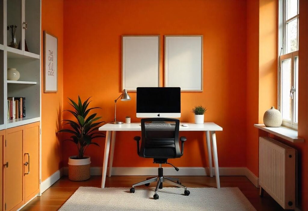
Choosing the right color combinations is essential to creating a space that feels cohesive and supports the mood you want. While some pairings are classic and predictable, others might surprise you by delivering just the right emotional impact when combined thoughtfully.
Harmonious Pairings Based on Mood
Harmonious color combinations rely on tones that naturally complement each other to create a unified, pleasing look. These pairings often come from similar areas of the color psychology chart, reinforcing a specific mood—whether it’s calm, energized, or grounded. Using these combinations can simplify your design process and ensure your rooms feel balanced and intentional.
Unexpected Combos That Still Feel Right
Sometimes, mixing colors that don’t traditionally go together can produce dynamic and exciting results. These unexpected combinations work when balanced well with neutrals or when one color serves as a bold accent. Experimenting with these palettes can add personality and freshness to your spaces without overwhelming the senses.
🎯 Here’s a quick-reference chart to guide your choices:
| Mood | Color Combo | Vibe |
|---|---|---|
| Energized | Yellow + White | Sunny & Inviting |
| Grounded | Earthy Green + Brown | Natural & Balanced |
| Sophisticated | Deep Blue + Gray | Cool & Modern |
Use this chart to find combinations that fit your mood goals and inspire your next home design project.
Final Thoughts – Designing for the Mood You Want
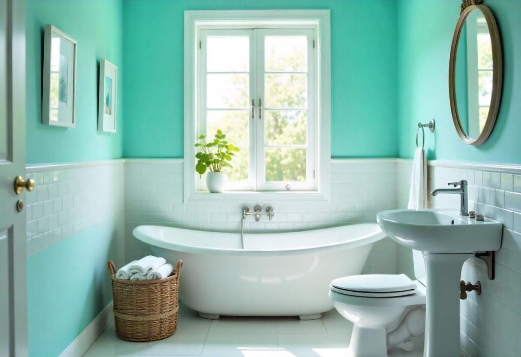
Designing your home with a color psychology chart in mind is about more than following rules—it’s about creating a space that feels right for you. While scientific insights provide a valuable guide, trusting your instincts and personal preferences is equally important. The best designs come from a balance of knowledge and intuition.
Trusting Your Gut, But Using Psychology as a Guide
Let the emotional impact of colors inform your decisions, but don’t feel confined by strict guidelines. Use the principles of color psychology in interior design to understand how colors might influence your mood, then adapt those ideas to fit your unique style and daily needs.
Experiment and Adjust Over Time
Your relationship with color can evolve, so be open to experimenting with new palettes or rearranging your space as your feelings change. Small adjustments like adding accent colors or switching decor elements can refresh your home’s atmosphere without a full overhaul.
💬 Closing Note: We’d love to hear from you! Share your favorite room color choices in the comments or keep a journal of how different colors make you feel in your own spaces. This personal reflection can deepen your connection to your home and guide future design decisions.
Using a Color Psychology Chart to Create Your Ideal Home Atmosphere
A color psychology chart is a powerful tool that helps you design your home with intention and emotional awareness. By understanding how colors affect mood and energy, you can choose palettes that enhance each room’s purpose and create a balanced, inviting environment. Remember, while the science behind color psychology offers valuable guidance, your personal preferences and feelings are just as important. Use the chart as a starting point, experiment confidently, and let your home become a true reflection of the mood you want to live in every day.

