


The ceiling, often called the fifth wall, is a powerful design canvas that can transform a room’s proportions, light, and mood with a surprisingly approachable dose of paint. In this guide to Ceiling Decor with paint, the aim is to demystify layout, teach crisp-line methods, and unlock practical design moves such as color blocking, stripes, and geometric frames that look polished without requiring a renovation budget. Whether the goal is to make a low ceiling feel higher, introduce a quiet accent, or anchor a bold, modern vibe, this walkthrough delivers the strategy and step-by-step techniques to accomplish it with confidence.
To make the experience enjoyable, this article uses digestible sections, clear subheadings, and helpful tables so information lands quickly without overwhelming walls of text. For deeper dives into related home tips, explore ameliastips.com, and for an authoritative overview on painting fundamentals, see Consumer Reports painting advice.
Introduction: Why Paint the Fifth Wall?
There is a reason designers return to Ceiling Decor again and again: a painted overhead surface changes the way a room is perceived, sometimes more dramatically than the walls themselves. A lighter plane can visually lift the height, a deeper tone can cocoon tall or echoey spaces, and a patterned approach such as stripes or geometric frames can add rhythm and focus where the eye needs guidance. Beyond aesthetics, paint is accessible, relatively affordable, and reversible, which makes it perfect for experimentation, rentals where allowed, and incremental updates.
Unlike permanent architectural changes, paint invites iterative play. Try a narrow border first, then graduate to broader color blocking or wider stripes once the layout techniques feel natural. The key is combining design intent with good tape and layout habits so the reveal looks seamless and professional. In the sections ahead, planning, setup, and execution are broken down deliberately so each step builds confidence and ensures the final result delivers both visual impact and everyday livability.
Planning the Look
Before the first strip of tape is pulled, planning determines whether a scheme feels serene and airy or bold and sculptural. With Ceiling Decor, the palette, pattern choice, and finish selection need to harmonize with ceiling height, room size, natural light, and existing trim. A thoughtful plan prevents mid-project second-guessing and ensures every mark serves a purpose. Think in three layers: the overall mood, the pattern type, and the practical finish. This framework simplifies decisions and aligns the ceiling’s role with the room’s function.
Palette Strategy: Contrast vs Harmony
A harmonious ceiling color stays within the room’s palette and often sits one or two values lighter or darker than the walls, creating a sophisticated, whisper-soft transition that suits bedrooms, studies, and spaces meant to restore. A contrasting palette, by comparison, highlights the architecture; it is perfect for living rooms and dining rooms that benefit from a strong visual anchor overhead. When ceilings are low, aim for lighter values or cooler undertones to suggest height; for high ceilings, deeper, warmer tones can compress the vertical stretch and introduce balance.
Low vs High Ceilings: Saturation and Value
Low ceilings benefit from light-reflective values and restrained saturation to avoid visual weight, especially in compact rooms. High ceilings can comfortably handle richer pigments and mid-to-deep values that reduce echo and create intimacy. If the goal is optical lift, keep the ceiling at least a couple of steps lighter than the wall. If the goal is cozy containment, reverse that relationship, especially in tall rooms where a deeper overhead tone stabilizes the vertical dimension and draws the eye inward.
Room Types: Intent and Function
Match palette intensity to function. Bedrooms and nurseries tend to thrive with calming, lower-contrast ceilings that encourage rest, while dining rooms and entryways invite more confident contrasts to frame conversation and first impressions. Hallways reward continuity and simple motifs that visually connect spaces; living rooms can accommodate either approach depending on the desired atmosphere. Anchor choices in actual activity: concentration benefits from gentle tones, while social energy can enjoy stronger color stories.
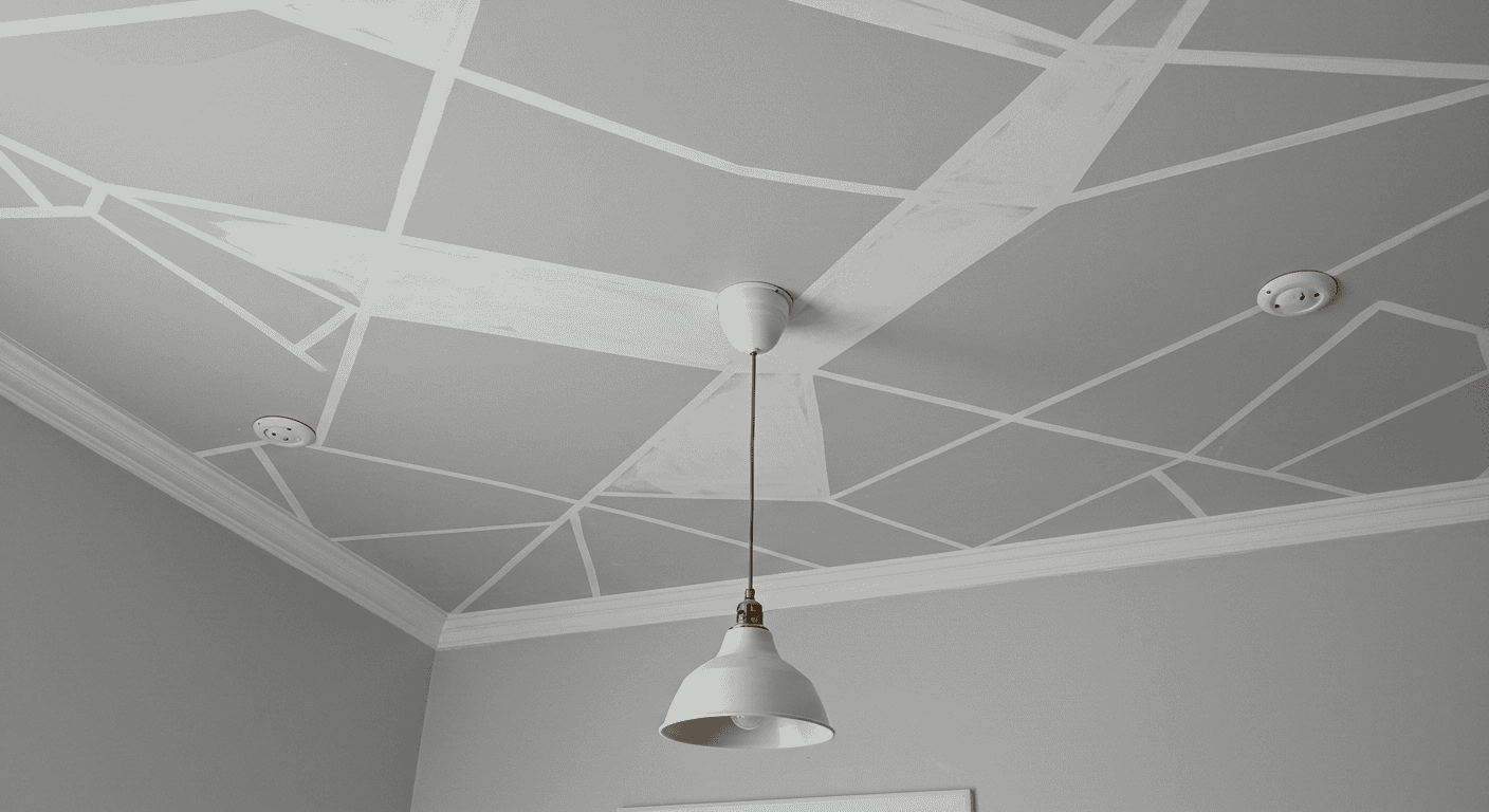
Pattern Chooser: Color Blocking, Stripes, Geometric Grids
Pattern selection is less about trend and more about solving a spatial challenge with style. Color blocking offers the fastest transformation through a precise transition line that caps or lifts the room. Stripes introduce motion and rhythm, either elongating or widening the space depending on orientation and width. Geometric grids or frames emphasize symmetry and highlight features like a central light fixture, beams, or coffers. Choose the pattern that supports the room’s proportions and complements the furnishings below.
Two-Tone Borders vs Full Accent Ceilings
A two-tone border, often 8 to 12 inches down from the ceiling line, adds sophistication with minimal effort and pairs beautifully with simple drywall edges. A full accent ceiling, by contrast, saturates the entire plane, making a dramatic statement and clearly defining the room’s personality. Borders are excellent for first-time projects; full accents fit spaces craving strong identity or tone-on-tone elegance with trim and door casings.
Transitions at the Wall–Ceiling Junction
Clean transitions make or break Ceiling Decor painted designs. For border bands and color blocks, align tape to a measured, level line that repeats evenly around the room. Where walls are slightly out of square, a common reality, prioritize a visually level line over an exact wall measurement. If crown molding is present, decide whether it belongs to the ceiling or the wall scheme and tape accordingly, ensuring the reveal feels intentional rather than accidental.
Finish and Prep Checklist
Most ceilings read best in matte or flat finishes for minimal glare and to hide minor texture inconsistencies; trims can shift to satin or semi-gloss for subtle contrast. Plan for patching, sanding, and priming where needed, particularly over stains or sheen changes, so final coats read as one continuous surface. A little extra time here pays dividends in the crispness of edges and the uniformity of color.
| Goal | Recommended Pattern | Orientation or Placement | Notes |
|---|---|---|---|
| Make ceiling feel higher | Light color block or narrow stripes | Stripes oriented toward longest dimension | Keep value lighter than walls to lift visually |
| Add intimacy to tall rooms | Full accent ceiling or wide horizontal band | Band 8 to 12 inches down from ceiling line | Deeper tones reduce perceived height |
| Elongate a narrow space | Stripes | Run stripes along the long axis | Even widths create calm; varied widths add energy |
| Highlight a central fixture | Geometric frame or grid | Centered to room or seating plan | Use symmetry to avoid visual drift |
Tools, Materials, and Setup – Ceiling Decor
A smooth project rests on simple, dependable tools and a tidy setup. For Ceiling Decor projects involving color blocking and stripes, the essentials include painter’s tape, a roller with an extension pole, brushes for cutting in and detailing, a reliable level, and protective gear like drop cloths and masking film. Patching compound, sandpaper, primer, and a clean bucket for decanting paint round out the kit. Treat setup like mise en place in cooking: if everything is measured, staged, and within reach, the work flows.
Essential Kit
At minimum, gather tape designed for crisp lines, a roller frame with an extension to avoid ladder fatigue, and a set of brushes for precise edges and small corrections. Add a level to ensure lines are truly straight across the room, and keep a sharp pencil, chalk line, and measuring tape for layout marks. Have primer ready for stains and previous sheen transitions, and use drop cloths to protect floors and furniture. Nothing kills momentum like stopping to clean accidental drips mid-roll.
Layout, Protection, and Comfort
Start by clearing or covering furnishings, then protect floors fully and tape off trims not being painted. Mark the layout lightly in pencil or chalk, confirm levels on at least two opposing walls, and dry-run tape positions before committing. For comfort, alternate between cutting in and rolling to reduce neck strain; take short breaks and keep the pole length adjusted so shoulders stay neutral. Thoughtful ergonomics make detailed work such as stripes easier to sustain and execute cleanly.
Layout Accuracy
Accuracy determines whether the effect reads as custom or makeshift. Confirm the room’s true horizontal using a level rather than relying on ceilings or floors, which can be slightly off. Transfer marks across corners, then connect with a chalk line or tape sequentially while checking references periodically. For multicolor patterns, create a light, labeled map on paper with dimensions and order of operations, including drying times and tape removal sequences.
Measuring and Marking Methods
For borders, measure down from the ceiling at regular intervals, every 16 to 24 inches, and make small, consistent marks. For stripes, decide total count and width first, then mark from a clean centerline to avoid compounding error. When a line wraps around obstacles like vents or beams, keep the measurement grid consistent so the pattern re-emerges aligned on the other side, preserving visual rhythm.
Surface Prep
Preparation may not be glamorous, but it is everything. Wash the ceiling to remove dust and oils, fill dents and hairline cracks with a suitable compound, and sand until transitions disappear under fingertip. Prime patched areas and any stains to prevent flashing. This creates the uniform base paint needs to deliver consistent sheen and color, ensuring the final Ceiling Decor patterns look intentional and refined.
| Tool or Material | Purpose | Pro Tip |
|---|---|---|
| Painters tape | Masking crisp edges and patterns | Burnish edges and seal with base color before accent |
| Roller and extension | Even coverage, reduced fatigue | Use a quality sleeve and keep a wet edge |
| Level | Straight, consistent reference lines | Confirm at multiple points to catch wall variance |
| Primer | Uniform base, stain blocking | Spot-prime patches to avoid flashing |
| Drop cloths and film | Protect floors and furnishings | Cover wider than the projected splash zone |
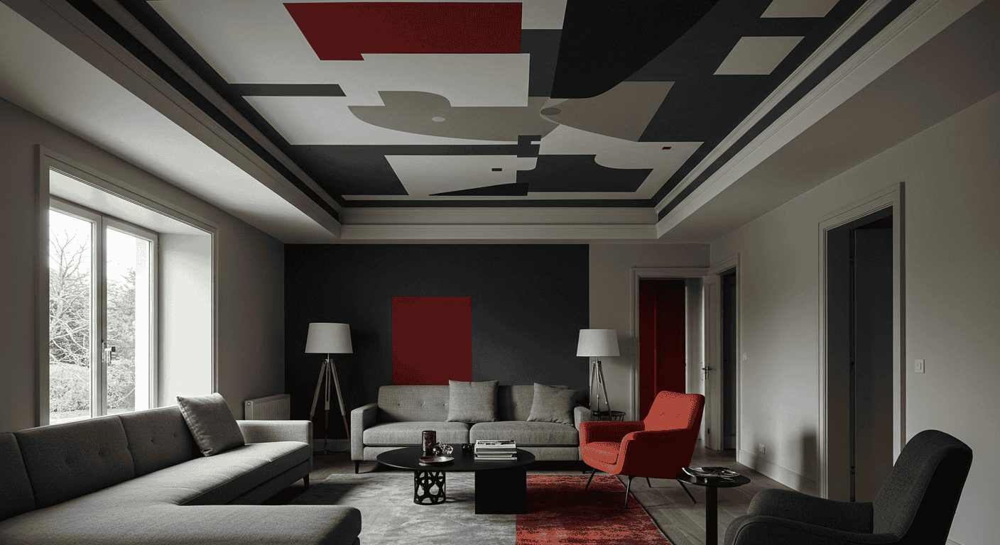
Color Blocking: Clean Transitions and Two-Tone Borders
Color blocking is the quickest way to make Ceiling Decor feel tailored. The hallmark is a controlled transition between ceiling and wall tones, either at the junction or set down to create a border band. The move can visually heighten or compress a space, depending on where the line falls and which color is placed overhead. Because it is essentially one long, continuous edge, color blocking is ideal for learning tape technique and mastering the satisfying reveal of a crisp boundary.
Where to Place the Break Line
For modest ceilings, place the break at or just below the junction to visually expand height. For higher ceilings, a band 8 to 12 inches down pulls the ceiling’s perceived plane downward and adds intimacy. Consider how the line relates to windows, door heads, and built-ins. Aligning the band with architectural elements can look intentional and cohesive. If crown molding exists, decide whether it shares the ceiling color or the wall color, then let that choice govern the band’s start.
Proportional Rules by Ceiling Height
As a starting point, rooms around 8 feet tall can keep the line within the first 2 to 4 inches to avoid truncating height. Nine to ten foot ceilings handle 8 to 12 inch bands comfortably. Taller volumes can push even wider bands if the goal is to ground the space. These are guidelines rather than laws. Allow furniture scale, window height, and lighting to refine placement. Always step back and view marks from multiple vantage points before taping to lock in the most natural proportion.
Taping the Transition
Once placement is confirmed, connect measured marks with a level or snapped chalk line, then run tape carefully along the path with consistent pressure. For the sharpest edge, burnish lightly with a clean cloth or a plastic smoothing tool. Where walls and ceilings meet, choose whether the tape sits on the wall or the ceiling side depending on which color will be applied next. Consistency along the perimeter prevents small wobbles or overlaps from accumulating visually.
Mark, Snap, Tape Workflow
Work in a loop. Mark at measured intervals, snap a chalk reference if desired, and then lay tape precisely to the reference, pressing as you go. As the final step before painting the accent color, seal the tape edge with the base color that sits under the tape line. This back-filling step blocks microscopic gaps that cause bleed and produces a razor-sharp reveal when the accent coat is applied and the tape is pulled.
Painting Sequence
Paint the lighter, larger field first, often the ceiling or upper portion, then apply the darker accent. With the tape burnished and the edge sealed in the base tone, apply the accent color in two light, even coats rather than one heavy pass. While the paint is still slightly wet, pull the tape at a low angle to avoid lifting fresh paint. If a small ridge forms, a gentle pass with fine sandpaper after curing, followed by a touch-up, will flatten the transition invisibly.
| Placement | Effect | Suggested Band Width | Best For |
|---|---|---|---|
| At ceiling junction | Maximizes perceived height | 0 to 2 inches | Low ceilings and small rooms |
| 8 to 12 inches down | Adds intimacy and frames walls | 8 to 12 inches | Tall rooms and formal spaces |
| Split wall and ceiling | Graphic modern statement | Varies by ceiling height | Living and dining rooms |
Stripes: Horizontal, Vertical, and Angled
Stripes inject motion and structure into Ceiling Decor. On ceilings, they can guide sightlines, emphasize the room’s longest dimension, or frame a central fixture with calculated rhythm. The two secrets to success are thoughtful width selection and precise layout from a centerline. With those in place, edges become crisp and the pattern reads as deliberate architecture instead of an afterthought. Stripes can be subdued in tone-on-tone schemes or dynamic in contrasting colors. Both approaches benefit from clean execution.
Planning Stripe Count and Width
Begin by choosing a total count and a repeating width that fits the room’s scale. Even counts feel balanced and calm. Odd counts allow for a single central stripe that can align to a feature like a light or dining table, creating a focal axis. Wider stripes look modern and restful. Narrower stripes introduce energy and a sense of texture. Mock up with painters tape before painting to validate proportions and sightline effects from seating areas and entrances.
Even vs Odd Logic and Focal Alignment
An odd number of stripes creates a natural centerline that can be aligned to the main fixture or the room’s furniture layout, which helps the pattern feel integrated. Even counts suit hallways and long rooms where symmetry from edge to edge is more important than a single center stripe. If the room has an asymmetrical feature, use stripe spacing to rebalance the composition, favoring the eye’s primary view rather than mathematical perfection alone.
Crisp Lines Method
For immaculate edges, use the seal-the-tape technique. After taping the stripe boundaries, paint a light coat of the base color along the tape edge to pre-seal it, then add the stripe color. This fills micro-gaps, prevents bleed, and yields an exceptionally tidy reveal. Pull tape while the stripe coat is still slightly wet and at a low angle to reduce the chance of tearing or ridging. If repeating across a large ceiling, work in sections that maintain a wet edge and consistent behavior.
Sealing, Timing, and Removal
Avoid heavy paint loading at tape edges. Multiple light coats dry more predictably and reduce ridge formation. If the ceiling texture is pronounced, press and burnish tape more firmly and consider a slightly thicker seal coat with the base color. Remove tape as soon as the final coat has skinned over but before full cure. This timing helps prevent lifting. Keep a sharp utility blade on hand to score stubborn areas without disturbing surrounding paint.
Working Around Obstacles
Ceilings rarely present perfect blank canvases. Stripes often need to navigate vents, beams, medallions, sprinklers, or ceiling-mounted hardware. The best tactic is to continue the stripe logic straight through obstacles whenever possible, then adjust at logical breaks like corners or beams. If a disruption is unavoidable, truncate or resume the stripe symmetrically so the interruption looks planned, not accidental. Pre-visualizing with tape avoids surprises and keeps the rhythm consistent.
| Room Size | Ceiling Height | Recommended Stripe Width | Orientation Tips |
|---|---|---|---|
| Small | Low, up to 8 feet | 4 to 6 inches | Run along longest dimension to elongate |
| Medium | Standard, 8 to 9 feet | 6 to 10 inches | Centerline alignment keeps balance |
| Large | Tall, 9 feet or more | 10 to 14 inches | Wider stripes calm visual noise |
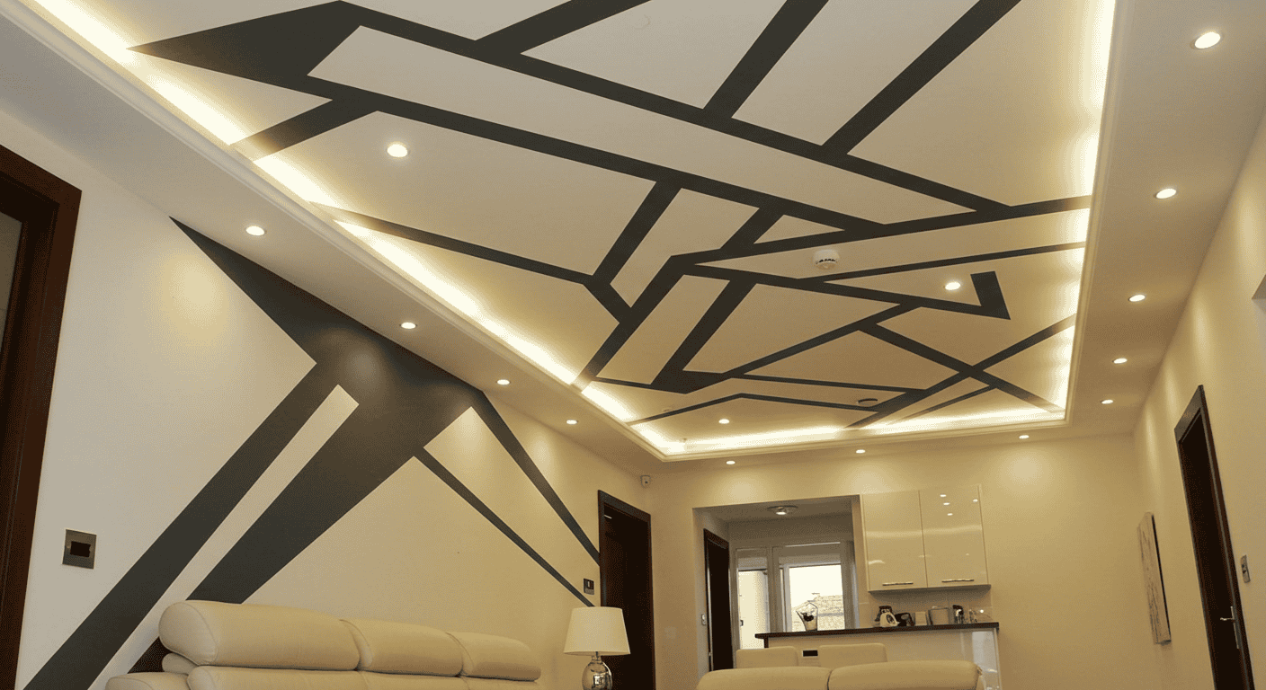
Geometric Ceilings: Grids, Frames, and Feature Zones
Geometric patterns give Ceiling Decor architectural presence. Simple grids, border frames, and accent panels can emphasize symmetry, highlight a chandelier or fan, and bridge disparate elements with a unifying structure. While geometry looks complex, it is easy to start small. A single frame around a central fixture or a perimeter border that echoes the room’s footprint will build confidence. Work from a measured center to keep margins equal and the composition balanced.
Simple Grids and Frames
A frame is the most approachable geometric move. Measure equal margins from the room’s edges or center on a fixture, tape the border, and fill with an accent tone. For a grid, start with large rectangles sized to the ceiling’s proportions, then adjust spacing until the intersections avoid cutting through fixtures awkwardly. Keep lines consistent in width. A steady visual rhythm is the difference between tailored and busy.
Starting with Rectangles or Borders
Begin with rectangle frames that echo the room’s shape. This feels intuitive and forgiving. Once comfortable, consider adding an inner border in a lighter or darker value to layer depth without visual clutter. For rooms with beams or coffers, use paint to enhance the existing geometry by differentiating planes and emphasizing relief, ensuring the new pattern integrates with rather than fights the architecture.
Layout Techniques for Symmetry
Measure to locate the true center and snap chalk references from that point. Divide dimensions evenly to establish consistent margins and intersections, and verify using diagonal measurements so the grid is genuinely square. If the ceiling is out of square, bias the layout toward sightlines from key positions like the entry or main seating so the final impression reads symmetrical where it matters most.
Center-Out Measuring and Equal Margins
From center, measure equal distances to each edge for the first pair of parallel lines, then repeat for the perpendicular axis. This approach keeps errors from compounding and maintains balance even in imperfect rooms. Label each taped line lightly to track paint order and colors if more than one tone is involved, minimizing confusion during the painting sequence.
Painters Sequence
Paint from lightest to darkest when possible, which simplifies touch-ups and keeps coverage clean. Overlap tape confidently and burnish edges to reduce bleed. For intersecting lines, paint one direction first, remove the tape, allow to dry, then tape and paint the crossing lines. This preserves edge clarity at junctions and avoids muddy overlaps that dull the geometry’s precision.
| Pattern | Difficulty | Time Investment | Best Room Match |
|---|---|---|---|
| Single frame | Easy | Low | Bedrooms and dining rooms |
| Perimeter border | Easy to Moderate | Low to Medium | Entryways and hallways |
| Rectangular grid | Moderate | Medium | Living rooms |
| Diamond lattice | Moderate to Advanced | Medium to High | Feature spaces |
Pro Techniques for Crisp Lines
Crisp edges are the calling card of refined Ceiling Decor. Three habits elevate results instantly. Seal tape edges with the underlying color, remove tape at the right moment, and control paint thickness at edges to avoid ridges. Combine these with careful leveling practices and the finish will mimic custom millwork in its precision. These are craft-forward techniques that anyone can learn and apply consistently.
Tape Edge Sealing
After masking, apply a light coat of the base color along the tape edge so the base color bleeds under the tape instead of the accent color. This creates a micro-barrier that locks down fibers and texture. Once dry to the touch, proceed with the accent color in controlled coats. The reveal is remarkably sharp. Even on light textures, this method outperforms heavy-handed taping alone.
Preventing Bleed and Ridge
Resist the temptation to saturate the brush at the tape line. Excess paint leads to ridges that can shadow under certain light. Use multiple light passes and feather slightly away from the edge. If a ridge does occur, allow paint to cure fully, then gently sand with very fine grit and touch up. This small corrective step restores a perfectly flat profile with minimal effort.
Leveling Aids
A long level or laser keeps long runs true. Check reference marks at each corner and midspan. Ceilings and walls can wander subtly across a room. When in doubt, prioritize what looks level from the primary sightline, such as the main entry or seating position. If the tape route must deviate to accommodate wall variance, make the change in an inconspicuous area and return to level as soon as possible.
Double-Taping for Long Spans
For exceptionally long lines, double-tape with a sacrificial guide strip. Lay a secondary tape line parallel to the primary so the roller edge rides the sacrificial tape, keeping pressure off the critical edge. Remove the sacrificial tape first, then pull the primary at a low angle while the paint is still slightly wet. This method reduces mechanical scuffing and protects the true edge from accidental brush or roller contact.
The Reveal
Timing the reveal matters. Pull tape as the final coat becomes tack-free but has not fully cured, usually within minutes to a short hour depending on conditions. Peel slowly at a 30 to 45 degree angle away from the painted edge, supporting the paint film as needed. If any area resists, lightly score along the edge with a sharp blade. This careful removal preserves the integrity of the line and minimizes repair work.
| Issue | Likely Cause | Fix |
|---|---|---|
| Bleed under tape | Poor burnish or no seal coat | Seal with base color, re-tape, repaint |
| Torn edge | Tape removed too late or too fast | Score and touch up, pull while slightly wet |
| Ridge line | Excess paint along tape | Light sand after cure, feather touch-up |
| Wavy line | Inconsistent measuring or level | Re-measure, snap chalk line, reapply tape |
Optical Effects and Room Psychology
Successful Ceiling Decor considers optics and mood. Lighter tones lift and open, while darker tones embrace and focus. Horizontal bands calm and widen. Vertical emphasis elongates. A considered ceiling can guide attention to where it belongs, toward a dining table, a reading corner, or an entry focal point, and away from awkward proportions. Tuning the ceiling is a quiet yet powerful way to affect how a space feels and functions every day.
Make a Low Ceiling Feel Higher
Keep the ceiling plane a touch lighter and cooler than the walls, and let color transitions occur close to the junction. Narrow stripes oriented toward the room’s longest dimension subtly stretch the perception of length, while a consistent ceiling field reduces visual clutter. Avoid heavy contrasting bands that can cut the wall height. Use reflective decor sparingly so the ceiling reads as expansive rather than busy.
Light, Value, and Sheen
Opt for matte finishes that absorb glare. Gloss on a low ceiling can highlight imperfections and visually push the plane down. If the walls are medium value, taking the ceiling two steps lighter can be enough to lift the room without feeling disconnected. When daylight is limited, favor clean, neutral undertones that maintain clarity in varied light conditions.
Tame Tall Spaces
In lofty rooms, a deeper ceiling tone and a generous horizontal band bring down the perceived height and generate warmth. Stripes perpendicular to the longest dimension can visually widen tall, narrow spaces. If echo is a concern, pair the deeper ceiling tone with soft textiles below to reinforce a comfortable acoustic impression that matches the visual coziness.
Balance and Proportion
Let the band’s width relate to architectural elements. Align with window heads or door tops when possible, or choose a proportional width for example, approximately 10 to 15 percent of wall height that feels measured rather than arbitrary. Check how pendant heights and ceiling fans interact with the band. Ensure the composition supports rather than competes with functional fixtures.
Flow Through Connected Rooms
In open plans or adjacent rooms, echo color families and repeat simple motifs to maintain visual continuity. A subtle frame in a hallway that resolves into a bolder accent in a living area signals progression without jarring transitions. Use a common thread, like a recurring stripe width or a shared accent value, to stitch spaces together while letting each room express its specific purpose.
| Goal | Tactic | Common Mistake |
|---|---|---|
| Higher feel | Lighter ceiling and minimal band at junction | Overly dark or heavy borders |
| Cozier feel | Darker ceiling and wide horizontal band | Too narrow a band to impact perception |
| Elongate space | Stripes along long axis | Random widths that create noise |
| Unify rooms | Repeat stripe width or accent value | Inconsistent undertones between spaces |
Step-by-Step Mini Projects – Ceiling Decor
Translating concepts into action is where Ceiling Decor becomes fun. The following quick projects are designed for a weekend and are scalable. Start small, then expand the palette, width, or complexity as confidence grows. Each includes a logical sequence that emphasizes clean prep, sound layout, and crisp reveals, which are universally transferable to more ambitious designs.
Two-Tone Border Band
Prep the ceiling and walls, then measure and mark the band distance down from the ceiling at regular intervals. Connect the marks with a level or chalk line, tape precisely to the line, and burnish. Seal the tape edge with the base color, allow to dry, then apply the band color in two light coats. Pull the tape carefully at a low angle before full cure. The result is a tailored line that adds structure without overwhelming the room.
Sequence and Cleanup
The order matters. Clean, patch, sand, prime patches, paint the larger field, lay out the band, seal tape, apply the accent, then reveal. Keep a small brush and a damp cloth handy for quick touch-ups, and dispose of tape as soon as the reveal is complete to avoid accidental adhesion transfer. A final walk-around under different lighting, day and evening, confirms evenness and edge quality.
Three Wide Ceiling Stripes
Center a single wide stripe to the feature point of the room, a fixture or the seating axis, then measure equal distances for the adjacent stripes. Tape along the stripe edges with care, burnish, and seal the tape with the base color. Apply the stripe color in controlled coats and pull tape while slightly wet. Because stripes are bold, maintaining consistent widths is crucial. Verify measurements at multiple points to avoid gradual drift.
Centerline Logic
Mark a reliable centerline first, then mirror outwards to keep symmetry. If the room is asymmetrical, visually center stripes to the main sightline rather than the exact geometry of the walls. This ensures the composition appears intentional from the vantage points that matter most in daily use.
Geometric Frame Around a Light
Measure equal margins from the room’s edges or center on the fixture to establish a rectangle or square. Tape the frame, burnish, and seal with the base color. Apply the accent tone in light coats, then reveal while slightly wet. This simple move concentrates attention where light already gathers, creating a refined focal point that elevates the entire scheme without dominating it.
Margin Consistency
Keep frame widths consistent on all sides and confirm squareness with diagonal checks. If the room is out of square, bias the geometry toward what appears square from the doorway or primary seating position. The goal is a visually convincing frame that reads crisp and intentional.
| Project | Estimated Time | Skill Level | Core Tools |
|---|---|---|---|
| Two-tone border band | Half day | Beginner | Tape, level, roller, brush |
| Three wide ceiling stripes | One day | Beginner to Intermediate | Tape, measuring tools, roller, brush |
| Geometric frame around a light | Half day | Beginner | Tape, level, brush |
Troubleshooting and Maintenance – Ceiling Decor
Even careful projects encounter hiccups, and good maintenance ensures Ceiling Decor looks fresh for the long haul. Most issues trace back to tape adhesion, timing, or surface preparation. The key is to diagnose quickly and apply a targeted fix. After completion, protect the finish with gentle cleaning and keep a labeled touch-up jar for each color so minor scuffs and dings can be resolved in minutes.
Fixing Bleed and Ragged Edges
If bleed occurs, let paint dry fully, then score along the line lightly, re-tape precisely, and repaint the affected section using the seal-the-tape method. For ragged edges on textured ceilings, press and burnish tape more firmly next time and consider a slightly thicker seal coat in the base color to fill micro-voids. Patience during layout pays for itself during the reveal.
Texture and Timing
On textured substrates, edge control relies on firm tape burnish and removal while the top coat is still slightly wet. Pulling too late can cause tearing or jagged edges. If resistance is felt, score gently before continuing. Aim to work in manageable sections so timing stays consistent across the pattern.
Touch-Ups and Cleaning
For touch-ups, stir paint thoroughly and use a fine brush to feather into surrounding areas. Avoid overworking the surface while partially dry. For cleaning, use a soft cloth and a gentle solution suitable for painted surfaces. Harsh abrasives can polish matte finishes and create shiny spots, so test in an inconspicuous area first.
| Problem | Cause | Solution |
|---|---|---|
| Paint bleed | Tape not sealed or poor adhesion | Seal with base color, re-tape, repaint |
| Tearing on removal | Removed after full cure | Pull while tack-free or score carefully |
| Wavy transition | Inaccurate measuring or leveling | Re-measure, snap guide, reapply tape |
| Ridge lines | Heavy coats along tape edge | Use light coats, sand ridge after cure |
Conclusion – Ceiling Decor
When approached methodically, Ceiling Decor yields an outsized impact for modest effort. Planning clarifies intent, layout ensures balance, and edge discipline unlocks professional reveals that frame daily life with quiet polish. Start with a simple border or a trio of stripes to build confidence, then step into bolder color blocking or geometric frames as skills grow. A ceiling tuned to the room’s proportions and purpose will improve how the space feels every day. For more home-friendly techniques and room-by-room ideas that pair smoothly with these ceiling moves, visit ameliastips.com, and for broader painting best practices, keep a trusted reference like Consumer Reports painting advice bookmarked as a companion.