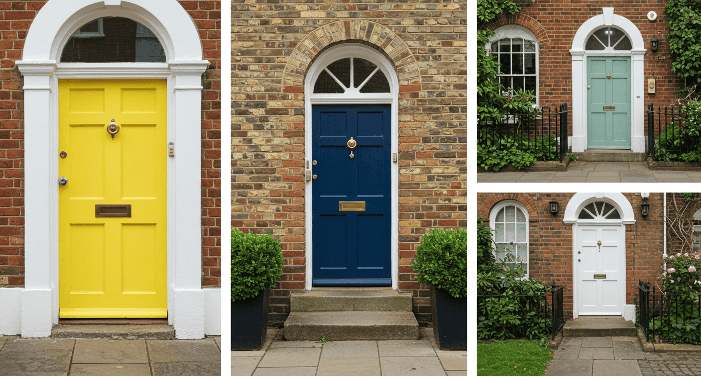
First impressions begin before a knock, and few elements set the tone as decisively as the color at the threshold. The psychology of door colors blends human perception, environmental context, and design intent to send rapid signals about welcome, trust, confidence, and identity. This guide goes beyond clichés with decision tables, actionable frameworks, and real‑world considerations so the entryway feels intentional rather than accidental. For more practical home tips, visit Amelia’s Tips, and for background on how color influences perception, see this primer on color psychology.
Introduction: Why Door Colors Matter
The psychology of door colors operates at the intersection of emotion and environment, where a split‑second glance can shape expectations about the people and experiences behind the door. While taste and tradition play a role, the entry color acts as a social signal—an immediate cue about approachability, modernity, confidence, or calm. Even subtle shifts in tone, saturation, and finish can alter perceived warmth or restraint, guiding how guests and passersby interpret a home’s character.
Rather than treating color as an afterthought, consider the door as the home’s handshake. A well‑chosen hue harmonizes with architecture, climate, and neighborhood rhythm while foregrounding the desired feeling—serene, welcoming, elegant, or bold. Translating the psychology of door colors into smart decisions is less about memorizing meanings and more about aligning mood, context, and maintenance realities to create a lasting first impression.
The Psychology Behind First Impressions
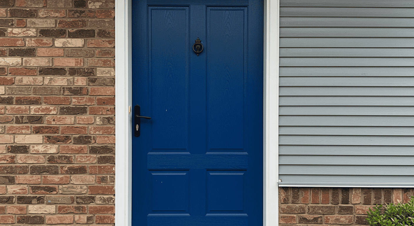
First impressions are rapid and sticky, shaped by heuristics that evaluate color cues faster than conscious thought. Warmth versus coolness, brightness versus depth, and contrast against the facade all nudge interpretations like friendly versus formal or energetic versus composed. The psychology of door colors benefits from a structured lens: hue temperature influences emotion, contrast guides the eye, and finish affects perceived quality and care.
How Color Cues Are Read at the Entry
Warm hues often imply approachability and energy, while cool hues can convey calm and reliability, and neutrals can suggest timelessness or restraint. These associations are flexible; surrounding materials—stone, wood, and metal—and adjacent trim amplify or soften the message. The psychology of door colors is highly sensitive to saturation: muted versions feel sophisticated and versatile, whereas highly saturated tones command attention and require careful balancing with trim and landscaping.
Quick‑reference table: Sensory cues vs first‑impression effect
Use the table below to connect key visual levers—temperature, saturation, contrast, and finish—to common first‑impression outcomes. This provides a practical shorthand before exploring specific hues in depth.
| Sensory cue | Typical read | First‑impression effect | When to use |
|---|---|---|---|
| Warm temperature | Inviting, energetic | Approachable, social | Boost welcome and visibility |
| Cool temperature | Calm, composed | Trustworthy, serene | Project stability and ease |
| High saturation | Vivid, attention‑grabbing | Bold, memorable | Create a focal point |
| Low saturation | Muted, nuanced | Understated, refined | Balance complex facades |
| High contrast trim | Crisp edges, clarity | Clean, intentional | Sharpen sightlines |
| Matte/satin finish | Soft, subtle | Approachable, modern | Reduce glare and hide flaws |
| Gloss finish | Lustrous, formal | Elevated, classic | Emphasize heritage details |
Curb Appeal and Social Signaling
Curb appeal is more than aesthetic polish—it influences perceived care, value, and hospitality. Through the lens of the psychology of door colors, curb appeal becomes a conversation about social signaling: whether a home feels open and lively, calm and reserved, or elevated and formal. Well‑selected colors harmonize with roofline, siding, and landscape, ensuring the doorway reads as deliberate rather than discordant.
Light, Orientation, and Viewing Distance
Outdoor light changes hue perception throughout the day and across seasons. North‑facing entries typically read cooler and dimmer; south‑facing entries amplify warmth and glare; shaded porches mute saturation; bright, reflective masonry can wash out subtle tones. Applying the psychology of door colors means testing swatches at morning, noon, and evening from the street and the stoop, because the door must succeed at multiple viewing distances and angles.
Warm vs Cool: Setting the Tone

Choosing between warm and cool families frames the emotional profile of the entry. Warm hues like red, coral, and golden yellow can feel spirited and welcoming; cool hues like blue, teal, and green skew serene and trustworthy. Neutrals—black, white, and gray—operate as versatile anchors that can heighten contrast or quiet the composition. The psychology of door colors is about matching tone with the desired first impression while respecting architectural style and neighborhood context.
Warm Hues for Energy and Welcome
Warm doors enliven facades, especially in cloudy climates or shaded porches. Reds can broadcast confidence and hospitality; oranges can read playful and creative; yellows can convey optimism and cheer. Because warmth accelerates visual attention, manage intensity with surrounding trim and consider the street’s overall palette so the doorway pops with intention rather than shouting for attention.
Cool Hues for Calm and Trust
Cool doors soothe and steady, ideal when the aim is a composed, collected first impression. Blues can imply reliability and calm; greens suggest renewal and connection to nature; violets hint at creativity and introspection. In the psychology of door colors, cooler hues excel where the goal is to lower visual temperature, especially against warm masonry or sun‑baked siding.
Neutrals as Timeless Anchors
Neutrals bring flexibility and longevity. Black communicates sophistication and clarity of outline, particularly with crisp trim; white can feel fresh and inviting, though care is needed to avoid glare; grays range contemporary to classic depending on undertone. Neutrals are the quiet powerhouses of the psychology of door colors, adapting to remodels and seasonal decor without losing coherence.
Table: Warm vs cool vs neutral—emotion, best contexts, cautions
| Family | Emotional read | Best contexts | Watch‑outs |
|---|---|---|---|
| Warm | Inviting, lively | Shaded porches, cloudy climates, modern facades needing pop | Can overpower subtle siding; balance saturation |
| Cool | Calm, dependable | Sunny exposures, brick/stone warmth, coastal or minimalist styles | May read distant if too muted on dark facades |
| Neutral | Timeless, refined | Historic trims, high‑contrast schemes, changing seasonal decor | Risk of blandness without texture or accent |
Color Meanings: Quick Lookup by Hue
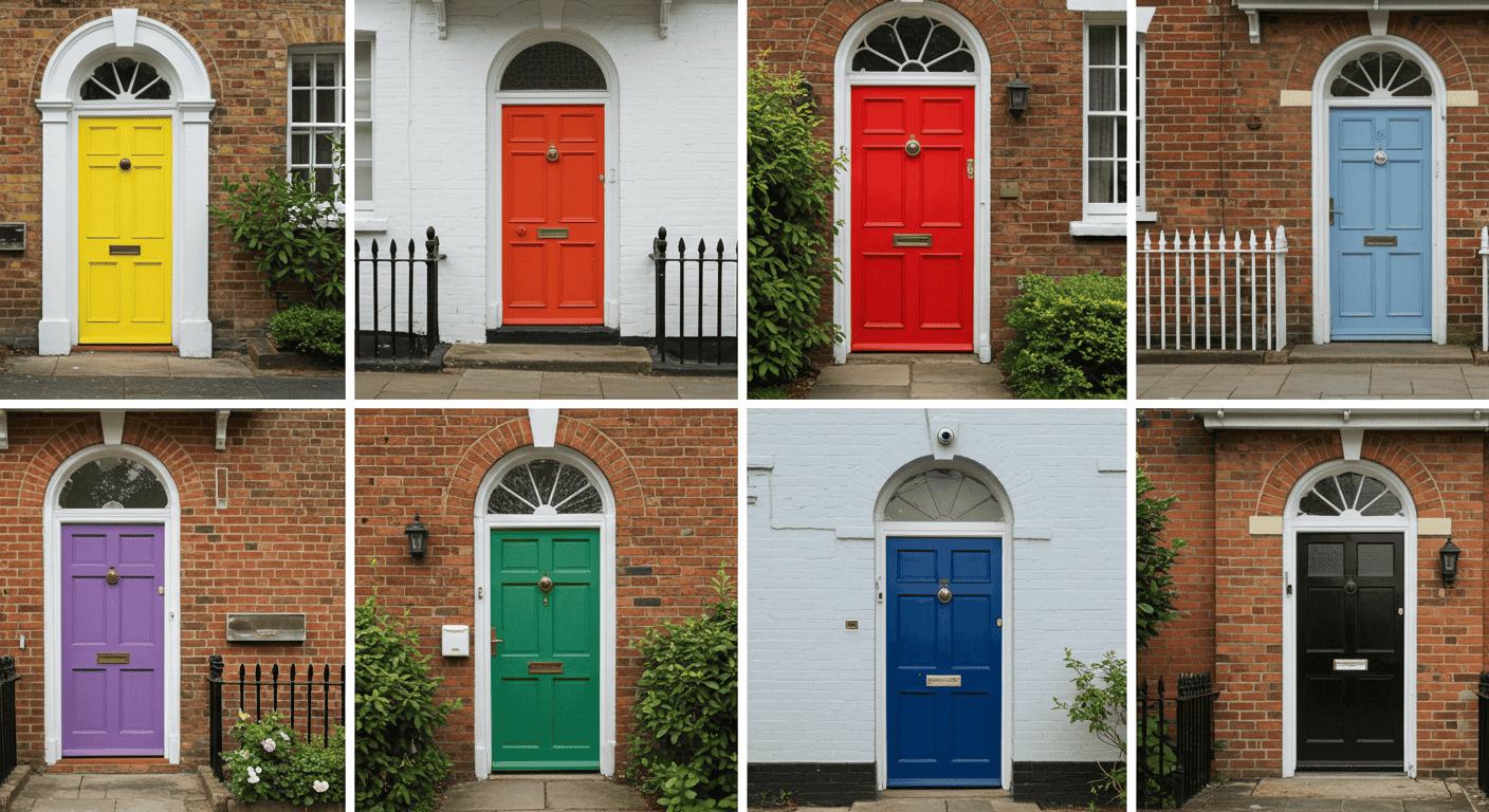
While meanings vary by culture and context, a quick‑reference view helps kickstart decisions. Treat these as directional cues rather than rigid rules, folding in architecture, neighborhood tone, and light conditions. The psychology of door colors is most effective when hue meaning, facade composition, and finish choices work together as a single statement.
Classic Palette Meanings
Traditional front door palettes persist because they communicate quickly and wear well over time. Red often signals confidence and welcome; blue reads calm and trustworthy; green suggests balance and renewal; yellow conveys optimism and friendliness; black leans sophisticated and authoritative; white feels clean and approachable. These baseline narratives can be adjusted by undertone and finish for greater nuance.
Expressive and Uncommon Hues
Beyond the classics, expressive colors bring personality. Purple can nod to creativity and distinction; orange reads adventurous and sociable; pink hints at playfulness or charm; turquoise and teal feel refreshing and coastal; brown and wood tones bring warmth and natural grounding. Use these hues to carve out identity where surrounding homes share similar siding or roof colors.
Cultural and Symbolic Notes
Cultural traditions and local norms shape interpretation, so consider regional expectations and historical references. In some contexts, bold red is celebratory and welcoming, while elsewhere it might read formal. The psychology of door colors adapts best when symbolism is understood alongside practicalities like climate, maintenance, and the home’s era.
Table: Color → emotions → first‑impression takeaway → architectural matches
| Color | Emotions | First‑impression takeaway | Architectural matches |
|---|---|---|---|
| Red | Confident, warm | Bold welcome | Colonial, farmhouse, eclectic |
| Blue | Calm, reliable | Composed hospitality | Coastal, modern, craftsman |
| Green | Balanced, natural | Grounded ease | Craftsman, cottage, mid‑century |
| Yellow | Optimistic, bright | Joyful greeting | Cottage, bungalow, eclectic |
| Black | Sophisticated, strong | Elevated clarity | Georgian, modern, transitional |
| White | Clean, open | Fresh welcome | Traditional, coastal, minimalist |
| Purple | Creative, distinctive | Imaginative character | Victorian, eclectic |
| Turquoise/Teal | Refreshing, lively | Inviting vibrancy | Coastal, contemporary |
| Brown/Wood tones | Natural, warm | Organic welcome | Craftsman, rustic, Scandinavian |
Matching Color to Home and Street
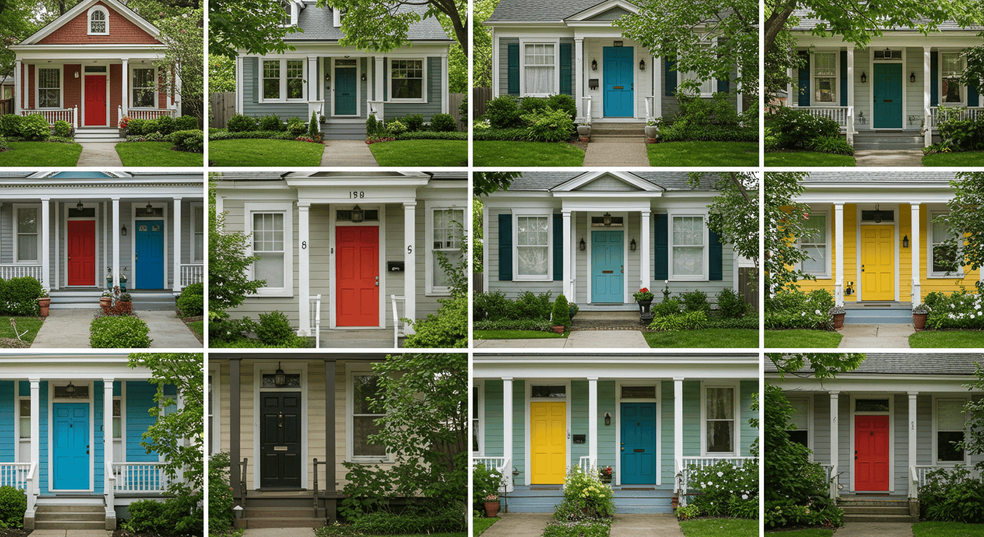
A great door color is contextual: it harmonizes with architecture, settings, and the lived patterns of the street. The psychology of door colors gains clarity when aligned with the home’s silhouette—roof pitch, trim profile, and window rhythm—and the neighborhood’s visual cadence. Aim for a deliberate stance: complementary rather than conformist, distinctive rather than discordant.
Architectural Style Alignment
Modern volume‑based forms often favor clear contrast and simplified palettes; classic homes can handle richer tones and gloss accents; cottage and farmhouse styles welcome cheerful or natural hues that echo gardens and porches. Read the lines and details: heavy trim supports deeper colors; delicate profiles read sharper with lighter or crisper hues.
Neighborhood and Curb Cohesion
Walk the block and note prevailing siding colors, roof tones, and pace of contrast. A distinctive door should feel like a punctuation mark, not a non sequitur. The psychology of door colors encourages standing out with intention: choose a hue that complements the streetscape while setting a unique note visitors identify quickly.
Facade, Trim, and Landscape Context
Consider masonry undertones, siding texture, and trim thickness. Darker hues sharpen on light facades; lighter hues glow on darker backgrounds. Nearby foliage can tint perception—greens next to abundant plantings may blend, while complementary hues like coral or teal pop pleasingly against deep greenery.
Table: Style/context → recommended tones → contrast strategy → finish level
| Style/Context | Recommended tones | Contrast strategy | Finish level |
|---|---|---|---|
| Modern, flat facades | High‑chroma accent or deep neutral | High contrast with crisp trim | Satin or semi‑gloss |
| Historic/traditional | Deep classics or soft neutrals | Moderate contrast to honor details | Semi‑gloss or gloss |
| Coastal/cottage | Fresh blues, greens, whites | Light‑to‑medium contrast | Satin to reduce glare |
| Rustic/craftsman | Earthy greens, browns, warm reds | Low‑to‑medium contrast | Matte or satin |
| Dense greenery | Complementary coral, teal, yellow | Clear separation from foliage | Satin for durability |
Finishes, Contrast, and Detail Work
Finish is a force multiplier in the psychology of door colors. Sheen affects perceived quality, depth, and even color temperature, while contrast organizes the entry and aids wayfinding. Surround details—frames, sidelights, thresholds—act like a stage for the door, shaping how every hue is read from the sidewalk and the step.
Finish Sheen for Durability and Perception
Matte and satin finishes feel soft and contemporary, forgiving of minor surface imperfections and comfortable in strong daylight. Semi‑gloss and gloss finishes elevate formality, sharpen reflections, and highlight millwork, but they demand smoother preparation. Where weathering is harsh, balance desired sheen with maintenance expectations to keep the door crisp over time.
High‑Contrast vs Monochrome
High contrast helps the door act as a focal point and clarifies circulation from the street, especially on complex facades. Monochrome schemes feel serene and minimalist, allowing texture and shadow to do the storytelling. Both are valid; success depends on architecture and the emotional stance desired at the threshold.
Hardware and Surrounds as Color Amplifiers
Without naming brands, it’s helpful to note that metal tones, sidelight mullions, and glazed panels modulate color read. A dark handle set can ground a light door; warm metallics can soften cool hues; clear versus patterned glazing adjusts perceived luminosity around the entry. Treat these elements as a chorus that supports the lead vocalist—the door color.
Table: Finish choice → pros/cons → first‑impression impact → best use cases
| Finish | Pros | Cons | Impression | Best use |
|---|---|---|---|---|
| Matte | Subtle, hides flaws | Less wipeable | Approachable, modern | Textured doors, strong light |
| Satin | Balanced sheen, durable | Some glare | Polished, friendly | Most exteriors |
| Semi‑gloss | Highlights detail, durable | Shows imperfections | Refined, crisp | Trim‑heavy entries |
| Gloss | Formal, striking | High prep, reveals flaws | Elegant, high‑impact | Heritage doors, minimal textures |
Practical Selection Framework
Turning insight into action is where the psychology of door colors proves its worth. This three‑step method helps define a clear intention, choose a direction confidently, and validate in real conditions before committing. Use it as a predictable path from mood to color to finish.
Three‑Step Door Color Method
Step 1: Define the desired first impression in plain language—welcoming, serene, confident, or timeless—and select two secondary traits to keep the message focused. 2nd Step: Match hue temperature to that intention and to context: warm for energy or visibility, cool for composure, neutral for longevity and versatility. Step 3: Choose finish and contrast based on architecture, maintenance comfort, and how the door should read from the street and the stoop.
Testing Under Real Conditions
Test large samples at multiple heights and edges, observing in morning, noon, and evening light. Step into the street and evaluate the read at 10, 25, and 50 feet. In the psychology of door colors, this street‑to‑stoop testing phase is where many surprises emerge—undertones appear, glare shifts, and saturation either blooms or recedes depending on exposure and surroundings.
Trim and Surround Ratios
Balance the proportions among door face, frame, sidelights, and adjacent wall. A simple ratio approach—base (door) as the hero, trim as the outlining narrator, and a reserved accent if needed—keeps the entry legible. High‑contrast trims sharpen silhouettes; low‑contrast trims let color mass and texture do the work, supporting a calm, cohesive look.
Table: Goals → hue paths → contrast levels → test checklist
| Goal | Hue path | Contrast level | Test checklist |
|---|---|---|---|
| Welcoming | Warm reds/corals/yellows | Medium‑high | Daylight glare, trim balance, street read |
| Serene | Cool blues/greens/teals | Medium | Evening tone, foliage context, stoop view |
| Confident | Deep hues or black | High | Edge crispness, millwork detail, gloss tolerance |
| Timeless | Balanced neutrals | Medium | Undertone drift, seasonal decor fit, maintenance |
FAQs for Fast Decisions
Even with a framework, common questions arise at the last mile. The psychology of door colors translates goals into quick moves that reduce decision fatigue. These answers keep nuance while providing clarity for typical scenarios.
Which Color Makes the Best First Impression?
There is no universal “best.” If visibility and cheer are priorities, warm hues excel; for composure and trust, cool hues lead; for longevity across trends, neutrals are reliable anchors. The best choice is the one that harmonizes with the home’s architecture, the street’s palette, and the emotion desired at the threshold.
Do Warm Colors Attract More Attention?
Typically, yes—warmer hues and higher saturation attract the eye faster, especially against muted facades or gray climates. The key is calibrating intensity so the door stands out for the right reasons, using trim and finish to keep the look intentional rather than loud.
Does Black or White Read Better Curbside?
Both can be excellent, but context rules. Black sharpens edges and signals polish, especially with crisp trim; white feels fresh and bright, but can wash out in full sun. Consider glare, facade value, and how the outline reads at different distances before settling on a final choice.
Table: Scenario → recommended palette → why it works → common mistakes
| Scenario | Recommended palette | Why it works | Common mistakes |
|---|---|---|---|
| Shaded porch | Warm mid‑tones | Adds vitality and visibility | Going too dark; losing definition |
| Full sun, light facade | Cool mid‑deep hues | Reduces glare, adds depth | Too light; looks washed out |
| Brick or warm stone | Balanced blues/greens | Complements warmth with calm | Clashing reds near brick |
| Minimalist modern | Deep neutral or single accent | Clarifies geometry | Overly busy color mixes |
Reader‑Friendly Tables and Quick Comparisons
To keep this guide skimmable and enjoyable, here is a consolidated set of reference tables that recaps the psychology of door colors in practical, at‑a‑glance terms. Use these when evaluating samples on‑site or when comparing a small set of finalists to make a confident choice.
Emotion‑Led Shortlist
Start with the feeling desired at the threshold and work backward to specific hue families, then adjust saturation and finish according to light and architecture. This keeps the narrative clear from the street to the stoop.
| Feeling | Hue families | Saturation guidance | Finish guidance |
|---|---|---|---|
| Welcoming | Warm reds, corals, sunny yellows | Medium saturation for balance | Satin for friendly glow |
| Serene | Soft blues, greens, teals | Low‑to‑medium for subtlety | Matte or satin to calm glare |
| Confident | Deep blues, charcoal, black | Deep saturation for impact | Semi‑gloss to elevate |
| Timeless | Balanced neutrals, muted classics | Low saturation to endure | Satin for versatility |
Context‑Led Shortlist
When context is the constraint—sun, shade, or surrounding materials—use this table first, then refine hue and finish to suit the emotional goal. This prevents chasing trends that fight real‑world conditions.
| Context | Hue direction | Contrast tactic | Notes |
|---|---|---|---|
| Bright sun | Cooler mid‑deep tones | Moderate contrast | Avoid glare‑prone light tints |
| Shade/overhang | Warmer or lighter mids | Higher contrast | Adds presence in dim light |
| Warm masonry | Balanced cools | Medium | Counterbalances undertones |
| Cool siding | Warm accents | Medium‑high | Prevents flatness |
| Minimalist form | Deep neutral or single accent | High | Clarifies geometry |
Conclusion: Make an Entrance with Intent
A door color is more than paint—it’s a message at the threshold. By aligning emotion, architecture, and environment, the psychology of door colors becomes a reliable design tool rather than a guessing game. Start with the feeling to spark, match hue temperature and saturation to the facade and light, and choose a finish that reinforces the narrative. With a few decisive moves and real‑world testing, the entry can welcome, reassure, or inspire—setting the tone for every moment that follows.
For additional frameworks that move from concept to choice, explore more guides at Amelia’s Tips. To deepen understanding of perceptual effects behind color choices, this general resource on color psychology provides helpful background. When the door tells the right story, the first impression writes itself.


