


The way a room feels has as much to do with the light as it does with the furniture. At the center of this is lighting color temperature, the quality of white light that ranges from candle-like warmth to crisp, daylight-like brightness. Understanding how Kelvin values translate into mood, comfort, and clarity unlocks the power to tailor each space to the activity it supports, whether that’s winding down in a bedroom or concentrating at a kitchen island. This guide breaks down the essentials of lighting color temperature, provides room-specific ranges, and shows how to combine layers, brightness, and color accuracy for a home that looks great and functions even better.
Instead of rigid rules, think of lighting color temperature as a flexible toolkit. Warm light encourages relaxation and intimacy; neutral tones balance comfort and visibility; cooler tones boost alertness and task performance. Throughout this article, practical tables and clear examples make selection simple, including quick selectors by room and by goal. For readers eager to explore more home strategies after this guide, visit the internal resource hub at ameliastips.com, and for a trustworthy, neutral reference on the fundamentals of color temperature and Kelvin, see this general-level primer at an established encyclopedia resource: Color temperature.
Color temperature 101
At its core, lighting color temperature describes the visual “warmth” or “coolness” of white light on the Kelvin (K) scale. Lower Kelvin values (around 2000K–3000K) create a golden, firelight-like glow associated with softness, comfort, and evening calm. Mid-range Kelvin values (roughly 3200K–4000K) appear more neutral, delivering a balanced white that supports most everyday activities without feeling too warm or stark. High Kelvin values (4500K–6500K) shift toward bluish-white, increasing perceived crispness, contrast, and alertness—useful for detailed tasks and daylight simulation. These differences aren’t about “more or less brightness”—they’re about the color quality of the light itself and the emotional response it tends to evoke.
Because lighting color temperature influences how colors, textures, and even faces are perceived, picking the right range helps a room do its job better. Bedrooms and lounges thrive on warmth that encourages slower evenings, while kitchens, craft areas, and offices benefit from neutral to cool tones that keep edges defined and tasks clear. Keeping this spectrum in mind makes it easier to match each room’s function, decor, and natural light with the most supportive Kelvin range.
The Kelvin scale made simple
Think of Kelvin like a thermometer for the shade of white light. At the “warm” end, sources resemble flames and incandescent glows; at the “cool” end, they mimic clear midday skies. In practice, most homes live between 2700K and 5000K. Below 2700K feels rustic and candlelit; 2700K–3000K is cozy and familiar; 3000K–3500K is adaptable and welcoming; 3500K–4000K supports task clarity without looking clinical; and 4500K–5000K delivers a daylight-like punch that’s ideal for detail work or active environments. Once this mental map clicks, optimizing lighting color temperature becomes intuitive.
Warm vs neutral vs cool: quick visual logic
A helpful rule of thumb: warm tones flatter wood, textiles, and skin; neutral tones respect both warm and cool palettes; cooler tones emphasize sleek finishes and make edges pop. This is why living spaces typically prefer warm-to-neutral ranges, while work surfaces lean neutral-to-cool. If a room feels flat, slightly cooler tones can add visual crispness; if it feels harsh, a warmer base can soften the experience. The art of lighting color temperature is choosing the smallest move that fixes the biggest problem.
When higher Kelvin helps—and when it hurts
Higher Kelvin can improve perceived clarity for reading, cooking, or intricate tasks, but it can also feel sterile in spaces meant for relaxation. The trick is to deploy cooler ranges intentionally where precision matters and warm or neutral tones where people gather to unwind. In open-plan areas, setting a warm ambient base and adding pockets of neutral task light preserves comfort while delivering function. This layered approach lets lighting color temperature work with, not against, the room’s purpose.
Typical labels: warm white, soft white, neutral, daylight
Store labels often say “warm white,” “soft white,” “neutral” (or “natural”), and “daylight,” each mapping to a Kelvin range. While labels vary, warm white typically aligns with 2700K–3000K, neutral with 3500K–4000K, and daylight with 5000K–6500K. Use Kelvin numbers as the decisive reference, and let labels serve as a quick guide. This keeps lighting color temperature choices consistent across different packages and suppliers.
Mixing temperatures without visual clutter
Mixing can be gorgeous when done with intent. Keep ambient and accent lighting within a tight Kelvin band, then reserve a slightly cooler task light for precision. Maintain clear zones and consistent sightlines to prevent a patchwork look. With this discipline, lighting color temperature contrasts feel purposeful, not chaotic.
| Kelvin Range | Appearance | Typical Uses |
|---|---|---|
| 2000K–2700K | Amber, candle-like warmth | Bedrooms, lounges, dining nooks |
| 2700K–3000K | Cozy warm white | Living rooms, hospitality areas, evening spaces |
| 3000K–3500K | Neutral-warm balance | Mixed-use living, hallways, general ambient |
| 3500K–4000K | Clean, neutral white | Kitchens, bathrooms, craft tables |
| 4500K–5000K | Crisp, daylight-like | Home office, garages, detail tasks |
Kelvin, lumens, and CRI—how they work together
Choosing lighting color temperature gets even better when paired with the right brightness and color accuracy. Lumens describe how much light is delivered (perceived brightness), Kelvin describes the hue of white light, and CRI (Color Rendering Index) indicates how faithfully colors appear. Treat these as three levers: set Kelvin for mood and function, specify lumens for sufficient illumination, and use CRI to ensure faces, food, and materials look true. A common mistake is to chase higher Kelvin for “brightness,” when the room actually needs more lumens or better distribution.
Another overlooked detail is how surfaces affect perceived brightness. Matte finishes spread light softly; glossy finishes intensify highlights and glare. A neutral Kelvin may feel plenty bright in a white-tiled bath but too stark against cool grey walls. By calibrating lumens to the task, CRI to color-critical zones, and lighting color temperature to the mood, lighting becomes precise and comfortable.
CRI basics: 80+ vs 90+ and where accuracy matters
CRI is rated from 0–100; the higher the number, the more accurately colors appear. Note that CRI 80+ suits most general spaces, while CRI 90+ shines in areas where skin tone, food presentation, art, and fabrics matter. Mirrors and dining surfaces especially benefit from higher CRI, where the subtleties of complexion and cuisine are more flattering. Combine the right CRI with an appropriate lighting color temperature to keep faces natural and materials vivid.
Bright but cozy: balancing lumens and Kelvin
If a room feels dim, start by increasing lumens or adding an additional layer of light before jumping to cooler Kelvin. Cooler tones may feel “sharper,” but they can erode the cozy vibe when overused. For living spaces, pair 2700K–3000K ambient with targeted neutral task lighting so the whole room doesn’t tip into sterile territory. This balances perceived brightness with warmth, ensuring lighting color temperature supports the mood while tasks remain easy.
The “looks brighter” myth: why cooler isn’t always better
Cooler light can appear brighter due to contrast and how eyes perceive bluish tones, but it does not actually emit more light purely because of Kelvin. The outcome people want—reading clarity, clean counters, crisp details—often comes from adequate lumens, good beam spread, and excellent CRI. Using cooler light as a shortcut can backfire in cozy spaces. Let the purpose guide lighting color temperature, and use brightness and optics to achieve clarity.
Skin tones, food, fabrics: when CRI ≥90 shines
Where true-to-life color matters, a high CRI works wonders. In vanities and dining areas, it makes faces look healthy and food appetizing; in closets and craft areas, it preserves the integrity of garments and materials. Marry CRI 90+ with a supportive lighting color temperature—warm for comfort, neutral for balanced accuracy—to bring spaces to life without harshness.
Dimming and “warm dim” options to expand use cases
Dimming enables multiple moods from the same fixture. Even if the lighting color temperature is fixed, dimming lowers visual intensity and shifts the ambiance. Some technologies offer “warm dim” behavior that moves from neutral to warmer tones as light levels decrease, simulating candlelight for evenings. If tunable options aren’t available, separate warm ambient and neutral task sources create similar flexibility.
| Attribute | What it Controls | Typical Targets |
|---|---|---|
| Lumens | Perceived brightness at task plane | Higher for tasks, moderate for ambient |
| Kelvin (CCT) | Warmth/coolness of white light | Warm for relaxing, neutral/cool for tasks |
| CRI | Color fidelity of objects and skin | 80+ general; 90+ for mirrors, dining, crafts |
Room‑by‑room Kelvin picks
The simplest way to implement lighting color temperature is to select a narrow Kelvin window for each room and then layer light types within that window. Bedrooms and living rooms respond best to warm-to-neutral ranges that flatter skin and textures. Kitchens and bathrooms favor neutral ranges that keep surfaces clean and faces natural. Offices and utility areas benefit from cooler ranges with high clarity. The table below summarizes these ranges and helps guide quick decisions.
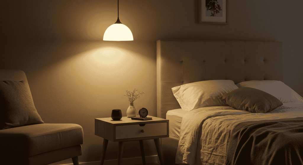
Cozy cores: bedrooms and living rooms
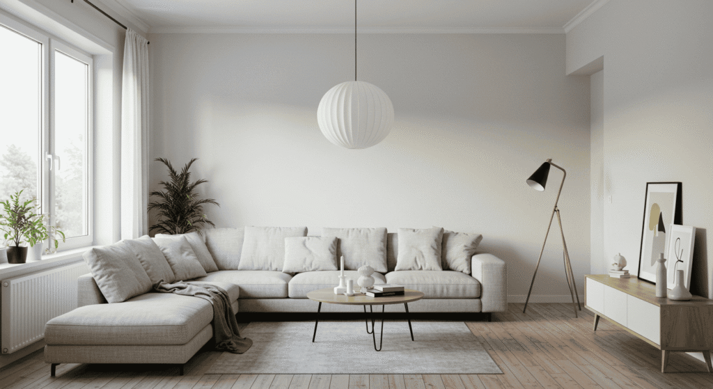
Bedrooms feel most restful with a warm base, generally 2700K–3000K. Here, the goal is gentle, enveloping illumination that cues relaxation. Living rooms handle a touch more neutrality—3000K–3500K—to keep conversation areas flattering while maintaining a crisp-enough backdrop for reading. Accent layers at similar or slightly warmer tones pull focus to art and texture without overpowering the scene. With the right lighting color temperature, evenings become naturally calmer.
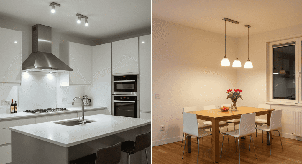
Clarity zones: kitchens and bathrooms
For meal prep, clean-up, and grooming, balanced whites support accuracy and hygiene. Kitchens thrive around 3500K–4000K, especially on worktops and sinks, where clear edge definition helps. Bathrooms benefit from 3000K–4000K, with careful attention to mirror lighting so faces appear true-to-life. Choose a consistent lighting color temperature across key sightlines to avoid a patchy look, reserving minor shifts for specific tasks.
Focus hubs: home office and utility areas
When focus and detail matter, slightly cooler tones around 4000K–5000K enhance contrast and help sustain alertness. In offices, combine this with glare control and correct brightness at the desk surface. Garages and workshops often benefit from the top end of this range for precision tasks. Maintain high CRI for accurate color, and keep the overall lighting color temperature aligned with the space’s active purpose.
Vanity mirrors vs shower zones: subtle Kelvin shifts
At the vanity, prioritize flattering and accurate skin tones with CRI 90+ and a balanced 3000K–3500K. In shower areas, slightly neutral-to-cool light can make tile look crisp and clean. Keep the difference modest so the bathroom reads as unified. This finesse ensures lighting color temperature supports both grooming accuracy and spa-like calm.
Under‑cabinet task contrast without harshness
Under-cabinet lighting shines when set a notch cooler or simply more neutral than the room’s ambient base. If the ambient sits at 3000K, try 3500K for worktops. The small shift improves contrast without clashing. The result is a kitchen that feels warm overall yet reads clearly on the cutting board—a subtle victory for lighting color temperature design.
| Room | Recommended Kelvin | Notes |
|---|---|---|
| Bedroom | 2700K–3000K | Promotes relaxation and wind-down |
| Living Room | 3000K–3500K | Cozy yet versatile for reading and conversation |
| Kitchen | 3500K–4000K | Neutral task clarity for prep and cleanup |
| Bathroom | 3000K–4000K | Accurate face lighting with clean surfaces |
| Home Office | 4000K–5000K | Focus and contrast for productivity |
| Entry/Hall | 2700K–3000K | Welcoming tone when transitioning indoors |
| Garage/Utility | 4000K–5000K | Visibility and detail-oriented work |
Layered lighting strategy
The most comfortable rooms combine ambient, task, and accent layers, each tuned to a supportive lighting color temperature. Ambient sets the overall mood; task lighting creates pockets of precision; accent lighting highlights texture and focal points. With a warm ambient base, neutral task lighting, and slightly warmer accents, spaces feel cohesive and purposeful. This approach keeps eyes relaxed while ensuring every activity has the right light.
Layering also makes rooms resilient to change. As seasons shift and routines evolve, dimming or selectively turning layers on and off transforms the room without replacing fixtures. When the base lighting color temperature is well chosen, small adjustments go a long way.
Ambient: warm base, calm evenings
Ambient lighting should be broad, indirect, and gentle, establishing the emotional temperature of the space. In living areas, 2700K–3000K supports conversation, reading, and screen time without harshness. Entrances feel welcoming at similar ranges, easing the transition from outdoors. Choosing a slightly lower lighting color temperature for ambient invites relaxation from the moment a room is entered.
Task: neutral to cool for precision
Task lighting is all about clarity where hands and eyes work. A neutral 3500K–4000K is a sweet spot for kitchens, desks, and vanity mirrors, balancing crispness with comfort. In specialized areas or detailed craft work, moving toward 4500K–5000K can increase contrast. Keep beams focused and avoid spill onto ambient zones, so the overall lighting color temperature remains cohesive.
Accent: warmer to make textures pop
Accent lighting flatters materiality and creates depth. Slightly warmer than ambient, it adds dimension to wood grain, textiles, and art. Use narrow beams or soft grazes to reveal texture without glare. With a thoughtful lighting color temperature offset, accents “lift” the room without calling attention to themselves.
Scene logic: reading, dining, cooking, unwinding
Build scenes around verbs, not fixtures. For reading: neutral task light plus warm ambient. For dining: warm ambient with modest accent on the table surface. As for cooking: neutral task on worktops, warm ambient elsewhere. For unwinding: warm ambient only, dimmed. Scenes like these make lighting color temperature feel intentional and intuitive.
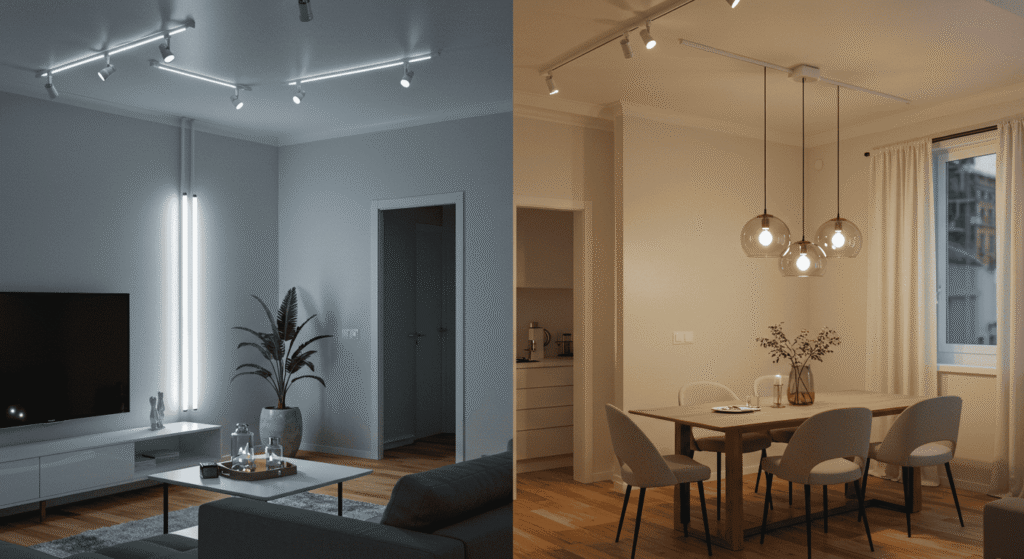
Avoiding color temperature clashes in open plans
Open plans demand discipline. Keep adjacent zones within about 500K of each other, especially in shared sightlines. Allow slightly cooler task pockets only where needed and keep accents tied to the ambient tone. This converts potential clashes into gentle gradients of lighting color temperature that read as harmonious.
| Layer | Typical Kelvin | Placement | Dimming Notes |
|---|---|---|---|
| Ambient | 2700K–3000K | Ceiling washes, shaded fixtures, indirect | Dim in evenings for relaxation |
| Task | 3500K–4000K | Desks, counters, mirrors, craft areas | Independent control for clarity on demand |
| Accent | 2700K–3000K | Art walls, shelves, textured surfaces | Subtle dimming to sculpt depth |
Matching color temperature across fixtures
Few things undermine a design like a patchwork of whites. To keep spaces coherent, select a primary lighting color temperature for each room and let that anchor the ambient and accent layers. Task lights can shift slightly cooler for function, but keep transitions soft and avoid mixing widely different tones within the same sightline. Where rooms connect, use transitional spaces like halls to gently bridge Kelvin differences.
Another tip is to consider lensing and shade materials, which can warm or cool the output visually. Even with identical Kelvin specs, different diffusers or finishes may skew appearance. Always compare lights in place before committing, and document chosen ranges so replacements match in the future.
Single‑room consistency vs zone‑based variation
In a single room, consistency tends to win—especially for ambient and accent layers. Variation works best when zoned: an island or reading nook can justify a small shift if the rest of the room remains unified. The guiding principle is that lighting color temperature should serve the activity without sacrificing the overall look.
Transition spaces: halls and entries as Kelvin buffers
Halls and entries are ideal for gently stepping between rooms with different tones. A warm hall can prepare eyes for a neutral kitchen; a neutral entry can ease the path from bright daylight outside to a cozy living room. Treat these connectors as calibration points for lighting color temperature, and circulation will feel natural.
Dimming, scenes, and time‑of‑day adjustments
Dimmers and scene presets simplify life. Morning routines can lean neutral for alertness; evenings can drop into warmth for rest. Even with fixed CCT, layering and dimming simulate flexibility. Over time, the home becomes adaptive, with lighting color temperature shifting to match energy levels and tasks.
Color shift pitfalls: mixing lamp types and lens tints
Beware of hidden shifts from shade materials, reflectors, and lenses. Frosted diffusers often warm the look; clear lenses can seem harsher. When evaluating options, compare side-by-side in the actual space. This avoids unplanned swings in perceived lighting color temperature.
Color rendering drift: keep CRI aligned with tasks
Two sources may share CCT yet differ in CRI, making colors appear inconsistent. Keep CRI levels aligned within the same task area—especially mirrors, prep zones, and craft surfaces. This preserves both the integrity of lighting color temperature and the fidelity of the environment.
| Use Case | Ambient (Kelvin) | Task (Kelvin) | Why It Works |
|---|---|---|---|
| Living + Reading Nook | 3000K | 3500K | Warm base for comfort; neutral pocket for clarity |
| Kitchen + Island Prep | 3000K–3500K | 3500K–4000K | Unified room tone with crisper workplanes |
| Bath + Vanity | 3000K | 3500K–4000K (CRI 90+) | Relaxed feel with accurate face rendering |
Special considerations: mirrors, materials, and finishes
Surfaces make or break light. Wood deepens under warm tones; stone and tile pop under neutral light; metals reflect highlights that can either sparkle or glare. Mirrors multiply both beauty and flaws, so careful choice of lighting color temperature, CRI, and beam control is essential. By matching Kelvin to material qualities, spaces look intentional and inviting.
A smart tactic is to test a sample lamp near key materials—backsplash tile, upholstery, paint swatches—and observe changes across warm, neutral, and cool options. Subtle shifts often yield more comfort and perceived quality than dramatic changes.
Skin tone fidelity at vanities and dressing areas
Few places are as sensitive to color fidelity as the mirror. Balanced Kelvin (around 3000K–3500K) paired with high CRI reduces shadows and preserves natural skin tones. Place light at face level from two sides or in a broad, even field to avoid harsh up-light or down-light shadows. With the right lighting color temperature, daily routines feel calmer and more accurate.
Food color accuracy on counters and dining tables
In kitchens and dining areas, color integrity improves appetite appeal and presentation. Neutral Kelvin maintains the freshness of greens and the richness of warm dishes, while high CRI keeps subtle hues intact. Consider neutral task lighting for prep and warm ambient for dining to harmonize function and mood. This balance ensures lighting color temperature enhances both taste and atmosphere.
Screens and glare: office ergonomics at 4000K–5000K
Screens complicate light planning. Cooler neutrals help maintain alertness, but glare control is crucial. Use indirect or diffused sources, keep bright beams out of sightlines, and maintain consistent lighting color temperature so the eye doesn’t constantly adapt. The result is a workspace that supports long sessions without fatigue.
Matte vs glossy: perceived brightness and harshness
Matte finishes spread light evenly, keeping highlights soft and gentle. Glossy or polished surfaces amplify specular reflections, making cooler light feel crisper—but sometimes harsher. If a glossy room feels too sharp, warming the lighting color temperature or adjusting beam direction can restore comfort.
Narrow beam task lights with neutral CCT for detail
For detail-oriented work—sewing, soldering, model building—use focused beams at neutral Kelvin to keep edges defined without bathing the whole room in cooler light. This localizes intensity, letting lighting color temperature fit the activity perfectly while the rest of the space stays inviting.
| Material/Finish | Best Kelvin Tendency | Effect |
|---|---|---|
| Warm Woods | 2700K–3000K | Enhances grain and warmth |
| Cool Stone/Tile | 3500K–4000K | Highlights texture and cleanliness |
| Metals/Glass (Glossy) | 3000K–3500K | Balances sparkle with comfort |
| Textiles/Upholstery | 2700K–3000K | Softens and enriches color |
Quick selectors: choose by goal, not just room
Rooms host many activities throughout the day, so plan lighting around goals as well as location. If the aim is relaxation, choose warm tones and lower intensities. If the aim is productivity, use neutral-to-cool tones with controlled, focused beams. The matrix below turns goals into a straightforward lighting color temperature plan that’s easy to implement and adjust with dimmers.
The best part of goal-based planning is how it reduces decision fatigue. Pick the verb—relax, entertain, focus, clean, display—then dial Kelvin and brightness to match. It’s an elegant way to make lighting feel intentional and enjoyable every day.
Wind‑down evenings without blue bias
For calmer nights, keep light warm and diffused. Swap overhead glare for shades and wall washes. Even a small reduction in output helps the body slow down. This is where a warm lighting color temperature becomes a gentle cue that the day is ending.
Meal prep clarity without clinical vibes
For chopping, mixing, and cleaning, increase task illumination and lean into neutral Kelvin at the counter. Keep ambient warm so the whole room doesn’t feel sterile. With a subtle separation of layers and a measured lighting color temperature shift, kitchens remain inviting while tasks stay clear.
Weekend reading and crafting precision
Reading nooks and crafting corners benefit from localized neutral-to-cool task light, set apart from warmer ambient. Position beams to avoid glare on pages and materials. This geometry-first approach, paired with the right lighting color temperature, supports long, comfortable sessions.
Shortcuts: 2700K cozy, 3000K versatile, 3500–4000K balanced, 5000K punchy task
Keep a few quick picks in mind when shopping or tuning scenes: 2700K for maximum cozy, 3000K for warm versatility, 3500–4000K for balanced clarity, and 5000K for high-focus task pops. These presets turn lighting color temperature into an easy, repeatable decision.
Use dimmers to “fake” flexibility when CCT is fixed
If color tuning isn’t available, dimmers are the next best tool. Lowering output warms perception and reduces contrast, yielding a more intimate feel. A thoughtful dimming strategy extends the usefulness of a fixed lighting color temperature without replacing fixtures.
| Goal | Kelvin Range | CRI | Dimming/Notes |
|---|---|---|---|
| Relax | 2700K–3000K | 80+ (90+ for flattering skin) | Indirect, dim in evenings |
| Entertain | 3000K–3500K | 80+ | Warm ambient with soft accents |
| Focus | 4000K–5000K | 80+ (90+ for crafts) | Task beams with glare control |
| Clean | 3500K–4000K | 80+ | Uniform coverage, neutral tone |
| Display | 2700K–3000K | 90+ | Warm accents for depth and texture |
FAQs and fixes for common mistakes
Great lighting is often the result of small course corrections. Below are rapid explanations and micro-tables that address the most common pitfalls when choosing lighting color temperature. Use them to troubleshoot mismatched bulbs, uncomfortable glare, or rooms that feel “off” after a change.
If things still feel tricky after trying these, revisit the fundamentals: identify the main activity, confirm brightness at the task plane, check CRI needs, and then tune Kelvin. This back-to-basics method resolves most issues without an overhaul.
Do higher Kelvins look brighter, or just crisper?
Higher Kelvin can appear brighter due to contrast and the eye’s sensitivity to cooler light, but it does not inherently increase light output. If clarity is the goal, evaluate lumens, beam spread, and surface reflectivity before pushing Kelvin higher. Matching the purpose to the right lighting color temperature preserves comfort while delivering performance.
Can different color temperatures be mixed in one room?
Yes—carefully. Keep ambient and accent within a narrow band, and introduce cooler task light only where it is truly needed. Maintain consistent tones in shared sightlines and use dimming to balance transitions. Done well, mixing makes lighting color temperature feel dynamic rather than disjointed.
Is 3000K or 4000K better for kitchens—and why?
It depends on the balance between hospitality and precision. 3000K leans warmer and cozy, ideal for eat-in spaces and evening warmth. 4000K is cleaner and crisper, excellent for prep-heavy kitchens and bright finishes. Many households settle at 3500K globally, then add 4000K task pockets—an elegant compromise in lighting color temperature.
“My bulbs don’t match” troubleshooting checklist
Start by confirming the Kelvin numbers, not just the marketing labels. Next, check for lens or diffuser differences, which can warm or cool the look. Align CRI within a given area, and replace outliers first. In open plans, standardize by zone. This sequence quickly normalizes lighting color temperature without replacing everything at once.
“Faces look odd at the mirror” CRI and CCT tweaks
If faces look washed out, try a slightly warmer Kelvin and raise CRI toward 90+. If they look too red or dull, move toward a balanced neutral (around 3500K) with high CRI and soften shadows with broader, side-oriented light. These targeted adjustments align lighting color temperature with flattering, accurate reflection.
| Problem | Likely Cause | Fix |
|---|---|---|
| Room feels sterile | Kelvin too high for the function | Warm the ambient or dim and add warm accents |
| Tasks feel fuzzy | Insufficient lumens or too warm CCT | Add neutral task light and improve beam control |
| Colors look “off” | Low CRI mixed with varying CCT | Standardize CRI and tighten Kelvin range |
| Patchwork look | Mixed labels and diffusers | Match Kelvin numbers and optic types |
Putting it all together
Effective home lighting is a conversation between activity, materiality, and mood. Start with the room’s purpose, define a narrow lighting color temperature range that supports it, select CRI to fit the most color-sensitive tasks, and size lumens to the work at hand. Then layer ambient, task, and accent for depth and flexibility. With this method, even modest adjustments make rooms feel calmer, clearer, and more expressive.
For more practical home strategies that pair well with these principles, browse related guides on ameliastips.com. To reference fundamental definitions or deepen technical understanding, consult the neutral overview at Color temperature. These resources reinforce the decisions made here and keep future choices consistent and confident.
Conclusion: master mood and function with lighting color temperature
When the right light meets the right activity, rooms come alive. By treating lighting color temperature as the mood-setter, lumens as the performance tool, and CRI as the color-truth teller, every space can be tuned for comfort and clarity. Warm bases welcome, neutral tasks clarify, and subtle accents add depth—supported by consistent Kelvin choices and thoughtful dimming. Use the room-by-room and goal-based tables as quick selectors, mix temperatures with care, and align CRI where it matters most. With these practices, the home becomes adaptive, beautiful, and genuinely easy to live in—proof that lighting color temperature is one of the simplest, most powerful levers in design.